A Complete Guide To Spider Charts With Best Practices And Examples Of When To Use Them
Table of Contents
If you are reading this blog post then you must be somewhat aware of the value of data visualization. Because they make complex data more accessible and understandable for a wide range of audiences, graphs and charts, permeate all areas of our lives with their multiple use cases in the news, media, politics, and business.
At datapine, we are committed to providing a user-friendly space for our readers to learn and understand the value of data visualization. For that reason, we are putting together a series of blog posts that go through the most popular types of graphs and charts with their most common use cases, design best practices, and a list of examples for different industries and business functions.
We already discussed bar charts, column charts, and area charts. Now, it is the turn of a complex yet visually engaging visual: spider charts. Keep reading to learn everything there is to know about this powerful graph and how it can help extract actionable insights from your most important data.
As usual, let’s dive in with a definition!
What Is A Spider Chart?
A spider chart, also known as a radar chart or star chart, is a type of data visualization used to display two or more dimensions of multivariate data. These dimensions are usually quantitative and go from zero to a maximum value, forming a spider web shape.
As the image above shows, these graphs use a node (anchor) and equiangular spokes (axis) to represent each data dimension. The values from each spoke are connected using a line with the end result resembling a spider web or a star. Hence, why they are also known as star charts.
These graphics can prove valuable in many business scenarios and industries, with their most common use cases being HR analytics to compare employee performance based on specific attributes or market research to compare different brands or products and how they are perceived by the public, among others.
That being said, they are not the most common type of data visualization as they can be harder to interpret for non-technical audiences that are not too familiar with data analysis. Nevertheless, they can also be very engaging visuals for more experienced audiences as their particular shape catches the eye.
Now, what makes this visual so different from the rest? Well, the most important differentiation is the fact that they use a distinct method to plot the data, and we’ll dive into this topic below.
How do you plot a spider chart?
Most common two-dimensional chart types, such as columns, bars, areas, scatterplots, and others, use Cartesian coordinates to plot the data with a vertical and a horizontal axis: Y and X. Spider charts, on the contrary, use a different coordinate system called Polar coordinates. This differentiation is very important when building efficient spider or radar charts, as it will help you plot and interpret the data correctly. Let’s explore the differences between these two methods below.
- Cartesian Coordinates
The cartesian coordinates system uses three perpendicular lines, known as axes X, Y, and Z, to determine the point's locations, all starting from 0 up to a negative or positive direction. In most two-dimensional charts, such as bars, columns, scatterplots, and more, we use axes X and Y (horizontal and vertical) to plot and compare how multiple values compare or are related to each other across a linear path.
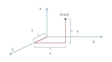
Source: differencebetween.com
- Polar Coordinates
On the other side, instead of simply plotting points linearly, polar coordinates define the position of a point in a 2-D space using a combination of a circular counter clock angle from the positive direction of the X axis and a straight reference line, known as radial and angular coordinates.
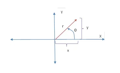
Source: differencebetween.com
Given that spider charts use quantitative dimensions in most cases, the axes are not continuous and don’t have the same scale. This means the values from each dimension need to be normalized for visualization purposes, resulting in the same scale for all dimensions, which goes from zero to a maximum observed value for each dimension.
When To Use A Spider Chart (And When Not To)
Now that you have a better understanding of what is a spider chart and how you can plot one, let’s explore some of the most common use cases as well as analytical scenarios when you should avoid them. It is important to note beforehand that radar graphs are best suited when exact values are not important for the analytical purpose as the irregular shapes make it harder to grasp exact differences; for that purpose, a bar chart is a better choice.
That being said, the most common use case for spider chart analysis is to compare one or more values based on a set of characteristics, features, or attributes. This enables audiences to analyze a single series of values based on the distances from the center of the chart to the end of the axis but also to compare different groups. The polygons that are formed after all values are connected with a line enable users to compare the sizes of the shapes and extract conclusions at a glance. The bigger the area the polygon covers, the better its position against the specific dimension.
For example, an HR manager can use a spider web chart to evaluate the performance of employees based on specific characteristics such as communication skills, punctuality, and productivity, among others. By comparing various employees at the same time, HR can identify weaknesses and areas for improvement from an individual and a team perspective.
Another common use case for these visuals is to compare performance based on a target. This is done by plotting one polygon as the actual performance and another as the target. For example, you can analyze actual vs. benchmark ROI by each department and compare the sizes of the shapes to understand which department is achieving and which ones need improvement.
Radar Chart Variations
Radar charts don’t have many considerable variations as other chart types. However, it is worth noting that there are a few different ways you can approach them, and we will discuss them below with a visual example.
- One group
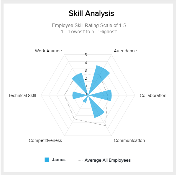
As its name suggests, this first type of spider chart corresponds to plotting a single group of values and comparing its performance based on the specified categories. As mentioned, this is a great use case to analyze employee performance or even for product development to analyze specific features.
Our example on top is about HR, where an employee called James is being evaluated based on specific criteria and compared to the average of all employees. This enables the HR manager to provide James with the necessary help and tools to develop his underperforming areas: communication, competitiveness, and technical skills, which are easily refined with the right effort.
- Multiple groups
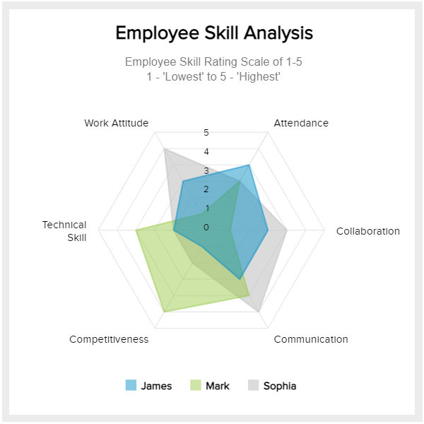
The second variation stems from plotting more than one group to compare them with each other and extract valuable conclusions. Remember that when plotting multiple groups, it is essential to be mindful of the number of groups, as spider charts can become quickly cluttered (more on this later in the post).
Our example above also tracks employee performance, this time comparing them as a whole instead of individually. Here, we can see that each employee has weaknesses and strengths. For instance, Sophia has a positive work attitude, collaboration, and communication but low attendance, which might need improvement if she is part of a team. On the other side, Mark has a low work attitude and collaboration but a high level of competitiveness and technical skills, so he needs to improve his softer skills.
- Filled spider chart
This radar chart type is purely an esthetical decision. It doesn’t really have any other purpose than highlighting or emphasizing the size and shape of the filled area, making it easier for audiences to visually interpret the graph at a glance, as we saw with our two examples on top, where each area was filled with a color.
That being said, if you have more than two series of values to plot, then a filled version of this chart might not be the best choice. As we saw with area charts, overlapping shades, even if they are transparent colors, make the chart overcrowded and the data harder to understand. In some cases, some important data might be hidden due to the new colors being formed because of the overlap. Therefore, it is best to keep the filled version to a maximum of three series is best.
Another common variation that is not enough to cover as a single point but is still worth mentioning is spider diagrams with markers. They follow the same logic as all of the other variations with the difference that each data point has a symbol which can be a circle, square, diamond, or any other shape to mark the exact position of the point in the chart. We will see an example of this later in the post.
Now, let’s look at how to make a spider chart.
Spider Graphs Tips & Best Practices
As you’ve probably learned by now, radar charts are complex visuals that require a thought-out design process. In that sense, following some key best practices and tips can help you build successful spider web charts for your analytical efforts. Let’s look at some of them.
- Be aware of the number of dimensions
Just like any other chart type, radar graphs have their limitations regarding the number of dimensions you are going to plot. Unlike bar charts, where you can easily understand the data by looking at the size of the bar, with spider graphics, you need to analyze irregular areas with different angles and peaks, making it harder to grasp the data if there are too many areas overlapping with each other. For that reason, it is recommended to use from one to six dimensions if you are not using transparent fillings. In the case of filling the areas with translucent colors, it is best to keep the number of dimensions from one to a maximum of three, as the overlapping of the colors can still hide the data.
- Think of your audience
This best practice should apply to any charting process but especially to the more complex or less-known types of graphs such as the one we are discussing in this blog post. When we say “think of your audience” we mean to be aware of their technical knowledge regarding the understanding of the graph and the data contained in it. A good tip for this is to use interactive features to show your audience how the chart is built and how each variable is plotted. This way, you’ll give them the base knowledge they need to grasp the data and the insights you are trying to portray more clearly. Supporting yourself with chart labels to convey essential information is another good practice in this regard.
- Organize dimensions wisely
Technically speaking, there is no mandatory rule when it comes to the order in which dimensions should be placed in a spider web chart. However, given that the filled areas will significantly change in shape and size depending on the order you use, it is a good practice to organize them in a way that makes sense. For instance, placing dimensions that are related or similarly structured together.
Spider Chart Templates & Examples
This post wouldn’t be complete without some KPI examples and templates to put the value of this chart type into perspective. These examples are for different business functions and industries created with a professional spider chart generator.
- Logistics
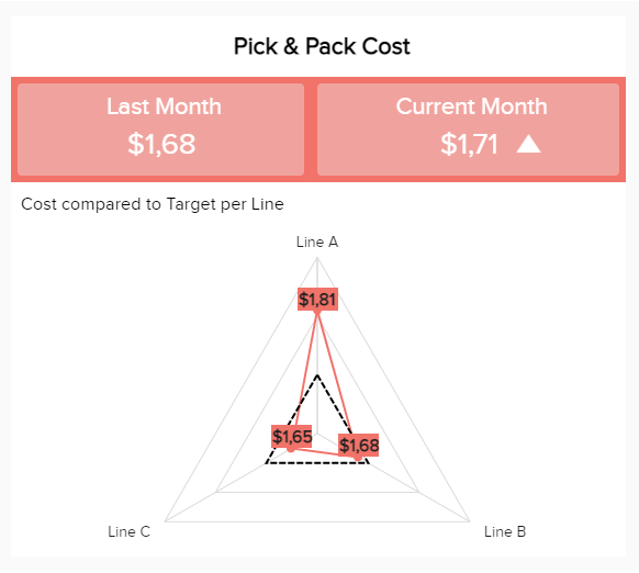
Our first example is about logistics analytics, tracking the pick and pack costs by each line of work. In this case, the spider web graphic is complemented by a number chart depicting the average from last month as a target and the average from the current month. This provides some extra context to the visual. Plus, unlike other examples that we’ll explore below, the exact values are specified on each data point to put into perspective the difference between the target but also to the other lines of work. Having these insights at hand can help a logistics company evaluate its costs and optimize them to ensure efficiency and profitability.
- Sales
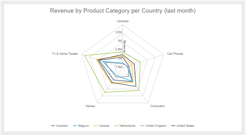
Our second example is a multiple grouping spider web diagram tracking the revenue by product category. This visual enables businesses to gather valuable information regarding their most profitable product categories in their target countries. Here, we can see that the Netherlands brings the most significant revenue in all categories but mostly in TV, games, and computers. This can present an opportunity to boost sales on other less-performing categories such as cameras and cell phones.
It is important to note that this example is within the limit regarding the number of groups being analyzed. If these areas were filled with color, the smaller ones would probably be harder to interpret.
- Human Resources
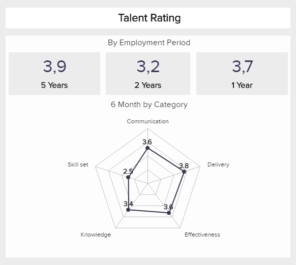
This next spider diagram example is similar to our employee productivity example, but this time it is tracking talent rating based on employment period. This gives the HR department an overview of productivity based on the years an employee has been working in the company and which areas are lacking in each group.
In this case, the spider web graphic depicted on top is not showing the data for a specific group but is an example of how a chart like this one would work for this analytical scenario. If all employment periods were plotted in the graph, we would be able to extract deeper conclusions such as a lack of skill set in employees from 1 and 2 years compared to the ones from 5, or even a higher delivery in 1 and 2 year periods compared to 5 as there is more motivation in those groups.
- Market Research
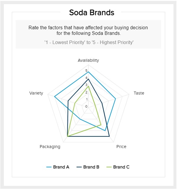
As mentioned at the beginning of the post, a common use case for these types of graphics is for analyzing brand or product perception. Our template above, generated with a spider chart maker, compares three soda brands based on specific attributes such as packaging, quality, price, and others. This is a great exercise to display answers to a survey and identify pain points as well as attributes from which customers recognize your brand and boost that in marketing campaigns and other promotions. This information, complemented with other relevant KPIs in a professional market research dashboard, can help businesses develop quality products based on customer feedback to outrank their competitors.
- Sales
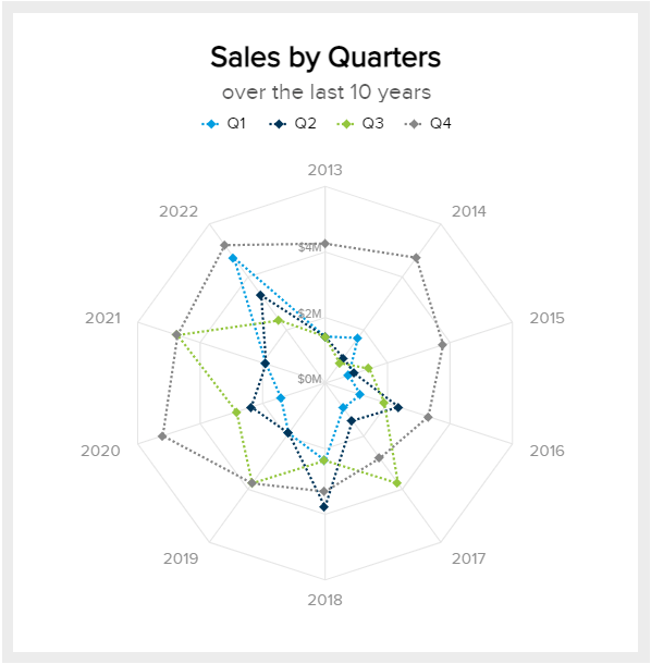
Lastly, we have a second sales example with a long-term approach tracking sales by quarter for the past ten years. Here, the spider chart goes deeper than just looking into the sizes of the areas but also marking each data point with a small square, making it easier to extract deeper conclusions from the chart at a glance. It is important to note that ten years is already a long period to use this chart type, but given that numbers use less space than words, it is still possible to plot multiple dimensions without overcrowding the chart.
Final Thoughts
If you got this far, congratulations. You are now aware of the benefits of using spider graphs to plot and compare a range of variables in a small area. These visuals are highly engaging due to their spider-web resemblance which also makes them harder to understand for non-technical audiences. However, they are easy to explain, and with a little bit of effort, you can get everyone in your business to use them to gather and communicate important business insights.
This same principle applies to any data-related process in a business context. With the right tools and training, anyone without the need for technical knowledge can implement data-driven initiatives into their daily operations. Recognizing the different types of data visualizations and their main use cases is a great way to start as this will set the groundwork for building efficient business dashboards to visualize critical performance data interactively and collaboratively.
If you are ready to start generating stunning spider graphs and elevate your analytical efforts, then try our online data visualization software today. We offer a 14-day free trial!