
Photographers are intentional, and often instinctual, about how they arrange elements to capture and hold the attention of their viewers. Composition is the term for the art of composing an image through framing. While there are “rules of thumb” for how to compose photographs (or any visual expression), visual artists would just as quickly say that great composition is beyond rules, subjective, and a natural ability.
This recognition, in real life, of a rhythm of surfaces, lines, and values is for me the essence of photography; composition should be a constant of preoccupation, being a simultaneous coalition—an organic coordination of visual elements. —Henri Cartier-Bresson
Data Storytelling is, of course, a visual medium. And as a new medium, we are well served to build on the shoulders of giants. What are a few lessons we can draw from photography to compose our data stories? Here are a few:
Leading Lines
In photographs: “The eye of the viewer will make its way through the frame of the photograph. The path is not always predicable, but how you arrange objects in the photograph, or how you frame the scene, can serve as a guide for the eye’s (hopefully) pleasing journey through your image—a journey that allows the viewer to understand the meaning of your photograph.” Todd Vorenkamp

Image by Pierre Metivier.
In data stories: As an author, your role is to guide the reader through the information. You can help people navigate through pointers, leading text, and numbering steps. Give them the signposts to know where to start and where to go next.

Foreground the Subject
In photographs: Photos are inherently two-dimensional. By composing a distinct foreground and background, the artist is able to create depth and interest.

https://petapixel.com/2016/09/14/20-composition-techniques-will-improve-photos/
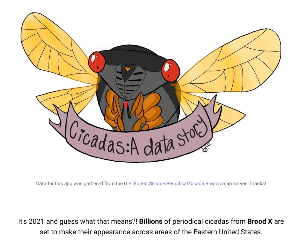
In data stories: It is critical to set the context of your story up-front (foregrounding) then draw your reader into the depths of the story gradually. In this example, a data story about Cicadas grabs attention with a title image before leading into the data exploration.
Balance, Symmetry, and Patterns
In photographs: People are naturally drawn to patterns, symmetry, and balance. It provides a sense of harmony that allows the viewer to linger on an image.

https://petapixel.com/2016/09/14/20-composition-techniques-will-improve-photos/
In data stories: The analytical tool on the right provides a sense of balance by centering the text and providing the same number of choices for the two chart axes. For analytical interfaces, providing a balanced UI can alleviate some of the user’s inherent fear of complexity.

Simplicity
In photographs: “Cut out all unnecessary details to keep keep the viewer's attention focused on the subject.” Photographymad

Image by Hien Nguyen.
In data stories: Focus on the core message or key question you want your audience to understand. Remove data and content that will distract from this message.

Negative Space
In photographs: By giving visual “breathing room” around the main subject, you make it easier for the viewer to engage with the subject.

https://petapixel.com/2016/09/14/20-composition-techniques-will-improve-photos/
In data stories: Traditional dashboards and report attempt to fill-up the entire screen to show as much data as possible at once. Providing negative space will give your readers the opportunity to see what is most important and focus their attention.


