Python in Finance: Real Time Data Streaming within Jupyter Notebook
Learn a modern approach to stream real-time data in Jupyter Notebook. This guide covers dynamic visualizations, a Python for quant finance use case, and Bollinger Bands analysis with live data.
In this blog, you will learn to visualize live data streams in real time, all within the comfort of your favorite tool, the Jupyter Notebook.
In most projects, dynamic charts within Jupyter Notebooks need manual updates; for example, it may require you to hit reload to fetch new data to update the charts. This doesn’t work well for any fast-paced industry, including finance. Consider missing out on crucial buy indications or fraud alerts because your user did not hit reload at that instance.
Here, we'll show you how to move from manual updates to a streaming or real-time method in Jupyter Notebook, making your projects more efficient and reactive.
What’s covered:
- Real-Time Visualization: You'll learn how to bring data to life, watching it evolve second by second, right before your eyes.
- Jupyter Notebook Mastery: Harness the full power of Jupyter Notebook, not just for static data analysis but for dynamic, streaming data.
- Python in Quant Finance Use Case: Dive into a practical financial application, implementing a widely used in finance with real-world data.
- Stream Data Processing: Understand the foundations and benefits of processing data in real-time, a skill becoming increasingly crucial in today's fast-paced data world.
By the end of this blog, you'll know how to build similar real-time visualizations like the one below within your Jupyter Notebook.

Quick recap of real time data processing
At the heart of our project lies the concept of stream processing.
Simply put, stream processing is about handling and analyzing data in real-time as it's generated. Think of it like Google Maps during a rush hour drive, where you see traffic updates live, enabling immediate and efficient route changes.
Interestingly, according to the CIO of Goldman Sachs in this Forbes podcast, moving towards stream or real-time data processing is one of the significant trends we’re headed toward.
Jupyter Notebooks as a Real-time Data Analytics Tool
It’s about combining the power of real-time data processing with an interactive and familiar environment of Jupyter Notebooks.
Besides that, Jupyter Notebooks play well with containerized environments. Therefore, our projects aren't just stuck on local machines; we can take them anywhere – running them smoothly on anything from a colleague's laptop to a cloud server.
Our use-case in Python in finance: Bollinger Bands
In finance, every second counts, whether for fraud detection or trading, and that’s why stream data processing has become essential. The spotlight here is on Bollinger Bands, a tool helpful for financial trading. This tool comprises:
- The Middle Band: This is a 20-period moving average, which calculates the average stock price over the past 20 periods (such as 20 minutes for high-frequency analysis), giving a snapshot of recent price trends.
- Outer Bands: Located 2 standard deviations above and below the middle band, they indicate market volatility - wider bands suggest more volatility, and narrower bands, less.
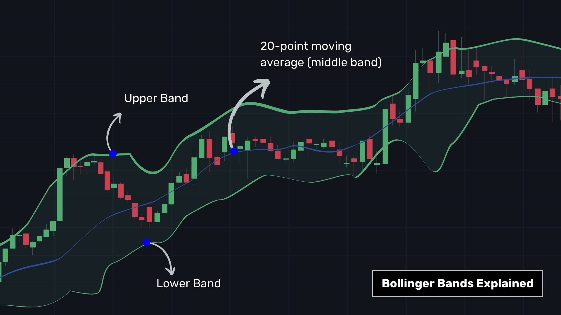
In Bollinger Bands, potentially overbought conditions are signaled when the moving average price touches or exceeds the upper band (a cue to sell, often marked in red), and oversold conditions are indicated when the price dips below the lower band (a cue to buy, typically marked in green).
Algo traders usually pair Bollinger Bands with other technical indicators.
Here, we made an essential tweak while generating our Bollinger Bands by integrating trading volumes. Traditionally, Bollinger Bands do not consider trading volume and are calculated solely based on price data.
Thus, we have indicated Bollinger Bands at a distance of VWAP ± 2 × VWSTD where:
- VWAP: A 1-minute volume-weighted average price for a more volume-sensitive perspective.
- VWSTD: Represents a focused, 20-minute standard deviation, i.e., a measure of market volatility.
Technical implementation:
- We use temporal sliding windows (‘pw.temporal.sliding’) to analyze data in 20-minute segments, akin to moving a magnifying glass over the data in real time.
- We employ reducers (‘pw.reducers’), which process data within each window to yield a particular outcome for each window, i.e., the standard deviations in this case.
Glance at tools used for enabling real time streaming data within our Jupyter Notebook
- Polygon.io: Provider of real-time and historical market data. While you can certainly use its API for live data, we've pre-saved some data into a CSV file for this demo, making it easy to follow without needing an API key.
- Pathway: An open-source Pythonic framework for fast data processing. It handles both batch (static) and streaming (real-time) data.
- Bokeh: Ideal for creating dynamic visualizations, Bokeh brings our streaming data to life with engaging, interactive charts.
- Panel: Enhances our project with real-time dashboard capabilities, working alongside Bokeh to update our visualizations as new data streams come in.
Step-by-Step Tutorial: Visualizing Real-Time Data within Jupyter Notebook.
This involves six steps:
- Doing pip install for relevant frameworks and importing relevant libraries.
- Fetching sample data
- Setting up the data source for computation
- Calculating the stats essential for Bollinger Bands
- Dashboard Creation using Bokeh and Panel
- Hitting the run command
1. Imports and Setup
First, let’s quickly install the necessary components.
%%capture --no-display
!pip install pathway
Start by importing the necessary libraries. These libraries will help in data processing, visualization, and building interactive dashboards.
# Importing libraries for data processing, visualization, and dashboard creation

import datetime
import bokeh.models
import bokeh.plotting
import panel
import pathway as pw
2. Fetching Sample Data
Next, download the sample data from GitHub. This step is crucial for accessing our data for visualization. Here, we have fetched Apple Inc (AAPL) stock prices.
# Command to download the sample APPLE INC stock prices extracted via Polygon API and stored in a CSV for ease of review of this notebook.

%%capture --no-display
!wget -nc https://gist.githubusercontent.com/janchorowski/e351af72ecd8d206a34763a428826ab7/raw/ticker.csv
Note: This tutorial leverages a showcase published here
3. Data Source Setup
Create a streaming data source using the CSV file. This simulates a live data stream, offering a practical way to work with real-time data without necessitating an API key while building the project for the first time.
# Creating a streaming data source from a CSV file

fname = "ticker.csv"
schema = pw.schema_from_csv(fname)
data = pw.demo.replay_csv(fname, schema=schema, input_rate=1000)

# Uncommenting the line below will override the data table defined above and switch the data source to static mode, which is helpful for initial testing
# data = pw.io.csv.read(fname, schema=schema, mode="static")

# Parsing the timestamps in the data

data = data.with_columns(t=data.t.dt.utc_from_timestamp(unit="ms"))
Note: No data processing occurs immediately, but at the end when we hit the run command.
4. Calculating the stats essential for Bollinger Bands
Here, we will briefly build the trading algorithm we discussed above. We have a dummy stream of Apple Inc. stock prices. Now, to make Bollinger Bands,
- We’ll calculate the weighted 20-minute standard deviation (VWSTD)
- The 1-minute weighted running average of prices (VWAP)
- Join the two above.
# Calculating the 20-minute rolling statistics for Bollinger Bands


minute_20_stats = (
    data.windowby(
        pw.this.t,
        window=pw.temporal.sliding(
            hop=datetime.timedelta(minutes=1),
            duration=datetime.timedelta(minutes=20),
        ),
        behavior=pw.temporal.exactly_once_behavior(),
        instance=pw.this.ticker,
    )
    .reduce(
        ticker=pw.this._pw_instance,
        t=pw.this._pw_window_end,
        volume=pw.reducers.sum(pw.this.volume),
        transact_total=pw.reducers.sum(pw.this.volume * pw.this.vwap),
        transact_total2=pw.reducers.sum(pw.this.volume * pw.this.vwap**2),
    )
    .with_columns(vwap=pw.this.transact_total / pw.this.volume)
    .with_columns(
        vwstd=(pw.this.transact_total2 / pw.this.volume - pw.this.vwap**2)
        ** 0.5
    )
    .with_columns(
        bollinger_upper=pw.this.vwap + 2 * pw.this.vwstd,
        bollinger_lower=pw.this.vwap - 2 * pw.this.vwstd,
    )
)
# Computing the 1-minute rolling statistics
minute_1_stats = (
data.windowby(
pw.this.t,
window=pw.temporal.tumbling(datetime.timedelta(minutes=1)),
behavior=pw.temporal.exactly_once_behavior(),
instance=pw.this.ticker,
)
.reduce(
ticker=pw.this._pw_instance,
t=pw.this._pw_window_end,
volume=pw.reducers.sum(pw.this.volume),
transact_total=pw.reducers.sum(pw.this.volume * pw.this.vwap),
)
.with_columns(vwap=pw.this.transact_total / pw.this.volume)
)# Joining the 1-minute and 20-minute statistics for comprehensive analysis
joint_stats = (
minute_1_stats.join(
minute_20_stats,
pw.left.t == pw.right.t,
pw.left.ticker == pw.right.ticker,
)
.select(
*pw.left,
bollinger_lower=pw.right.bollinger_lower,
bollinger_upper=pw.right.bollinger_upper
)
.with_columns(
is_alert=(pw.this.volume > 10000)
& (
(pw.this.vwap > pw.this.bollinger_upper)
| (pw.this.vwap < pw.this.bollinger_lower)
)
)
.with_columns(
action=pw.if_else(
pw.this.is_alert,
pw.if_else(
pw.this.vwap > pw.this.bollinger_upper, "sell", "buy"
),
"hold",
)
)
)
alerts = joint_stats.filter(pw.this.is_alert)
You can check out the notebook here for a deeper understanding of the computations.
5. Dashboard Creation
It's time to bring our analysis to life with a Bokeh plot and Panel table visualization.
# Function to create the statistics plot


def stats_plotter(src):
    actions = ["buy", "sell", "hold"]
    color_map = bokeh.models.CategoricalColorMapper(
        factors=actions, palette=("#00ff00", "#ff0000", "#00000000")
    )

    fig = bokeh.plotting.figure(
        height=400,
        width=600,
        title="20 minutes Bollinger bands with last 1 minute average",
        x_axis_type="datetime",
        y_range=(188.5, 191),
    )
    fig.line("t", "vwap", source=src)
    band = bokeh.models.Band(
        base="t",
        lower="bollinger_lower",
        upper="bollinger_upper",
        source=src,
        fill_alpha=0.3,
        fill_color="gray",
        line_color="black",
    )
    fig.scatter(
        "t",
        "vwap",
        color={"field": "action", "transform": color_map},
        size=10,
        marker="circle",
        source=src,
    )
    fig.add_layout(band)
    return fig


# Combining the plot and table in a Panel Row

viz = panel.Row(
    joint_stats.plot(stats_plotter, sorting_col="t"),
    alerts.select(
        pw.this.ticker, pw.this.t, pw.this.vwap, pw.this.action
    ).show(include_id=False, sorters=[{"field": "t", "dir": "desc"}]),
)
viz
When you run this cell, placeholder containers are created in your notebook for the plot and table. They'll be filled with live data once the computation starts.
6. Running the Computation
All the preparations are complete, and it's time to run the data processing engine.
# Command to start the Pathway data processing engine
%%capture --no-display
pw.run()
As the dashboard updates in real-time, you'll see how the Bollinger Bands trigger actions - green markers for buying and red for selling, often at a slightly higher price.
Note: You should manually run pw.run() after the widget is initialized and visible. You can find more details in this GitHub issue here.
TL;DR
In this blog, we understand Bollinger Bands and take you through a journey of visualizing real-time financial data in Jupyter Notebook. We showed how to transform live data streams into actionable insights using Bollinger Bands and a blend of open-source Pythonic tools.
The tutorial provides a practical example of real-time financial data analysis, leveraging open source for an end-to-end solution from data fetching to interactive dashboarding. You can create similar projects by:
- Doing this for a stock of your choice by fetching live stock prices from APIs like Yahoo Finance, Polygon, Kraken, etc.
- Doing this for a group of your favorite stocks, ETFs, etc.
- Leveraging some other trading tool apart from Bollinger Bands.
By integrating these instruments with real-time data within a Jupyter Notebook, you’re not just analyzing the market but experiencing it as it unfolds.
Happy streaming!
Mudit Srivastava works at Pathway. Prior to this, he was a founding member of AI Planet and is an active community builder in the domain of LLMs and Real-time ML.