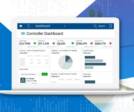
Dashboard design can mean the difference between users excitedly embracing your product or ignoring it altogether. Great dashboards lead to richer user experiences and significant return on investment (ROI), while poorly designed dashboards distract users, suppress adoption, and can even tarnish your project or brand.
That’s one of the many reasons we wrote The Definitive Guide to Dashboard Design—to help you avoid common pitfalls, including…
- Cramming too much onto one screen and expecting the user to figure out what’s interesting and relevant on their own
- Getting carried away with fonts and colors so the user is distracted by formatting instead of focusing on the content
- Using visualizations that might look fancy, but really aren’t appropriate for conveying the data at hand
In this guide, we’ll look at examples of these and many more dashboard mistakes in action—as well as examples of great dashboards that embody the fundamentals of design.
Download the Definitive Guide to learn why dashboard design matters, and how to do it well.


Let's personalize your content