Bubble Chart in Python
Introduction
A bubble chart is a type of data visualization that displays data points as bubbles on a two-dimensional graph. Each bubble represents a data point, and its size and color can be used to convey additional information. In this article, we will explore the benefits of using bubble charts in data visualization and learn how to create and customize bubble charts in Python.
Table of contents
Benefits of Using Bubble Charts in Data Visualization
Bubble charts offer several advantages in data visualization. Firstly, they allow us to represent three variables simultaneously – the x-axis, the y-axis, and the size of the bubble. This makes it easier to identify patterns and relationships between variables. Additionally, using color in bubble charts can provide further insights by representing a fourth variable. Bubble charts are handy when dealing with large datasets, as they can effectively display many data points without overwhelming the viewer.
Getting Started with Bubble Charts in Python
To start creating bubble charts in Python, we must install the required libraries and import the necessary modules.
Installing the Required Libraries
Before we begin, make sure you have the following libraries installed:
- Matplotlib: A popular data visualization library in Python.
- Plotly: An interactive data visualization library.
Importing the Necessary Modules
Once the libraries are installed, we can import the necessary modules in our Python script:
import matplotlib.pyplot as plt

import plotly.express as px
Creating a Basic Bubble Chart in Python
Now that we have the required libraries and modules let’s create a basic bubble chart in Python.
Preparing the Data
We need data containing three variables – x, y, and size- to create a bubble chart. Let’s assume we have the following data:
x = [1, 2, 3, 4, 5]

y = [10, 20, 30, 40, 50]

size = [100, 200, 300, 400, 500]
Plotting the Bubble Chart
Using Matplotlib, we can plot the bubble chart as follows:
plt.scatter(x, y, s=size)

plt.xlabel('X-axis')

plt.ylabel('Y-axis')

plt.title('Basic Bubble Chart')

plt.show()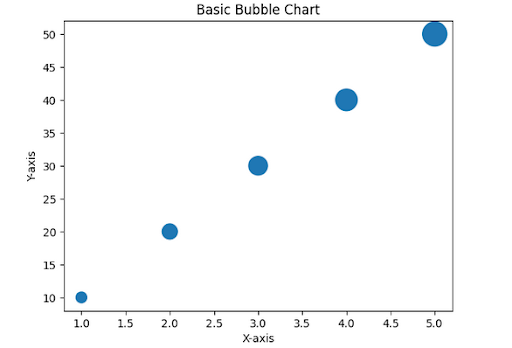
Customizing the Bubble Chart
We can customize the bubble chart by adding labels, changing colors, and adjusting the size of the bubbles. Here’s an example:
plt.scatter(x, y, s=size, c='red', alpha=0.5)

plt.xlabel('X-axis')

plt.ylabel('Y-axis')

plt.title('Customized Bubble Chart')

plt.show()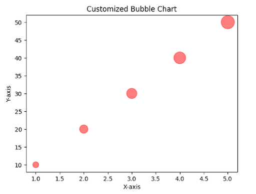
Advanced Techniques for Enhancing Bubble Charts
We can incorporate additional features such as color and size variations, labels, and handling multiple data points and categories to enhance bubble charts.
Adding Color and Size to Bubbles
We can use the ‘c’ parameter in the scatter function to specify the color of the bubbles based on a fourth variable. Similarly, the ‘s’ parameter can be used to adjust the size of the bubbles based on a fifth variable.
Incorporating Labels and Annotations
To make the bubble chart more informative, we can add labels to the bubbles using the ‘text’ parameter in the scatter function. Additionally, annotations can be added to highlight specific data points or provide additional context.
Handling Multiple Data Points and Categories
Bubble charts can handle multiple data points and categories by plotting different data sets on the same chart. This can be achieved by calling the scatter function numerous times with other data and customizing each set of bubbles accordingly.
Interactive Bubble Charts with Plotly
Plotly is a powerful library that allows us to create interactive and dynamic visualizations, including bubble charts.
Installing and Importing Plotly
To use Plotly, we need to install it using the following command:
pip install plotlyAfter installation, we can import the necessary module:
import plotly.express as pxCreating Interactive Bubble Charts
Plotly provides a simple and intuitive API to create interactive bubble charts. Here’s an example:
import pandas as pd

# Sample data

data = {

   'x': [1, 3, 4, 6, 8],

   'y': [10, 25, 40, 35, 50],

   'size': [100, 300, 500, 200, 400],

   'color': ['red', 'blue', 'green', 'yellow', 'orange'],

   'label': ['A', 'B', 'C', 'D', 'E']

}

# Creating DataFrame

df = pd.DataFrame(data)

fig = px.scatter(df, x='x', y='y', size='size', color='color', hover_data=['label'], width=800, height=500)

fig.show()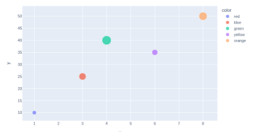
Adding Interactivity and Customization Options
Plotly allows us to add interactivity and customization options to our bubble charts. We can enable zooming, panning, and hover effects to provide a more engaging user experience. Additionally, we can customize the chart’s appearance by changing the color palette, marker style, and axis labels.
Tips and Tricks for Creating Effective Bubble Charts
To create effective bubble charts, consider the following tips and tricks:
- Choosing the Right Data and Variables: The appropriate data and variables are crucial for creating meaningful bubble charts. Ensure that the variables chosen are relevant and provide valuable insights.
- Designing Clear and Informative Labels: Labels convey information in bubble charts. Design clear and informative labels that are easy to read and understand.
- Adjusting Bubble Sizes and Colors for Clarity: To improve clarity, adjust the sizes and colors of the bubbles based on the data being represented. Use a color palette that is visually appealing and easy to interpret.
- Ensuring Consistency and Accuracy in Data Representation: Maintain consistency and accuracy in representing data in bubble charts. Avoid distorting the sizes or colors of the bubbles, as it can lead to misinterpretation.
- Incorporating Data Insights and Storytelling: Use bubble charts as a storytelling tool to convey data insights effectively. Highlight key findings and trends to engage the audience and make the visualization more impactful.
Conclusion
Bubble charts are a powerful tool for visualizing data in Python. They allow us to represent multiple variables simultaneously and provide insights into complex datasets. Following this article’s techniques and best practices, you can create informative and visually appealing bubble charts that effectively communicate your data. So, start exploring the world of bubble charts in Python and unlock the potential of your data visualization.


