
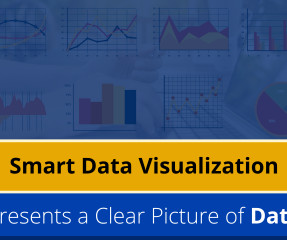
Interactive Data Visualization using rbokeh
Analytics Vidhya
JULY 27, 2022
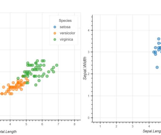
Introduction Data Visualization is used to present the insights in a given dataset. Several charts are available for specific purposes, like bar charts to present categorical distribution, line charts to […]. The post Interactive Data Visualization using rbokeh appeared first on Analytics Vidhya.


Let's personalize your content