A Beginners Guide To The Power Of Area Charts – See Examples, Types & Best Practices
Table of Contents
It is no secret that the human brain processes visual information way faster than text or numbers. In fact, a study by MIT researchers showed that 90% of the information transmitted to the brain is visual and that humans can identify images seen for as little as 13 milliseconds.
That is why graphical representations of data have been so popular in the media, politics, research, and businesses for decades. They breach the knowledge gap by offering an accessible understanding of complex information that would otherwise be harder to grasp.
That being said, despite the prevalence of graphs and charts, there is still a lack of knowledge about the roles and uses of each data visualization type we have available. To help eradicate that knowledge gap, at datapine, we are putting together a series of blog posts that do a deep dive into each type of graph and chart with their most common use cases and a list of examples and best practices.
We have already dived into gauge charts, bar charts, and column charts, and today is the turn of area charts. These powerful visuals with a mountain-like appearance are commonly used to represent differences and similarities within various data sets, proving to be valuable tools to support business decision-making.
Let’s get started with the area chart definition!
What Is An Area Chart?
An area chart, also known as a mountain chart, is a data visualization type that combines the appearance of a line chart and a bar chart. It is commonly used to show how numerical values change based on a second variable, usually a time period.
As seen in the image above, area graphs are visually appealing charts that can quickly catch the audience's attention due to their range of colors and particular shapes, making them a favorite visual to identify trends in essential data. That is especially true in a business context, where decision-makers use these tools to inform their most important strategies by identifying key patterns and insights.
Area chart vs. line chart
Now, you might wonder how an area graph differs from a line graph? Well, actually, area graphs are considered a variation of line charts as both of them use a continuous line to show changes or trends within the data. However, they differ in the fact that area graphs have a shaded or colored baseline and also because they can have more than one variable, hence, the resemblance to bar charts.
While these differences might sound purely esthetical, it is not the case, as they make a difference when plotting and analyzing the data. For starters, line charts are a better choice when you must display one-dimensional values and only focus on how they change in time. For example, if you want to show customer growth for the past five years, you can do it using a single line or multiple lines for different age ranges of customers. Area charts can also be used for this purpose, but the chart becomes easily overcrowded and more challenging to understand due to the colored baseline, even if you use lighter shades to differentiate the different data points. More on this later.
That said, area charts are best suited when the data has a total and you want to observe parts-to-whole relationships and how those change over long periods. Their colored baseline provides extra context to the data as it gives a sense of volume, making them perfect for not only comparing how the different values change based on the observed time but also in quantity.
With that differentiation out of the way, let’s look at common types of area charts.
Types Of Area Charts
Like many other data visualization types, area graphs have variations. Each type serves a different purpose and is better suited for specific scenarios. Below, we will look at the three key types and provide a visual example to put their value into perspective.
1. Basic area chart
The “basic” area chart, as we like to call it, is a graph that only plots a single data series. It is not the most popular use case for this type of chart, as we already mentioned that it is best suited to compare different series of values. However, it can still prove valuable if you want to analyze the total value across a trend.
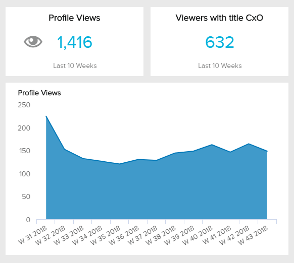
Our example above is tracking the number of weekly profile views from a business’s LinkedIn page. An area diagram is valuable in this case as it can let you identify trends within the data. For instance, imagine an influencer marketing campaign launched on week 39 that led new users to visit the business’s LinkedIn profile. The effect of this campaign can be observed in the following weeks as there is an incremental number of profile views. The insights provided by this and other KPIs visualized together in a professional LinkedIn dashboard can help marketers get a 360-view of performance and build informed strategies to boost traffic and engagement.
2. Overlapping area chart
The overlapping one is used to compare two or more data groups based on a specific variable. Like the traditional area graph, the values are plotted based on the vertical axes with the space between each point and the baseline shaded by a color that differentiates each group. Since the goal is to compare, the shading of each group will likely overlap at some point. In that case, a lighter or more transparent shade is used to help the chart users see how the values overlap, as seen in the image below.
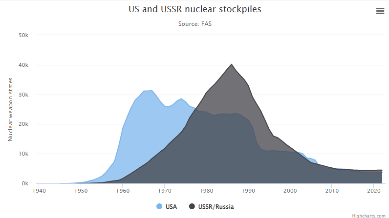
**Source: Highcharts.com**
It is important to note that overlapping area charts can become easily overcrowded when comparing multiple groups, as it can become difficult to differentiate them, even with transparency. If you have numerous groups to compare, it might be a better idea to pick a line chart, but, if you want to compare multiple groups and their part-to-whole relationships, then choose a stacked variation instead.
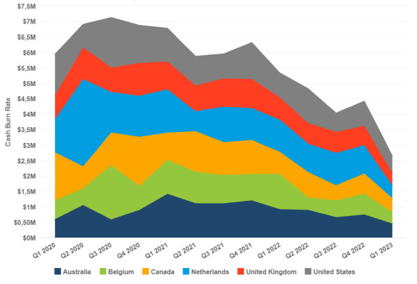
3. Stacked area chart
The most common type is the stacked area chart, also called a cumulative area chart. This type of chart is used when you want to go deeper than just comparing values but also understand how each group contributes to a total. Unlike the overlapping one, stacked area charts don’t use transparent shades but solid colors to differentiate each group, as there is no crossover within them. Instead, each group is plotted on top of the other, with the highest one representing the total value. Let’s look at the example below in more detail.
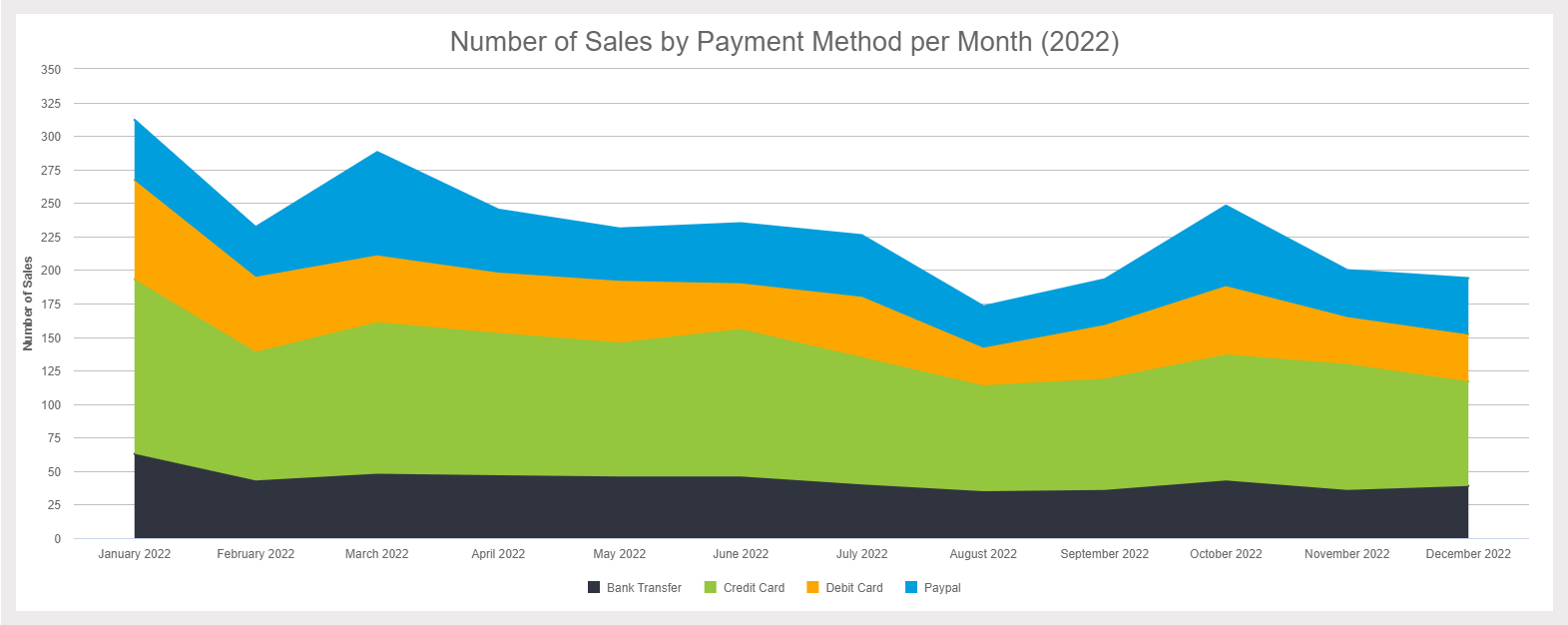
**click to enlarge**
The example tracks the number of sales by payment method for each month of the year. Each payment method is represented with a solid color and stacked on top of each other to complete the total number of sales. In this case, the stacked chart is valuable for identifying the most common payment method and generating strategies and initiatives to facilitate customer payments. Naturally, the credit card is the most frequent; therefore, this business needs to ensure the process is smooth and efficient.
Now that you know the different variations of this type of visual, let’s dive deeper into when to use an area chart.
When To Use Area Charts (And When Not To)
In most cases, analysts prefer a line or bar chart over an area chart as they can be considered easier to understand and more visually appealing. In light of this, area graphs only have a few valuable use cases. However, there are still some interesting ones we'll discuss below.
Probably the most valuable and popular use case is to analyze parts-to-whole relationships within multiple data series. The width of each area makes it easy for users to identify how each value changed over time and how much it accounts for the total. It also sets the perfect scenario to extract conclusions and identify trends within the data. For example, in sales analytics, you can use a stacked area chart to visualize sales by product category for the past 12 months. The different sizes of the areas can help you spot some months in which a particular product category saw an increase in sales and investigate the reasons behind this trend.
Another valuable use case is when you have multiple time periods that you want to compare. Grouped bar charts are great for this purpose as well. However, when plotting data points for multiple time periods they become heavily overcrowded, making area charts a way better option to fit large data sets.
That being said, it is important to mention that overlapping area charts can become harder to understand if multiple data points collide as the shades become more obscure and the data gets hidden behind. So, if you have more than two series to compare and quantity is irrelevant to your analysis, a line chart is a better choice. On the other hand, suppose the quantity is important, and you want to compare more than two data points over multiple time periods, then using transparency to ensure each point is visible should be a priority.
Lastly, an area diagram is great when communicating different trends and patterns. The way the different areas fluctuate and change in size makes it easy to extract conclusions and identify trends. However, if you intend to analyze the exact values, then there are better choices than an area chart. For example, when looking at a stacked area chart, you need to analyze the exact value of a point based on the previous one, which is not done at a glance. Conversely, in an overlapped area graph with solid colors, the overlap within the values makes it harder to understand where each data point starts. Again, this is why using transparency becomes so crucial during the design process.
It is also important to mention that area graphs should not be used if the difference between data points is too small. Plotting small differences becomes harder because area graphs need to mandatorily start at zero baselines. If that is the case, a line chart is a better choice as their axes are not required to start at zero.
With this in mind, let’s move on to some tips and best practices.
Area Graphs Tips & Best Practices
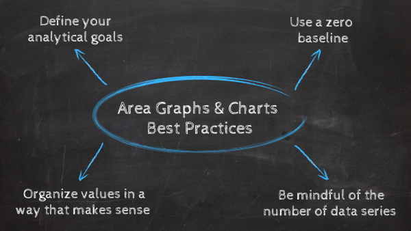
As you’ve learned throughout this post, area graphs are complex visuals that require particular conditions to be successful. To help you build effective area graphs, we will go through some key best practices and tips you should follow to ensure your visuals are working in your favor.
- Define your analytical goals
The first best practice when generating any kind of data visualization is to assess your goals and objectives as well as the type of data you have available. With this information in hand, you’ll be able to pick the graph that best fits your needs and ensure your insights come through when they are displayed in a professional online dashboard. As we mentioned a couple of times, when it comes to an area graph, your data should sum up to a total and show changes over time. If this is the case, then you are set to start generating stunning area graphs!
- Use a zero baseline
One of the most significant differences between a line and an area graph is that area graphs must have a zero baseline. That’s because this chart type compares how quantities change over time. Therefore, to avoid being misleading with the width of each area, it is of utmost importance to start your axes at zero. If this rule sounds familiar, it’s because it’s one of the key considerations when building bar or column charts, where the most critical requirement is to interpret the differences between the data points accurately. This is not the case with line charts, as the main goal is to compare changes in values over time and not the volume of the data.
If you want to learn more about this point, then check out our complete guide on misleading data visualization.
- Be mindful of the number of data series
This best practice applies only to overlapping area charts, but it is very important to mention it as it can influence your charting choices in the future. As we mentioned, this type of chart plots data series that overlap using transparent color shades. When two or more series overlap, the transparent shades start forming other color combinations that can become harder to recognize by the audience, especially because these new color shades are not mentioned in the chart legend. To avoid this from happening, it is best to limit the number of data series to up to two. This way, you’ll be able to reap the benefits from the overlapping chart without it becoming misleading or harder to interpret. If you want to plot multiple data series, a line chart is the best option only if quantities are not relevant for the analysis purpose.
- Organize values in a way that makes sense
This next best practice is exclusive to stacked area charts and concerns the order in which values are plotted. We recommend putting the most important or largest data at the bottom and the smallest or more fluctuating ones at the top. That is because it will be easier to gauge the values closer to the baseline when analyzing the chart. Therefore, putting the biggest or more important ones at the bottom will make your life easier when interpreting the chart.
Area Chart Examples & Templates
Now that you clearly understand the definition, types, and best practices of area graphs, it is time to look at some business examples to keep putting their value into perspective. Here, we’ll explore five examples of different business functions and industries generated with a professional KPI tool.
- Management
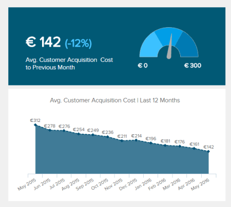
Our first example is customer acquisition cost, a key metric for a management dashboard. We previously mentioned that single-series area charts are not the most popular use case. However, in this case, the chart has labels that show the exact value of each data point, making it possible to visualize at a glance how the CAC changed from month to month and extract valuable conclusions.
- Customer Service

Our following example is a customer service KPI that tracks the average resolution time in minutes by each week of the year. In this case, we have a stacked area graphic that uses two colors to differentiate standard and special requests, which sum up the total requests for each week. The chart is complemented with a trend line that enables users to extract more profound conclusions about certain fluctuations. Naturally, the resolution time for special requests has more fluctuations as these requests often take longer if there are no standard processes to solve them.
- Sales
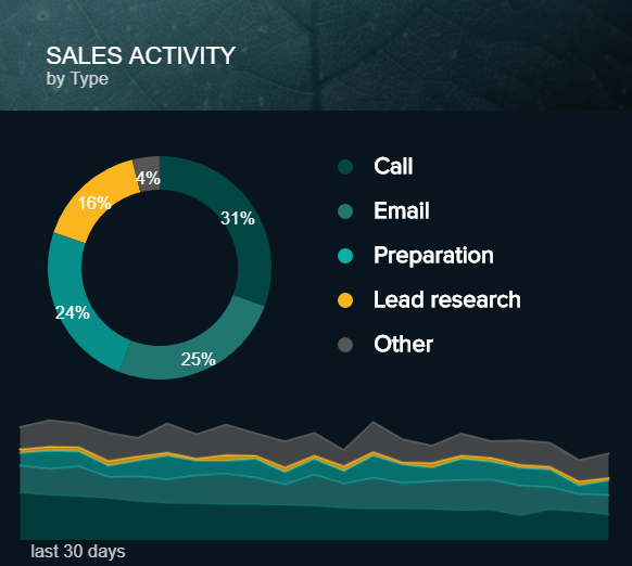
Tracking sales activity across the days is another excellent example to put the value of an area diagram into perspective. In this case, values for each sales activity are stacked on top of each other, with the highest percentages at the bottom and the smallest on top. In this case, the pie chart enables us to see the exact percentages of each activity but the area chart allows us to see how each of these activities fluctuated in time concerning the total, which sets the ground for more profound conclusions. So, again, this is an excellent example of how putting various chart types into a business dashboard can help achieve a more complete analysis.
- Energy
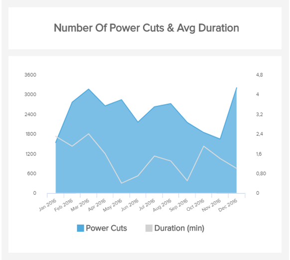
Moving on with our list of area graph examples, we have the number of power cuts and their average duration from an energy company. In this case, the area graph is elevated by adding secondary axes with an additional category. Through this, users can not only analyze the number of power cuts and how they fluctuate across the months, but can also complement that data with the average duration of those cuts and extract conclusions to keep the power cuts at a minimum.
- Marketing
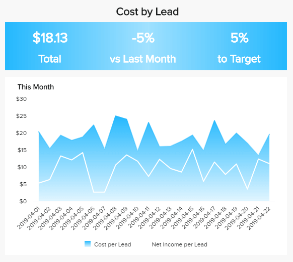
Our following area chart template is a great addition to a marketing report, and it tracks the cost per lead. In this case, this type of visual is a great choice as we track how the cost per lead changes daily for 22 days total. Plotting this in a column chart would’ve made for a very crowded visual. Plus, the chart offers extra information with the net income per lead, which is better visualized in the area format. By looking at this data, marketers can evaluate if their lead generation efforts bring enough financial rewards to the business or if something needs to be optimized.
If you want to see more KPI examples with different types of graphs and charts generated with datapine, check out our library with more than 300+ templates for different industries, functions, and platforms.
Final Thoughts
As we reach the end of our journey, we hope you better understand what area charts are and their value from an analytics perspective. While these types of graphs are not the most popular ones, they still prove to be helpful in some scenarios. Their vibrant colors and mountain-like shape make them very interesting and engaging graphics to support discussions during important business meetings.
The important takeaway from this guide is to be aware that each type of visual has its own set of rules and guidelines for design and interpretation. Each of these guidelines should be complemented with general data visualization techniques, and you should be set to go.
If you are ready to generate stunning area charts, check out our professional online data visualization software for a 14-day free trial today!