Also known as a Sorted Stream Graph.
An Area Bump Chart is a variation of the traditional Bump Chart that displays the rank and an additional quantitative variable changing over time.
In a regular Bump Chart, the lines show how the ranks of different categories or entities change over time. However, this does not convey any values or magnitudes changing over time. An Area Bump Chart addresses this limitation by using the area or thickness of the lines to represent the magnitudes or values.
Some Area Bump Charts will use the y-axis to represent the rankings, while other variations will instead display all the line areas bundled together and sorted based on ranking. The result is a flowing stream of varying areas, that allows the display of both the rank changes and the relative differences in magnitude between the categories compared.
Tools to create this chart with:
Nivo (React + D3)
RAWGraphs
Examples
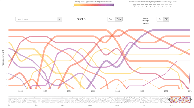
The 10 most popular baby names per year since 1880.
Nadieh Bremer’s Github
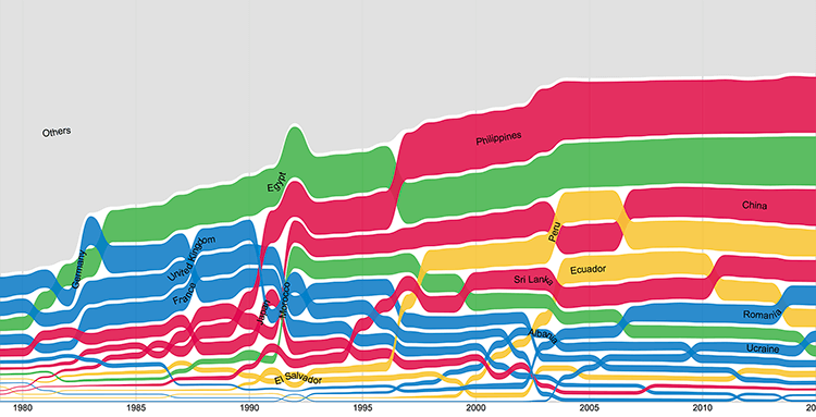
Foreign Residents in Milan by country.
Bump Chart! — John Outwater (not sure if he’s the author)
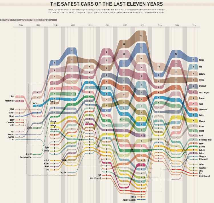
The safest cars of the last eleven years.
Infographic by titleproloans.com
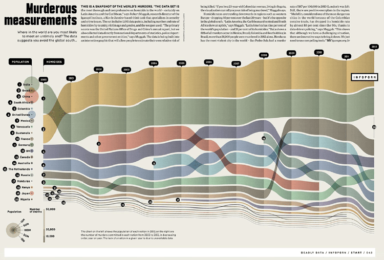
INFOPORN – Murderous Measurements.
WIRED UK — by Valerio Pellegrini
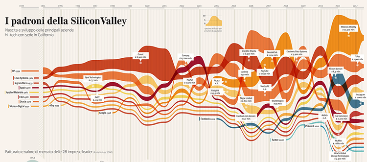
I padroni della Silicon Valley.
DensityDesign Lab
Related posts:
Chart Snapshot: Bump Charts

