How to create a Stroke Prediction Model?
This article was published as a part of the Data Science Blogathon
INTRODUCTION:
Stroke is a medical condition that can lead to the death of a person. It’s a severe condition and if treated on time we can save one’s life and treat them well. There can be n number of factors that can lead to strokes and in this project blog, we will try to analyze a few of them. I have taken the dataset from Kaggle. It has 11 variables and 5110 observations.
Importing Libraries:
For completing any task we require tools, and we have plenty of tools in python. Let’s start with importing the required libraries.
import pandas as pd
import numpy as np
import matplotlib.pyplot as plt
import seaborn as sns
from sklearn.preprocessing import LabelEncoder
from sklearn.feature_selection import SelectKBest, f_classif
from sklearn.model_selection import train_test_split
from sklearn.metrics import accuracy_score, f1_score,classification_report,precision_score,recall_score
from imblearn.over_sampling import SMOTE
from sklearn.linear_model import LogisticRegression
from sklearn.ensemble import RandomForestClassifier
from sklearn.svm import SVC
from xgboost import XGBClassifier
Reading CSV
Reading CSV files, which have our data. With help of this CSV, we will try to understand the pattern and create our prediction model.
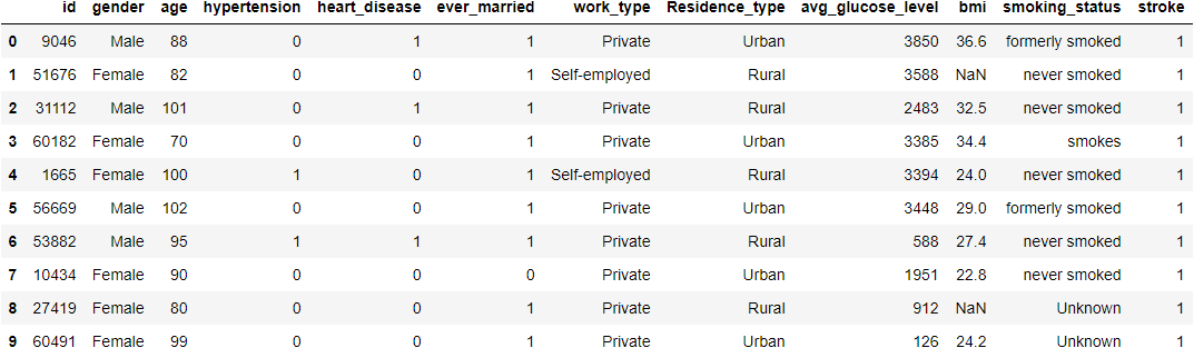
data=pd.read_csv('healthcare-dataset-stroke-data.csv')
data.head(10)
## Displaying top 10 rows
data.info()
## Showing information about datase
data.describe()
## Showing data's statistical features
Hit Run to see the output
EDA
ID
ID is nothing but a unique number assigned to every patient to keep track of them and making them unique. There is no need for ID it’s completely useless so let’s remove it.
data.drop("id",inplace=True,axis=1)
Gender
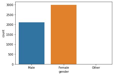
This attribute states the gender of the patient. Let’s see how does Gender affects and Gender wise comparison of stroke rate.
print('Unique values\n',data['gender'].unique())
print('Value Counts\n',data['gender'].value_counts())
# Above codes will help to give us information about it's unique values and count of each value.

sns.countplot(data=data,x='gender')
# Helps to plot a count plot which will help us to see count of values in each unique category.
sns.countplot(data=data,x='gender',hue='stroke')
# This plot will help to analyze how gender will affect chances of stroke.
Unique values
['Male' 'Female' 'Other']
Value Counts
Female    2994
Male      2115
Other        1
Gender Plot:
Gender with Stroke:
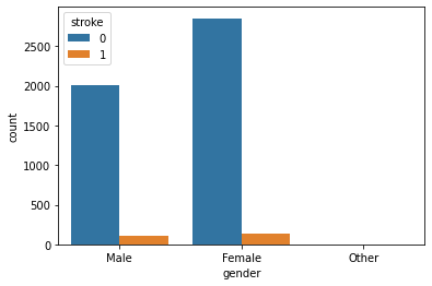
Observation:
Seems like the dataset is imbalanced. Anyway, as we can there is not much difference between stroke rate concerning gender
Age
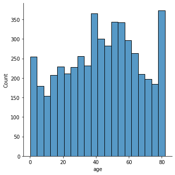
Well here age is just not a number, it’s one of the significant or as we can say it’s a very crucial factor. Let’s analyze our data and see how much impact actual impact it has.
data['age'].nunique()
# Returns number of unique values in this attribute
sns.displot(data['age'])
# This will plot a distribution plot of variable age
plt.figure(figsize=(15,7))
sns.boxplot(data=data,x='stroke',y='age')
# Above code will plot a boxplot of variable age with respect of target attribute stroke
Number of Unique Values:
104
Distribution Plot:
Age and Stroke:
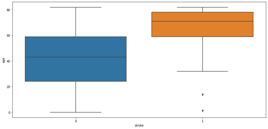
Observation:
People aged more than 60 years tend to have a stroke. Some outliers can be seen as people below age 20 are having a stroke it might be possible that it’s valid data as stroke also depends on our eating and living habits. Another observation is people not having strokes also consist of people age > 60 years.
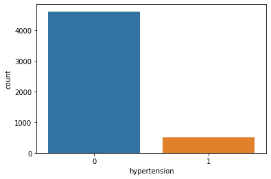
Hypertension
Hypertension is a condition when a person has high blood pressure. Hypertension might result in a stroke. Let’s see how it goes.
data['age'].nunique()
# Returns number of unique values in this attribute
sns.displot(data['age'])
# This will plot a distribution plot of variable age
plt.figure(figsize=(15,7))
sns.boxplot(data=data,x='stroke',y='age')
# Above code will plot a boxplot of variable age with respect of target attribute stroke
Unique Values and Value Counts:
Value Count [0 1]
Value Counts
0 4612
1 498
Count Plot:
Hypertension and Stroke:
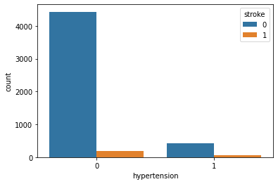
Observation:
Well, hypertension is rare in young people and common in aged people. Hypertension can cause a stroke. Based on our data picture is not that clear for hypertension. It has quite little data on patients having hypertension.
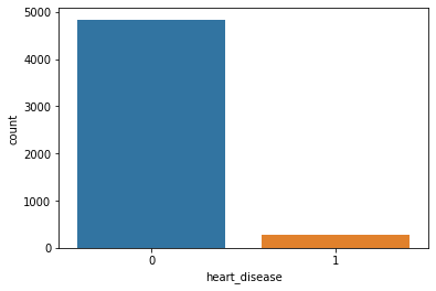
Heart Disease
People having heart disease tends to have a higher risk of having a stroke if proper care is not taken.
print('Unique Value\n',data['heart_disease'].unique())
print('Value Counts\n',data['heart_disease'].value_counts())
# Above code will return unique value for heart disease attribute and its value counts
sns.countplot(data=data,x='heart_disease')
# Will plot a counter plot of variable heart diseases
Unique Values and Count:
Unique Value
[1 0]
Value Counts
0    4834
1     276
Count Plot:
Heart Disease with Stroke:
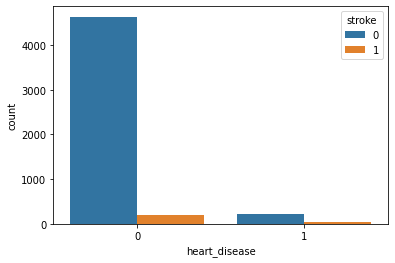
Observation:
Because of the imbalanced dataset, it’s a little bit difficult to get an idea. But as per this plot, we can say that heart disease is not affecting Stroke.
Ever Married
This attribute will tell us whether or not the patient was ever married. Let’s see how will it affect the chances of having a stroke.
print('Unique Values\n',data['ever_married'].unique())
print('Value Counts\n',data['ever_married'].value_counts())
# Above code will show us number unique values of attribute and its count
sns.countplot(data=data,x='ever_married')
# Counter plot of ever married attribute
sns.countplot(data=data,x='ever_married',hue='stroke')
# Ever married with respect of stroke
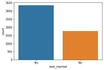
Unique Values and Count:
Unique Values
['Yes' 'No']
Value Counts
Yes    3353
No     1757
Count Plot:
Ever Married with Stroke:
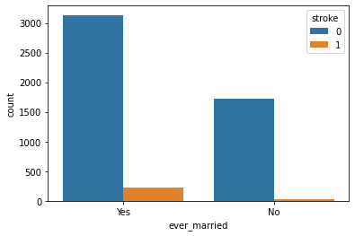
Observation:
People who are married have a higher stroke rate.
Work Type
This attribute contains data about what kind of work does the patient. Different kinds of work have different kinds of problems and challenges which can be the possible reason for excitement, thrill, stress, etc. Stress is never good for health, let’s see how this variable can affect the chances of having a stroke.
print('Unique Value\n',data['work_type'].unique())
print('Value Counts\n',data['work_type'].value_counts())
# Above code will return unique values of attributes and its count
sns.countplot(data=data,x='work_type')
# Above code will create a count plot
sns.countplot(data=data,x='work_type',hue='stroke')
# Above code will create a count plot with respect to stroke
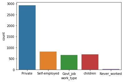
Unique Values and Count:
Unique Value
['Private' 'Self-employed' 'Govt_job' 'children' 'Never_worked']
Value Counts
Private          2925
Self-employed     819
children          687
Govt_job          657
Never_worked       22
Count Plot:
Work Type and Stroke:
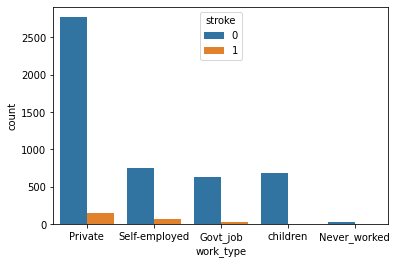
Observation:
People working in the Private sector have a higher risk of getting a stroke. And people who have never worked have a very less stroke rate.
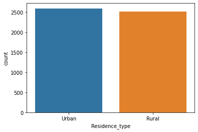
Residence Type
This attribute tells us whether what kind of residence the patient is. It can be Urban or Rural.
print('Unique Values\n',data['Residence_type'].unique())
print("Value Counts\n",data['Residence_type'].value_counts())
# Above code will return unique values of variable and its count
sns.countplot(data=data,x='Residence_type')
# This will create a counter plot
sns.countplot(data=data,x='Residence_type',hue='stroke')
# Residence Type with respect to stroke
Unique Values and Count:
Unique Values
['Urban' 'Rural']
Value Counts
Urban    2596
Rural    2514
Counter Plot:
Residence Type and Stroke:
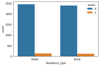
Observation:
This attribute is of no use. As we can see there not much difference in both attribute values. Maybe we have to discard it.
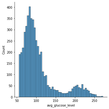
Average Glucose Level
Tells about the average glucose level in the patient’s body. Let’s see whether this affects the chances of having a stroke
data['avg_glucose_level'].nunique()
# Number of unique values
sns.displot(data['avg_glucose_level'])
# Distribution of avg_glucose_level
sns.boxplot(data=data,x='stroke',y='avg_glucose_level')
# Avg_glucose_level and Stroke
Unique Values and Count:
3979
Distribution Plot:
Glucose and Stroke:
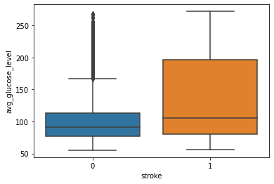
Observation:
From this above graph, we can see that people having stroke have an average glucose level of more than 100. There are some obvious outliers in patients who have no stroke but there are some chances of this being genuine records.
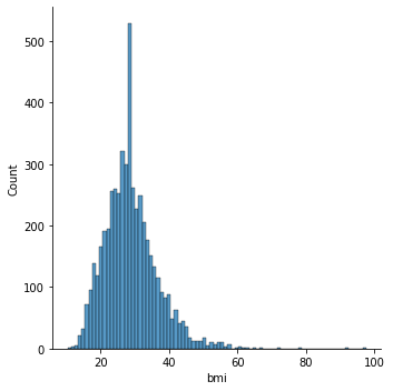
BMI
Body Mass Index is a measure of body fat based on height and weight that applies to adult men and women. Let’s see how does it affect the chances of having a stroke.
data['bmi'].isna().sum()
# Returns number null values
data['bmi'].fillna(data['bmi'].mean(),inplace=True)
# Filling null values with average value
data['bmi'].nunique()
# Returns number of unique values in that attribute
sns.displot(data['bmi'])
# Distribution of bmi
sns.boxplot(data=data,x='stroke',y='bmi')
# BMI with respect to Stroke
Null Values:
201
Unique Values and Counts:
419
Distribution Plot:
BMI and Stroke:
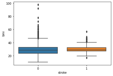
Observation:
There is as such no prominent observation of how does BMI affects the chances of having a stroke.
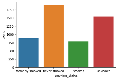
Smoking Status
These attributes tell us whether or not the patient smokes. Smoking is injurious to health and may cause cardiac disease. Let’s see how it turns out in the case of our data.
print('Unique Values\n',data['smoking_status'].unique())
print('Value Counts\n',data['smoking_status'].value_counts())
# Returns unique values and its count
sns.countplot(data=data,x='smoking_status')
# Count plot of smoking status
sns.countplot(data=data,x='smoking_status',hue='stroke')
# Smoking Status with respect to Stroke
Unique Values and Count:
Unique Values
['formerly smoked' 'never smoked' 'smokes' 'Unknown']
Value Counts
never smoked       1892
Unknown            1544
formerly smoked     885
smokes              789
Count Plot:
Smoke and Stroke:
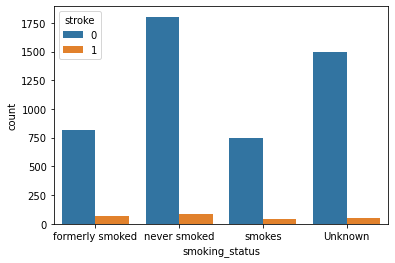
Observation:
As per these plots, we can see there is not much difference in the chances of stroke irrespective of smoking status.
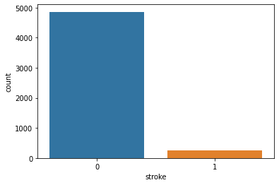
Stroke
Our target variable. It tells us whether patients have chances of stroke.
print('Unique Value\n',data['stroke'].unique())
print('Value Counts\n',data['stroke'].value_counts())
# Returns Unique Value and its count
sns.countplot(data=data,x='stroke')
# Count Plot of Stroke
Unique Values and Count:
Unique Value
[1 0]
Value Counts
0    4861
1     249
Count Plot:
Feature Engineering
Label Encoding
Our dataset is a mix of both categorical and numeric data and since ML algorithms understand data of numeric nature let’s encode our categorical data into numeric ones using Label Encoder. Label Encoder is a technique that will convert categorical data into numeric data. It takes value in ascending order and converts it into numeric data from 0 to n-1.
cols=data.select_dtypes(include=['object']).columns
print(cols)
# This code will fetech columns whose data type is object.
le=LabelEncoder()
# Initializing our Label Encoder object
data[cols]=data[cols].apply(le.fit_transform)
# Transfering categorical data into numeric
print(data.head(10))
Columns:
Index(['gender', 'ever_married', 'work_type', 'Residence_type',
       'smoking_status']
Correlation
plt.figure(figsize=(15,10))
sns.heatmap(data.corr(),annot=True,fmt='.2')
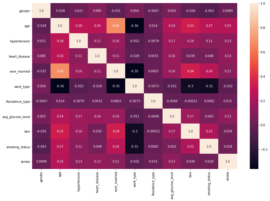
Observation:
Variables that are showing some effective correlation are:
age, hypertension, heart_disease, ever_married, avg_glucose_level.
Just to be on the safe side let’s check our features using SelectKBest and F_Classif.
classifier = SelectKBest(score_func=f_classif,k=5)
fits = classifier.fit(data.drop('stroke',axis=1),data['stroke'])
x=pd.DataFrame(fits.scores_)
columns = pd.DataFrame(data.drop('stroke',axis=1).columns)
fscores = pd.concat([columns,x],axis=1)
fscores.columns = ['Attribute','Score']
fscores.sort_values(by='Score',ascending=False)
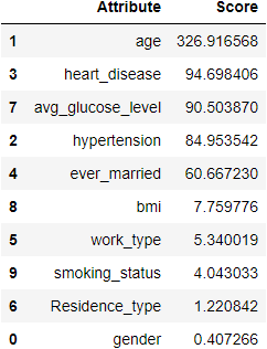
In the above result, we can see that age is a highly correlated variable and then it gets decreasing. I am keeping the threshold score as 50. Resulting in the same features we got in the heatmap.
cols=fscores[fscores['Score']>50]['Attribute']
print(cols)
1                  age
2         hypertension
3        heart_disease
4         ever_married
7    avg_glucose_level
Splitting data
Now, let’s split features into training and testing sets for training and testing our classification models.
train_x,test_x,train_y,test_y=train_test_split(data[cols],data['stroke'],random_state=1255,test_size=0.25)
#Splitting data
train_x.shape,test_x.shape,train_y.shape,test_y.shape
# Shape of data
Result:
((3832, 5), (1278, 5), (3832,), (1278,))
Balancing Dataset
As we know, our dataset is imbalanced. So let’s balance our data. We are going to use SMOTE method for this. It will populate our data with records similar to our minor class. Usually, we perform this on the whole dataset but as we have very fewer records of minor class I am applying it on both train and test data. Earlier I tried doing it by just resampling data of the training dataset but it didn’t perform that well so I tried this approach and got a good result.
smote=SMOTE()
train_x,train_y=smote.fit_resample(train_x,train_y)
test_x,test_y=smote.fit_resample(test_x,test_y)
The shape of data:
print(train_x.shape,train_y.shape,test_x.shape,test_y.shape)
((7296, 5), (7296,), (2426, 5), (2426,))
Model Creation
Let’s start with creating models. I have created few models namely, Logistic Regression, Random Forest Classifier, SVC, and XGBClassifier. Out of which XGBClassifier model’s performance was outstanding. So in this blog, I am just gonna add XGBClassifier but you can check other model’s performance here.
XGBClassifier
xgc=XGBClassifier(objective='binary:logistic',n_estimators=100000,max_depth=5,learning_rate=0.001,n_jobs=-1)
xgc.fit(train_x,train_y)
predict=xgc.predict(test_x)
print('Accuracy --> ',accuracy_score(predict,test_y))
print('F1 Score --> ',f1_score(predict,test_y))
print('Classification Report  --> \n',classification_report(predict,test_y))
In the balanced dataset, we rely on accuracy but here we have an imbalanced dataset, I am going with the f1 score. For a good classifier, it would be great to have good precision and recall score. Out of all models, XGBClassifier has a great result. So as a model, I am selecting XGBClassifier.
Closure
So in this mini-project, we saw some of the factors that might result in strokes. Where Age was highly correlated followed by hypertension, heart disease, avg glucose level, and ever married.
XGBClassifier was a knight who performed well. There are outliers in some variable, reason behind why I kept it as it is because these things are either depends on other factors and there are possibilities of having such kind of records. For example, BMI can be high and still no stroke as a person is young or he does not have any heart disease. If you have any doubt or suggestion please comment it down. I would love to learn new things.
So this was it for this time. See you in the next blog. Till then keep coding keep rolling 🙂
Note:
The image is taken from Unsplash Author Mara Ket.
The media shown in this article are not owned by Analytics Vidhya and is used at the Author’s discretion.


nice blog! well written.