article thumbnail

7 Tools to Create Engaging Presentations

Analytics Vidhya

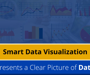
Introduction Visual presentations are indispensable for effective communication. Whether you’re a student, professional, or entrepreneur, mastering the art of crafting engaging and informative presentations is vital.

article thumbnail

PowerPoint Presentations Made East With GAMMA

Analytics Vidhya

Introduction PowerPoint has long been the reigning champion in creating presentations for clients or other important meetings. It is a web-based presentation builder that utilizes AI to help you create compelling and visually engaging presentations in minutes.

Insiders

Sign Up for our Newsletter

This site is protected by reCAPTCHA and the Google Privacy Policy and Terms of Service apply.

article thumbnail

Hugging Face Presents Idefics2: An 8B Vision-Language Model Revolution

Analytics Vidhya

With enhanced capabilities and a refined architecture, Idefics2 promises to reshape how we interact with visual and textual data. Also Read: Meta Releases Much-Awaited Llama 3 Model The Evolution of Idefics […] The post Hugging Face Presents Idefics2: An 8B Vision-Language Model Revolution appeared first on Analytics Vidhya.

Modeling 306
article thumbnail

The Psychology of Data Visualization: How to Present Data that Persuades

KDnuggets

This article discusses the psychology of data visualization, including the principles and techniques that underpin the creation of persuasive and effective visuals.

article thumbnail

A Practical Guide to Business Intelligence Governance

Speaker: Marius Moscovici, CEO Metric Insights & Mike Smitheman, VP Metric Insights

To be effective, Business Intelligence (BI) governance must cover both data and visualizations. This presentation will provide a practical step-by-step guide for implementing effective BI governance and a toolkit for addressing the three critical aspects of any program: People - Roles and responsibility in the governance process.

article thumbnail

Interactive Data Visualization using rbokeh

Analytics Vidhya

Introduction Data Visualization is used to present the insights in a given dataset. Several charts are available for specific purposes, like bar charts to present categorical distribution, line charts to […]. The post Interactive Data Visualization using rbokeh appeared first on Analytics Vidhya.

article thumbnail

Data Visualization: Presenting Complex Information Effectively

KDnuggets

Learn how to present complex information effectively with data visualization.