Visualising Published Articles and Analysing them Using Plotly
This article was published as a part of the Data Science Blogathon.
A picture speaks thousands of words. Thus the visualization maps are very important as they provide insight to data even for the non-technical person. To create a good chart there are many libraries present. I have used the plotly library for this article.
I prefer plotly because of the following reasons:
- Interactive
- Very Simple
- Creates beautiful charts
- Create dashboards
- Works with python scripting
This article deals with the bar charts in plotly. The data for the project is taken from Kaggle.
The Dataset
df = pd.read_csv("/kaggle/input/geeksforgeeks-articles/articles.csv")
df.head()
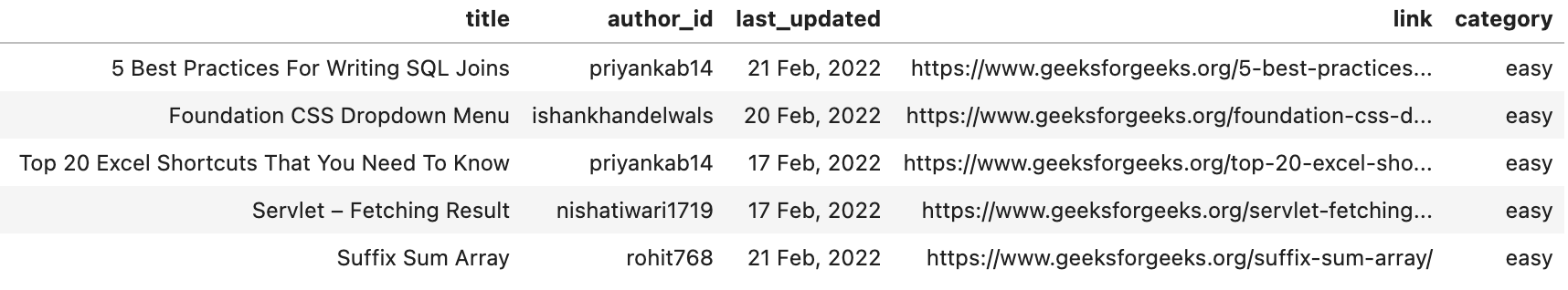
With this dataframe, we can add new columns such as date, month and year. To do this we need to use the last_updated column. Furthermore, we can also delete the link column as it is not useful for this analysis.
df["year"] = df["last_updated"].str.split(",", expand = True).get(1)
df["date_month"] = df["last_updated"].str.split(",", expand = True).get(0)
df["month"] = df["date_month"].str.split(" ", expand = True).get(1)
df["date"] = df["date_month"].str.split(" ", expand = True).get(0)
df.drop(["link"], axis = 1, inplace = True)
After doing modifications let us check the shape (rows, columns) in the dataframe.
df.shape # command used to check rows, columns
(34574, 8)
Checking Null Values
Before proceeding with any analysis it is important to see if we have any null values or values which are empty.
null_index = df.isnull().sum().index
null_values = df.isnull().sum().values
Now let us plot them
.png)
Conclusions:
- 19 author_id are missing
- last_updated have 18 missing values
- date extracted from the last_updated also have 18 missing values
- Column year and month have 114 missing values. These columns are extracted from the last_updated column.
df[df['year'].isna()].head()
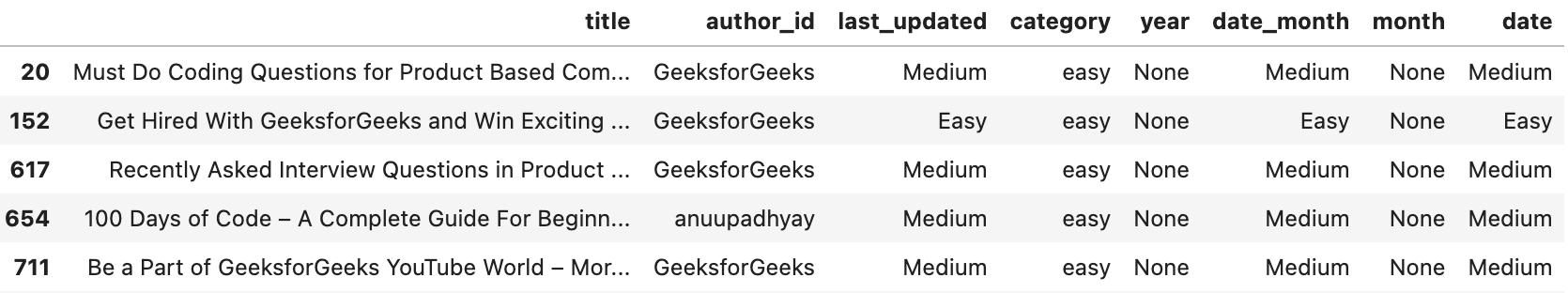
# The above shows that last_updated column have wrong entries.let us drop these rows
df.dropna(subset=['year'], inplace = True)
# The author_id also have some null columns. Let us drop them as well
df.dropna(subset=['author_id'], inplace = True)
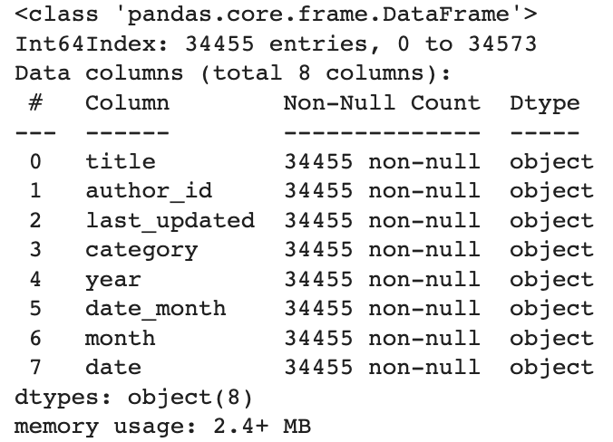
Our data now does not have any null values. Let us check the type of column defined by pandas (dtype). This helps in calculations and analysis.
df.info()
#dtype of the year and date should be integer type
df["year"] = df["year"].astype(int)
df["date"] = df["date"].astype(int)
Data Analysis and Visualization
Check the 10 most popular authors in the dataset
df.author_id.value_counts()[:10]
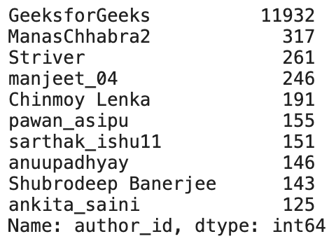
Conclusions:
- The articles written by GeeksforGeeks are way too large than the other authors
Most Frequent Authors
# Most frequent author
author_name = df.author_id.value_counts().index[1:11]
author_count = df.author_id.value_counts().values[1:11]
fig = px.histogram(x = author_name, y = author_count)

fig.update_layout(
        xaxis_title = "Author Name",
        yaxis_title = "Article Count",
        title = "Total article per author", # making the title bold
        plot_bgcolor = "#ECECEC")  # changing plot background color

fig.show()
.png)
Conclusions:
- The above graph shows the top 11 authors excluding first.
Check top authors on the basis of article category
# check the status of top 10 author other GeeksforGeeks
df_author_other = []

for i in author_name:
    df_new = df[df.author_id == i].groupby(["author_id", "category",
                "year"]).size().reset_index(name = "count").sort_values(by = "count",
                                                            ascending = False)
    df_author_other.append(df_new)

frame_other = pd.concat(df_author_other)

frame_other.head()
.png)
Conclusions:
- ManasChhabra2 published maximum article after GeeksforGeeks
- Basic level articles is popular among the above top 11 (excluding first) authors
Checking the article count on the basis of category
df_category = df.groupby("category").size().reset_index(name = "count")
fig = px.bar(df_category, x = "category", y = "count",  text_auto='.2s',
             color_discrete_sequence = ["#ffd514"] * len(df_category))
# providing custom color to the bars in chart
# text indicating the value of the bar
fig.update_layout(
        title = "Distribution of Category",
        plot_bgcolor = "#ECECEC",
        xaxis={'categoryorder':'total descending'} # arranging the bars in descending order
        )
fig.show()
#
# The column name is the name for the x axis and y axis label
.png) Fig 8: Category Distribution (Source: Author)
Fig 8: Category Distribution (Source: Author)Conclusions:
- Maximum articles are of medium category
- Expert level articles are nearly 5 times less than the medium level article
- The column name automatically become the labels for the x and y-axis
Checking the articles on the basis of yearly and monthly count
df_month = df.groupby(["year","month"]).size().reset_index(name = "count")
fig = px.bar(df_month, x = "month", y = "count", color = "year")
fig.update_layout(
        title = "Count of Yearly Articles Published per Month",
        plot_bgcolor = "#ECECEC",
        xaxis={'categoryorder':'total descending'})
fig.show()
.png)
Conclusions:
- Maximum articles are published in June
- The number of articles published in the years 2010-2016 is very less
- The frequency of article publishing increased from 2018
- Articles from the 2 months of 2022 (January and February) are also present. This means data is recent
- The bars of the graph are stacked over each other
Distribution of articles published by GeeksforGeeks
# grouped bars
df_author_geek = df[df.author_id == "GeeksforGeeks"].groupby(["author_id", "category",
                "year"]).size().reset_index(name = "count").sort_values(by = "count",
                                                            ascending = False)
fig = px.bar(df_author_geek, x = "year", y = "count", color = "category", barmode='group',
            color_discrete_map= {'basic': '#3C8DD6', 'expert': '#EC2781',
                                "easy":"#008237", "medium":"#FDDA0D", "hard":"#510020"},)
# custom color in bars
fig.update_layout(
        title = "Distribution of articles published by GeeksforGeeks over year",
        plot_bgcolor = "#ECECEC")
fig.show()
.png)
Conclusions:
- GeeksforGeeks published many articles in 2021
- Medium and Easy are the most common article category
- Articles at the Expert level are very less
Bi-weekly analysis
Let us check which bi-week is popular in 2021 for article publication. Is it the first 15 days or the last? To do it we need to create a new column in our dataset. The first 15 days will be denoted by 0 and the last 15 days will be denoted by 1.
# distribution of article as per the bi-weekly in 2021
df_year = df.loc[df["year"] == 2021]
bi_week = []
for i in df_year.date:
    if i <= 15:
        bi_week.append(0)
    else:
        bi_week.append(1)
df_year["bi_weekly"] = bi_week
# dividing data into two columns depending on the week they fall

df_2021 = df_year.groupby(["month", "bi_weekly"]).size().reset_index(name = "count")

fig = px.bar(df_2021, x = "month", y = "count", facet_col = "bi_weekly",

color_discrete_sequence = ["#000080"] * len(df_2021))

# adding a mean line to check the distribution

fig.add_hline(y=df_2021["count"].mean(), line_width=2, line_dash="dash",

line_color="#FF9933")

fig.update_layout(

paper_bgcolor = "#ECECEC",

plot_bgcolor = "#ECECEC",

autosize = True,

yaxis = dict(

title_text = "Count of Articles ",

titlefont = dict(size = 12) # adding font size for y-axis

),

title_text = "Distribution of Articles Bi-Weekly",

title_font_size = 16, # adding font size to the article

title_font_color = "black", # adding font color to the article

title_pad_t = 5, # adding space to the title heading

title_pad_l = 20 # adding space to the title heading

)

# adding line color, line width, and tick labels to both the axis

fig.update_yaxes(showticklabels = True, showline = True, linewidth = 2, linecolor = "black")

fig.update_xaxes(showticklabels = True, showline = True, linewidth = 2, linecolor = "black")
.png)
Fig 11: Bi-weekly and Mean Published Count(Source: Author)
Conclusions:
- The orange line shows the mean of the count of articles published in 2021
- Most of the month shows that the articles are equally distributed
- For the month of June, we see that the third and fourth week shows too many articles published in the second half
Conclusion
With the increasing need for data science in the business industry, it has become very important to create interactive reports. This analysis shows that not only plotly creates good quality graphs but is very easy to follow as well.
The summary of the above is:
- Most articles are published by GeeksforGeeks
- The website became popular around 2015
- Among top authors, basic is the most popular category
- The overall Medium category has maximum articles published
- Maximum articles are published in 2021
- In a generally equal number of articles are published in both bi-week of the month
Further Analysis
Every research has the scope of further analysis. In this we can also research on following topics:
- What is the reason for the high number of articles in June?
- Extract the technical words from the title column and check the popularity in terms of technical language
- Check which author is proficient in which subject?
For this article, we will stop here. Do let me know in the comments what you think of the article and positive criticism is welcomed!
Read the latest articles on our blog.
The media shown in this article is not owned by Analytics Vidhya and are used at the Author’s discretion.


