Analysis of Restaurants in the United States
This article was published as a part of the Data Science Blogathon.
Introduction
After working for a long time in the office, suddenly, we felt a storm brewing in our stomach, saying Hey! I need food. Then you just come out on the road and start searching for a nearby restaurant – it can be part of a chained restaurant or an independent restaurant. Search for nearby restaurants makes restaurant owners think about opening multiple outlets to grow their business. This is where the concept of the Chain Restaurant comes from. Some of the restaurants are owned by those who operate them. Those restaurants are called Independent Restaurants.
In this article, I am going to do some analysis of the chain and independent restaurants in the United States. We know about so many things like –
-
Which Restaurant has the Highest chains in the United States?
-
In Which State the most popular restaurants are located?
-
What is the cuisine type in those restaurants?
And many more.
So, without further ado, let’s get started.
The Data
The dataset is collected from this GitHub repository. The full dataset needs to merge part1, part2, and part3. The column descriptions are given in the below image.
Data Dictionary
Importing the Necessary Libraries
Before preprocessing and analysing the data, let’s import the necessary libraries so that we don’t have to face any import issues while doing the main task.
Now let’s dive into the data preprocessing part.
Data Preprocessing
Now let’s read the 3 parts of the data from GitHub and concat them.
After running the above code, you will see the below output.
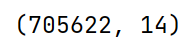
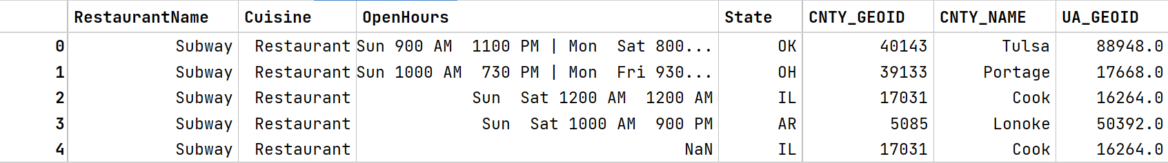
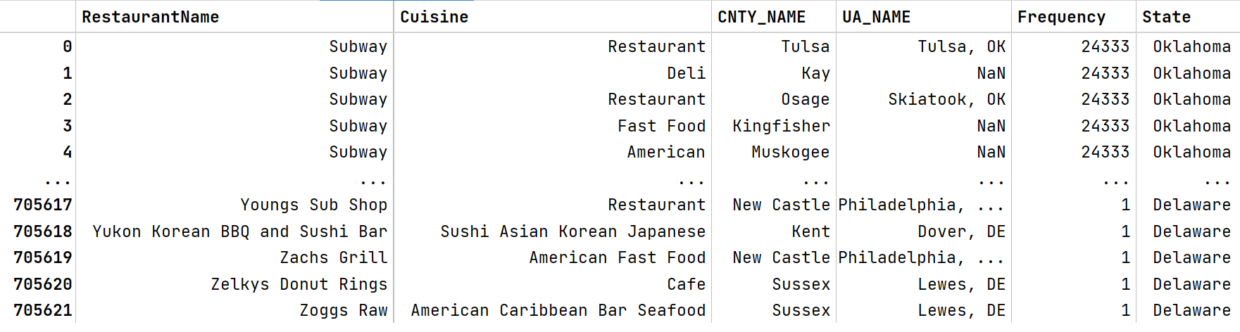
So, this data contains 705622 rows and 14 columns. The image of the first 5 rows of data is given below.
From the above image, we can notice that the states of the United States are in short form in the State column. Commonly, everybody doesn’t know every abbreviation of the US states. So we have to convert those abbreviations into their full form. For this, we scrape a table from a website containing all the full forms of those abbreviations. Afterwards, we merge that table with the original data and remove the abbreviated State column.
Let’s scrape the table from the website.
After running the above code, we can see the below output.
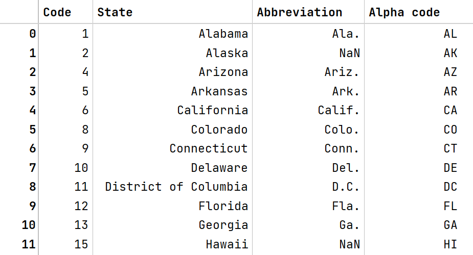
This table has 51 rows and 4 columns. I don’t display the whole table here. If you want to see the whole table, visit here. Now let’s merge this table into the original table.
Here I do one more thing – as every column of the original data is not necessary to us, so we only take the needed columns from the original data. The final table will look something like this.
Look at the UA_NAME column. This column contains the name of the city and the state in which they are located, separated by a column. Here we remove the state part as we already have a column containing states of the United States. For this, just run the below code.
chain_data['UA_NAME_MOD'] = chain_data['UA_NAME'].str.split(',', expand=True)[0]
Here is the output:
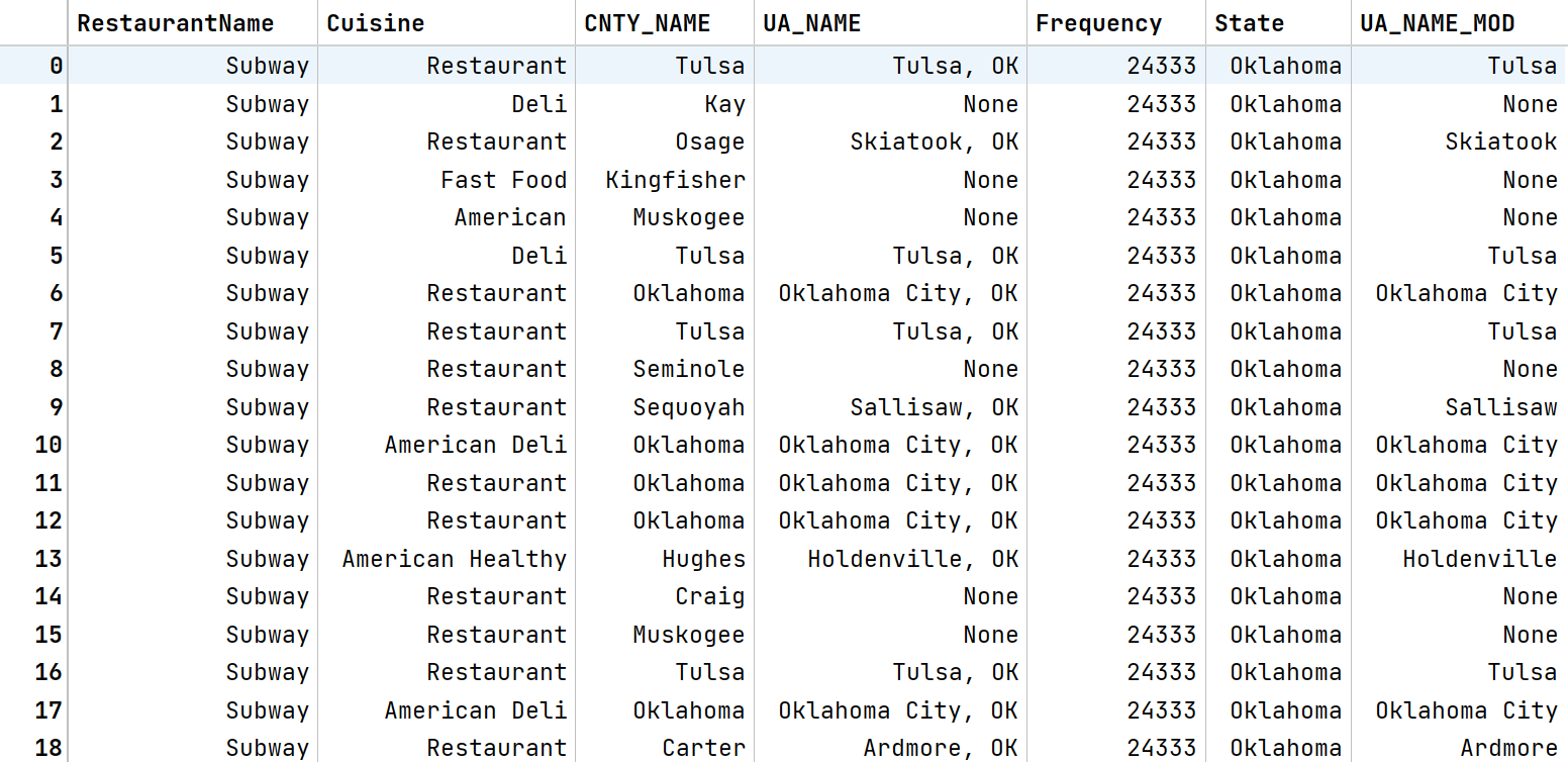
See the difference between UA_NAME and UA_NAME_MOD columns. The state part is removed from the UA_NAME_MOD column. Now you can drop the UA_NAME column as there is no use for it.
Now we are ready for the main task, i.e. Data Analysis.
Data Analysis
Statistical Summary
First, we see the statistical summary of the data as usual.
print(chain_data_sort.describe())
print(chain_data_sort.describe(include='O'))
The output for the first code description is shown below.
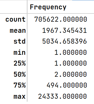
From the above result,
-
We can easily notice that the maximum hotel frequency is 24333. If we see the first 5 rows of the data, we can see that Subway has the highest number of chains. But from this result, we can’t tell that only Subway restaurants have the highest chains. We have to see further for that.
-
The lowest hotel frequency is 1, which denotes that those are independent restaurants.
Now let’s see the second output, which is given below.
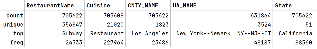
Hmm, we got a lot of information. Let’s check them one by one.
- There are Three Lakh Fifty-Six Thousand Eight Hundred and Forty-Seven (356847) unique restaurants in this dataset. Which Subway Restaurant has the top frequency (24333). That means Subway Restaurant has the highest number of chains. We don’t need to verify further for that.
- From the Cuisine column, we can see that the Restaurant has more popularity than any other Cuisine. Here Restaurant means that all types of foods are available there.
- Most restaurants are located in Los Angeles, California.
- Newark is a village in Wayne County, New York, United States, 35 miles (56 km) southeast of Rochester and 48 miles (77 km) west of Syracuse. The above table tells us that most restaurants are located in this area.
Where are Most Subway Outlets Located?
Now we know that Subway has the highest chains. But what about the Cuisine state they reside in and the county? Let’s see. But before that, we write some functions.
Now let me introduce you to those functions:
-
multi_count_df helps us convert multiple outputs we get by using .value_counts() on different columns of the pandas dataframe.
-
count_df function is responsible for converting only one output we get by using .value_counts() on a column of the pandas dataframe.
-
multi_donut_chart function helps plot multiple donut charts in a subplot.
- modded_bar_plot function helps us draw a modified version of the bar plot, which you will see later.
Now let’s plot our desired charts.
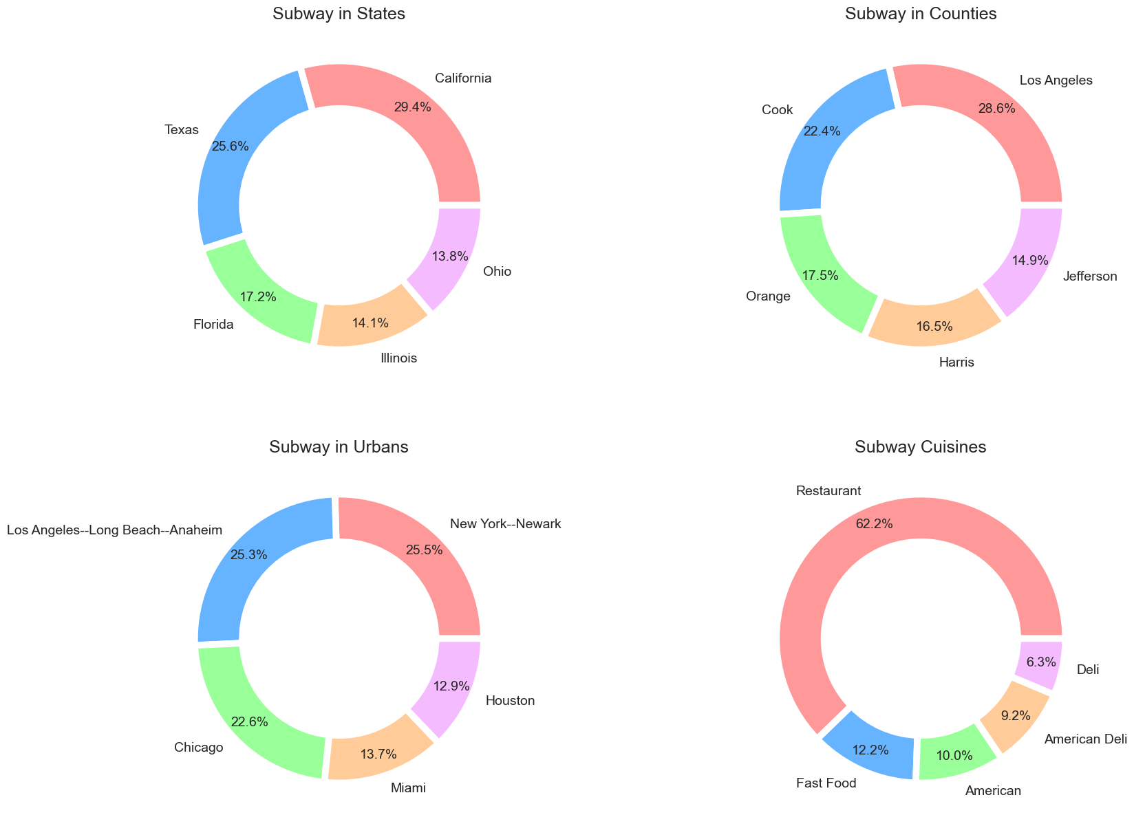
If we run the above code, we can see the output below.
Looks nice. Always plot charts in such a way that the charts look attractive as well as give comfort to our eyes. Though we create these beautiful charts with a few lines of code, many customisations are happening in the background. If you want to know more about these customizations, see this article.
Now let’s see what we got in those charts.
-
The First chart shows us that most of the Subway restaurants are located in California, United States.
-
The second chart shows that Subway took the major part of Los Angeles, the most populated California county (Population: 9,829,544). If you don’t know what a county is, Here is a definition from Wikipedia.

-
Though most Subway Restaurants are in Los Angeles when it comes to Urban areas, we get from the third chart that Newark, an urban area of New York, has the most number of Subway outlets. We can also see little difference between Long Beach and Anaheim, an urban area of Los Angeles, and Newark, an urban area of New York.
- The restaurant is the most popular cuisine in Subway, shown in the last donut chart. Here restaurant cuisine means those are normal restaurants providing all types of food.
Now this result is dependent on the whole data of Subway restaurants. What happens if we are interested only in Subway restaurants in California? Let’s see.
The output will look like the one below.
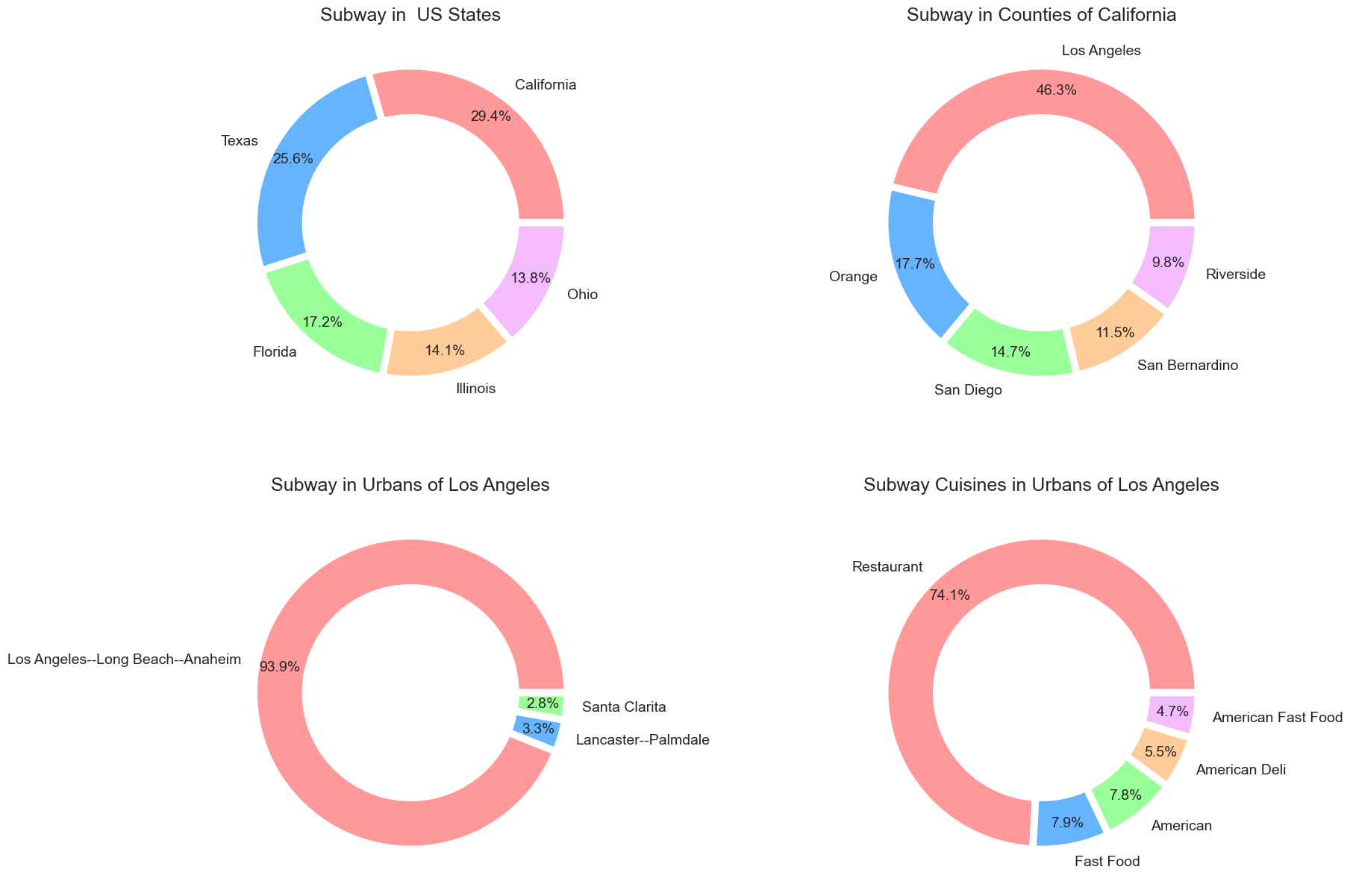
The first and second charts show that California and Los Angeles have the most Subway outlets, as we saw previously. The third and fourth charts changed drastically here. As we select the Urban Areas of Los Angeles, Anaheim and Long Beach came first here. And most of the Subway restaurants in this area are normal restaurants.
Which Restaurant has the Highest Chains after Subway?
Now that’s all about the Subway. Which restaurant has the highest chains after Subway? For this, we have to take the different restaurants in the dataset and take those restaurants with frequencies of more than 5 (as we are considering only the chain restaurants. Less than 5 frequencies are not considered chained.). After that, we plot the bar plot.
After running the above code, we will see the below output.

This is what I am talking about. This bar plot has no box, no x labels, and y labels, only the necessary part of the bar plot. From this plot, we can see that McDonald’s has the highest chains after Subway. Now let’s know about McDonald’s whereabouts.
cols = ['State', 'CNTY_NAME', 'UA_NAME_MOD', 'Cuisine']
dfs = multi_count_df(mcdonalds_chains, cols)
titles = ["McDonald's in  US States", "McDonald's in Counties", "McDonald's in Urbans", "McDonald's Cuisines"]
fig2 = multi_donut_charts(dfs, 2, 2, cols, colors, titles)
fig2.show()
The output of the above code is shown below.
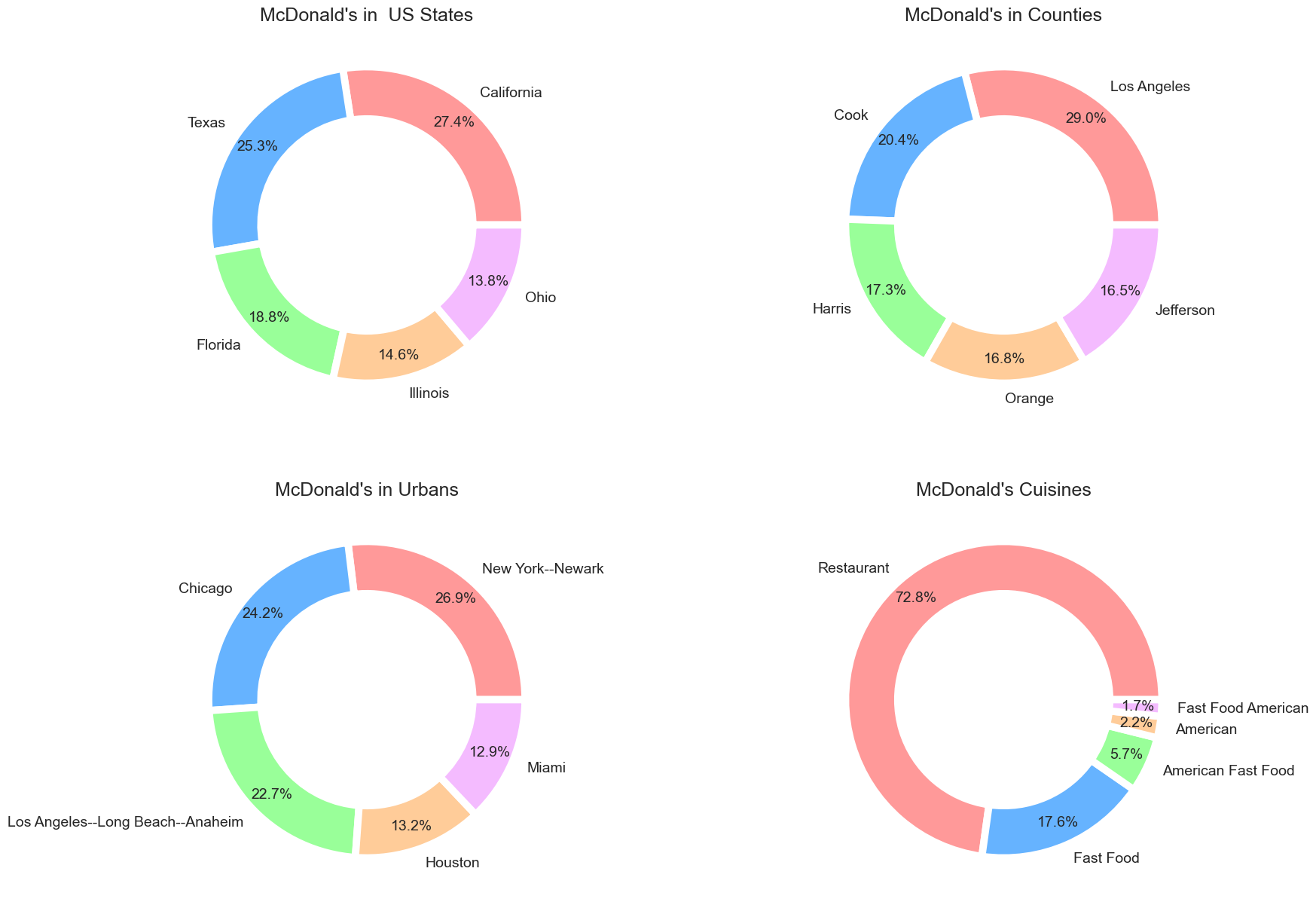
The results are the same as we saw for the subway restaurants. It seems that the most popular restaurants are located in Los Angeles, California.
What about Independent Restaurants?
Enough for the chain restaurants; now we see the stats about the independent restaurants. Independent restaurants are those restaurants whose frequencies are 1. We first filter those restaurants from the data and then see if they are also located mostly in Los Angeles. Let’s do it.
independent_rest = chain_data[chain_data['Frequency']==1]
cols = ['State', 'CNTY_NAME', 'UA_NAME_MOD', 'Cuisine']
dfs = multi_count_df(independent_rest, cols)
titles = ["Independent Restaurants in  US States", "Independent Restaurants in Counties", "Independent Restaurants in Urbans", "Independent Restaurants Cuisines"]
fig = multi_donut_charts(dfs, 2, 2, cols, colors, titles)
fig.show()
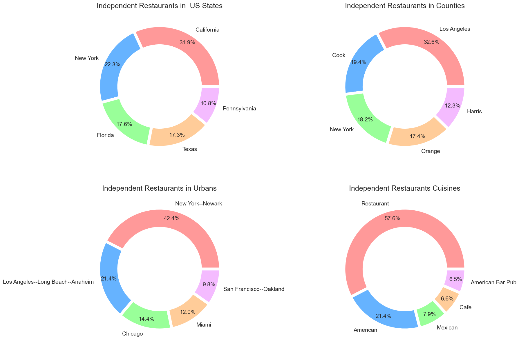
All types of restaurants are located in Los Angeles, California. Los Angeles is heaven for food lovers. If we see for the Urbans, Newark wins. All restaurants are normal restaurants that provide different types of food.
Which Restaurants have the Most Popular Cuisines in the United States?
Until now, we don’t get any good idea about the most popular cuisine among Americans. Now we are going to focus on this. After a bit of surfing on the internet, it comes out that Most Americans like Italian foods in the first place, then Mexican, and Chinese in the third preference (see here). Now let’s see which Restaurants have those popular cuisines. First, we see the chain restaurants.
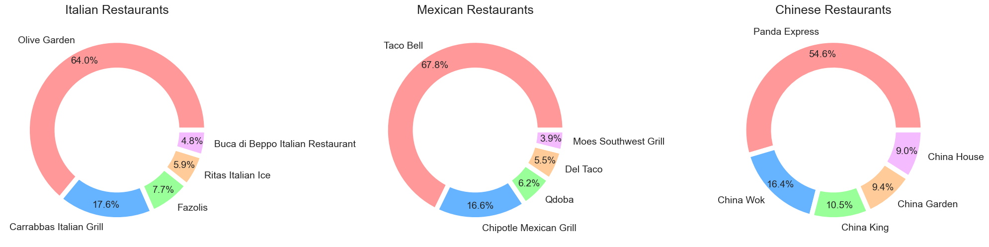
Pheww! We are getting different results after a long time. I thought I would see the name Subway in the Italian restaurant category. But we got a different restaurant. Olive Garden has the most outlets for Italian Cuisine. For Mexican and Chinese cuisines, Taco Bell and Panda Express have the most outlets, respectively. Now, are those restaurant outlets located mostly in California? Let’s see.
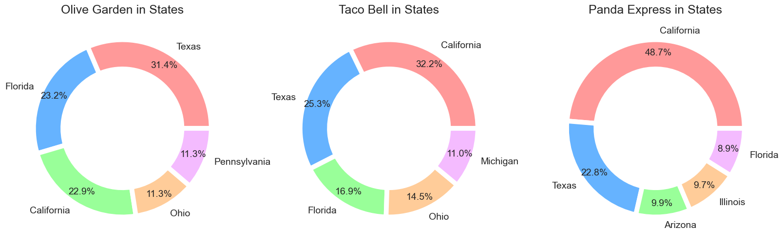
Our guess is not bad. Only Olive Garden’s outlets are mostly in Texas instead of California. Otherwise, Taco Bell and Panda Express outlets are mostly in California. Now What about the counties and urban? Let’s do this.
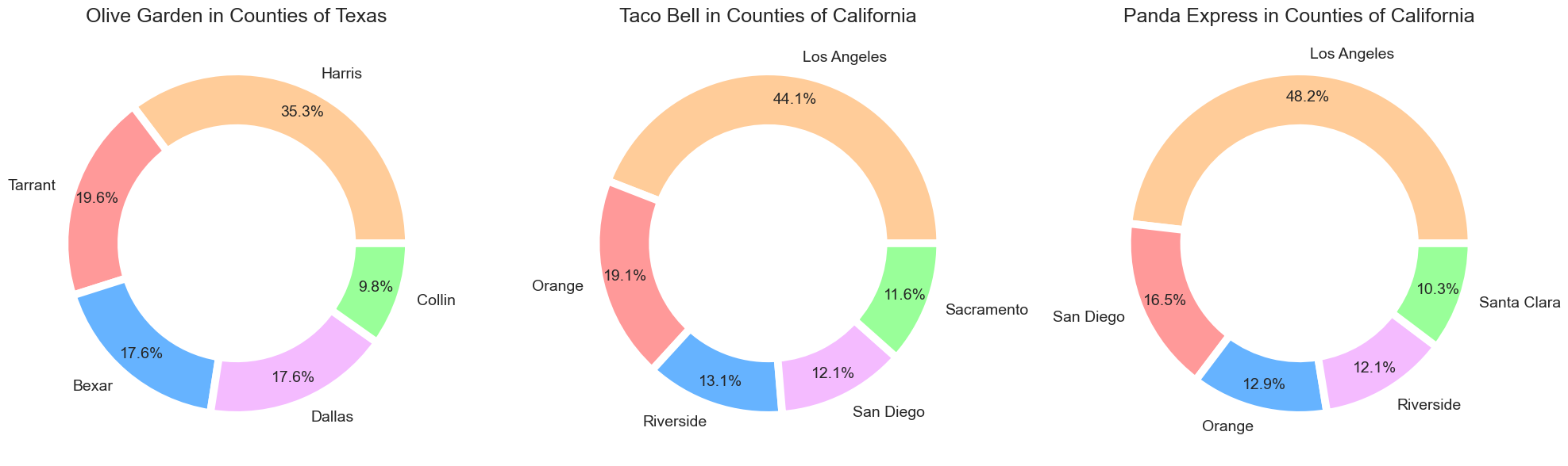
The outlets of Olive Garden are located mostly in Harris, Texas. And both Taco Bell and Panda Express outlets are in Los Angeles, California. Now let’s see about the Urban. Just replace CNTY_NAME with UA_NAME_MOD in the above code, and you will see the below output.
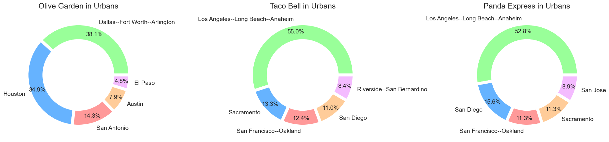
Most outlets of Olive Garden are located in Dallas, the third largest city of Texas; Fort Worth, the fifth largest city of Texas; and Arlington. Los Angeles, Long Beach, and Anaheim have the most Taco Bell and Panda Express outlets. If you like Italian cuisine, Dallas, Fort Worth, and Arlington – those three cities of Texas, should be your first choice.
Now, this is all about chain restaurants. What about independent restaurants? They also have some popularity, of course. But here is a problem. You can’t tell which restaurant outlets have mostly Italian cuisine by their frequencies as you found so many restaurants with the same frequencies. But we can tell in which state the most independent restaurants having Italian cuisine are located.
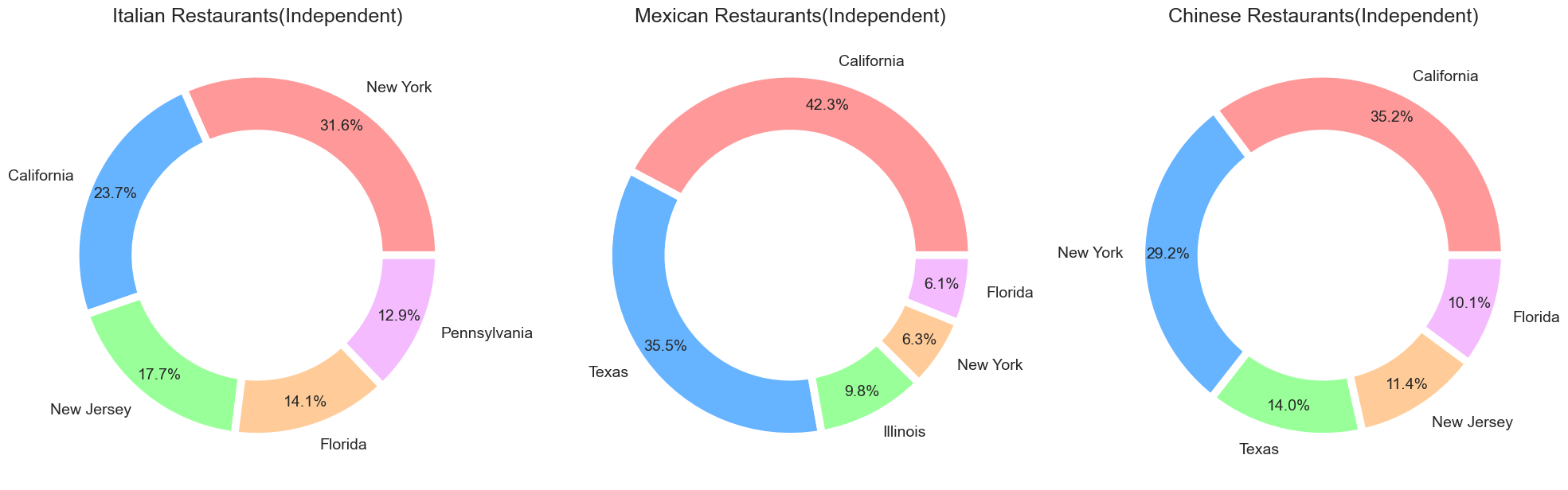
From the above charts, we can see that most Italian restaurants(independent) are located in New York. On the other side, Mexican restaurants(independent) and Chinese restaurants(independent) are mostly located in California.
Conclusion
So, That’s all I got. I know this article is pretty long, but you learned many things. Most of us don’t have knowledge about this restaurant’s types. But after reading this article, we know not only about this type but also how to deal with this type of data. We also plot some beautiful charts. In a nutshell, we learned –
-
How to modify a column when no information is available in the data?
-
How to use python functions to shorten the code so we can save time?
-
Plot customized graphs using seaborn and matplotlib – how to create attractive graphs which are also comfortable for the eyes. And,
-
As a bonus, there are facts about chain and independent restaurants in the United States.
But the analysis doesn’t end here. If you got something, let me know in the comments. If there is something wrong from my side, I am always here to listen to you. You can also do some more in the plots – there are so many options for customization. I don’t explain how the plots are drawn because this article mainly focuses on the analysis. Try the parameters and see which does what; this is not hard for you.
If you want more articles like this, visit my AnalyticsVidhya profile.
The media shown in this article is not owned by Analytics Vidhya and is used at the Author’s discretion.


