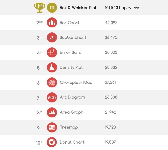
As per tradition, the website stats on the most popular chart reference pages for the past year are made public for all readers of this website to explore. As usual, the data is taken from 1st January 2022 to 31st December 2022 for only the English site, with any previously mentioned years following the same date range. Below is the list for the Top-10 chart reference pages for 2022:
But how does this list compare to last year’s Top 10?
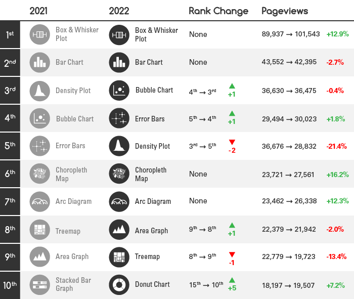
There hasn’t been a dramatic shift in ranking between 2021 and 2022. The only note-worthy thing is the Donut Chart page jumping onto the list. The Box & Whisker page continues to grow and maintain its first-place position.
However, this year I decided to try something different (instead of a Bump Chart) and use a Race Bar Chart to show how the ranking and page views have changed since 2017:
With the help of small multiple Line Graphs, we can see if any growth has happened over the past six years based on the number of page views:
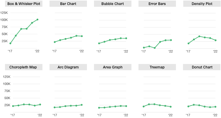
These charts highlight quite dramatically the continued growth of the Box & Whisker Plot page, while the rest remain mainly stagnant.
For now, that’s all there is to say. Hope this has been of interest. It’s always worthwhile to analyse the website statistics, as they may provide some indicator of what visualisation types are most commonly being referenced and read up about.
Previous yearly top-10 posts:

