
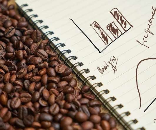
Spilling the Beans on Visualizing Distribution
Analytics Vidhya
DECEMBER 9, 2020
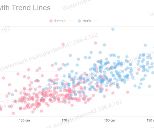
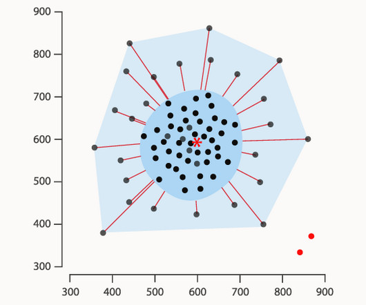
Introduction to distribution and drawing visual reference Distribution in the English language. The post Spilling the Beans on Visualizing Distribution appeared first on Analytics Vidhya. This article was published as a part of the Data Science Blogathon.


Let's personalize your content