article thumbnail

Build Up Your Performance With KPI Scorecards – Examples & Templates

datapine

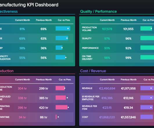
Tracking the success metrics based on your needs, and the time frame you select while comparing your values can be done with simple yet effective scorecards. What Is A KPI Scorecard? A KPI scorecard is a term used to describe a statistical record that measures progress or achievement towards a set performance indicator.

Scorecard 226
article thumbnail

Dashboard vs. Scorecard: Differences, Advantages, Templates

FineReport

As important parts of business intelligence, scorecards and dashboards can both play an obvious role in promoting enterprise performance management. However, many users are confused with the difference between scorecard vs. dashboard. Definition of scorecard and dashboard. What is a scorecard? What is a dashboard?

Insiders

Sign Up for our Newsletter

This site is protected by reCAPTCHA and the Google Privacy Policy and Terms of Service apply.

article thumbnail

Scorecard vs Dashboard: How to Choose to Maximize Your Benefits?

FineReport

As important parts of business intelligence, scorecard and dashboard can both play an obvious role in promoting enterprise development. However, limited by factors such as cost and corporate strategies, sometimes companies need to make a choice between scorecard vs dashboard. Definition of scorecard and dashboard.

article thumbnail

A Brief History of Data Visualization

Jet Global

Editors note: This blog was originally published in October 2013, and has been completely revamped and updated for accuracy, relevancy, and comprehensiveness in September 2019 Prior to the 17th century, data visualization existed mainly in the realm of maps, displaying land markers, cities, roads, and resources.

article thumbnail

24 Conditional Formatting Visuals in Microsoft Excel that Should Be Retired

Depict Data Studio

I’m normally very zen about data visualization. But with some behind-the-scenes editing, we can still make powerful visualizations inside Excel.”. I started to teach the Baruch College students about exploratory data visualization with conditional formatting. Conditional Formatting is a fancy way of saying “if-then visuals.”.

article thumbnail

Visualize data quality scores and metrics generated by AWS Glue Data Quality

AWS Big Data

An operational scorecard is a mechanism used to evaluate and measure the quality of data processed and validated by AWS Glue Data Quality rulesets. We can query and submit the Athena data to QuickSight to create visuals for the dashboard. The crawler builds a Data Catalog, so the data can be queried using Athena.

article thumbnail

A Beginner’s Guide To Inventory Metrics And Best Practices

datapine

Collecting big amounts of data is not the only thing to do; knowing how to process, analyze, and visualize the insights you gain from it is key. Your Chance: Want to visualize & track inventory KPIs with ease? Your Chance: Want to visualize & track inventory KPIs with ease? But let’s get back to our visual example.

Metrics 286