
Jupyter Notebook has become one of the key primary tools for many data scientists. It offers a clear way to collaborate with others throughout the process of data exploration, feature engineering and model fitting and through utilizing some clear best practices, can also become living documents of how that code operates.
Notebooks give users the ability to choose the languages and libraries of their choice which offers great flexibility but, on the counter, point they can be very code intensive doing certain tasks such as data profiling and analysis. This often leads data scientists to leveraging other tools like Tableau or PowerBI to cut down on the amount of overall code they need to write, but this often means disconnecting their exploratory analysis from the code that seeks to solve the problem.
What is Lux?
Lux is a Jupyter library integrated with an interactive widget that automates the generation of data visualizations from inside a notebook. This allows data scientists to quickly browse through a series of visualizations to seek out correlations and interesting trends. Lux also supports specifying particular intent and then further slice, dice and filter charts to find one that best suits the problem you’re working on.
This blog gives a quick setup guide and a project and environment within the Domino Enterprise MLOps platform to try it out for yourself.
Installation and Configuration
Lux requires Scipy, Altair, Pandas and Scikit-learn to be installed. Once these have been configured, installing Lux can be done through pip install commands in your console.
pip install git+https://github.com/lux-org/lux.git
pip install lux-api
Post installation of the libraries, you need to install the Lux widget as an extension to Jupyter from within your console.
jupyter nbextension install --py luxwidget
jupyter nbextension enable --py luxwidget
For Lux to work, Jupyter notebooks need to set to “trusted” and currently, only Chrome based browsers are supported.
Validating the Installation of Lux
Once you’ve setup Lux, you can ensure that it’s been configured correctly by running the following command inside your notebook.
!jupyter nbextension enable --py luxwidgetWhich will return the following
Enabling notebook extension luxwidget/extension...- Validating: OKOperating Lux
To operate Lux, we import Lux and Pandas into our notebook.
import lux
import pandas as pd
Lux appears as a toggle button in your Jupyter notebook once you call a dataframe object. In the example below, we load some wine quality data into a dataframe object and then call it within Jupyter.
df = pd.read_csv("/mnt/data/wine_red.csv",sep=';')
df
Once we call the data frame, Jupyter presents the usual tabular format of data however we can now press the toggle button to generate our automated visualizations.
By default, Lux creates correlation, distribution and occurrence charts across the data-frame object. These can be used to rapidly identify interesting patterns; however you can further customize the presentation of these charts by specifying intent – i.e the attribute(s) you would like to analyse.
Here, we specify the quality score as an intent and call the dataframe again.
df.intent = ["quality"]
df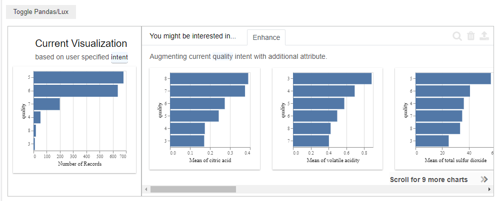
Lux now displays charts based on our specified intent with a series of graphs that seek to show the correlation of other attributes against the quality score in the “enhance” tab. If we click on any of these graphs and click the magnifying glass, Lux automatically includes the new attribute as an intent and generates graphs based on the two intents.
With more than two attributes selected, Lux lets you filter or generalize the dataset. This allows further customization of the charts. Filter lets you set a range on a particular attribute while generalize lets you remove attributes from the established intent – meaning you can perform other slice and dice analysis.
Saving Visualizations in Lux
Outside of performing slice and dice analysis, Lux allows you to bookmark certain visualizations by using the exported property. To bookmark a visualization, select them within Lux and hit the export button. This will save the object to the exported property stored on your dataframe object.
We can now call back any saved charts by calling this property within Jupyter.
df.exported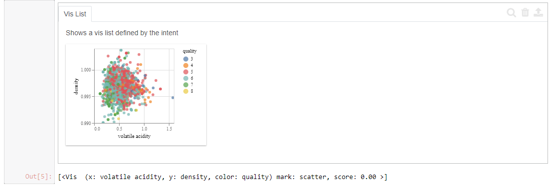
Conclusion
Lux offers data scientists a quick way to easily explore patterns and profile their data through automated visualizations inside of their Jupyter notebook. The ability to quickly slice and dice datasets without the need for extensive code provides efficiency and helps speed up the end-to-end process of analyzing new datasets.
The library also includes the ability to export graphs in a number of ways, including into code that can be called outside of the Lux widget itself giving data scientists a quick and easy way to share their analysis.
For more information about Lux, check out the Lux getting started guide.

SHARE
Other posts you might be interested in


Subscribe to the Domino Newsletter
Receive data science tips and tutorials from leading Data Science leaders, right to your inbox.
By submitting this form you agree to receive communications from Domino related to products and services in accordance with Domino's privacy policy and may opt-out at anytime.