I want to try out writing a series of blog posts that briefly explore a type of visualisation that’s not in the 60 chart reference pages listed on the main part of the website. I already have a long list of charts I want to research and write about, but at the moment it’s too ambitious to go into the depth I would like to go for all of them.
Instead, I think it would be good to lightly touch on each of these charts by providing a brief description on them along with some examples.
The first chart I would like to cover is the Alluvial Diagram. Although I have already written partly about this chart in a previous post, I think for tidiness sake it would be good to have a dedicated page.
Alluvial Diagrams
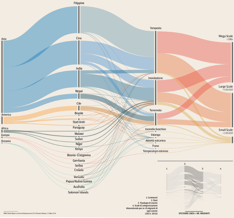
An Alluvial Diagram is a type of flow diagram that was originally designed to represent changes in a complex network structure over time. However, Alluvial Diagrams can also be useful for multi-dimensional data analysis, by illustrating shifts in group composition.
In this diagram, clusters of nodes are represented by blocks, and the flow paths between these blocks depict changes over time in the composition of node clusters. The height of a block corresponds to the size of the cluster, and the thickness of a stream field is proportional to the size of components in both connected blocks. The flow in the diagram is unidirectional.
Named after alluvial fans created by streaming water, Alluvial Diagrams utilise parallel vertical axes to assign variables, with blocks on each axis representing values. This visualisation method is effective in highlighting structural changes, emphasising major transitions through colour coding.
Alluvial Diagrams can be applied to various types of data to reveal significant changes, making them particularly suitable for tracking trends over time and illustrating patterns of flow in a fixed system. They are useful in demonstrating proportions through the width of lines, aiding in the visualisation and comprehension of data relationships in terms of proportionality.
Alluvial Diagrams specifically focus on categorical data, dividing flow paths at each displayed line set and allowing for the comparison of distribution between different categories. Colour coding can also be used to distinguish categories apart.
Examples
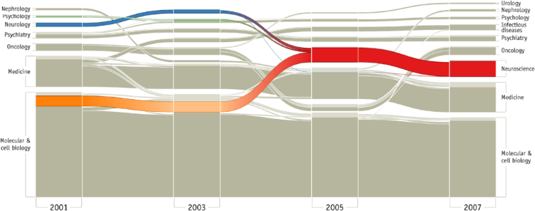
Figure 3. Mapping change in science.
Mapping Change in Large Networks by Martin Rosvall and Carl T. Bergstrom.
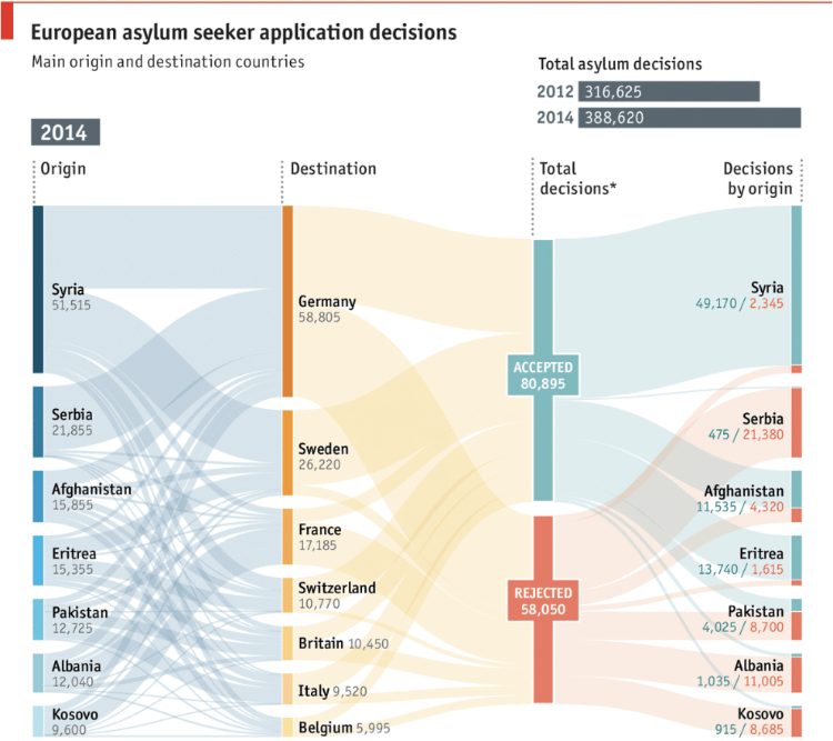
Seeking safety, European asylum application flows: acceptances and rejections
The Economist
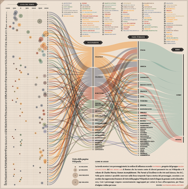
PANTHEON: Corriere della Sera, La Lettura #181
Valerio Pellegrini
G07: Environmental Migration
DensityDesign Lab
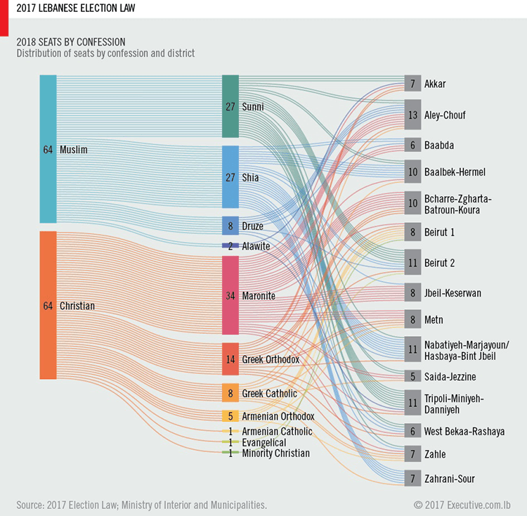
2017 Lebanese Election Law
Ahmad Barclay