This chart was originally used as a trading tool to visualise and analyse the price movements over time.
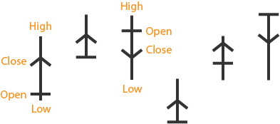
Each symbol or ‘anchor’ represents a trading session.
The vertical line through the middle represents the highest price from the top (or starting) position, while the bottom (or end) represents the lowest price.
The short, horizontal line marker indicates the open price, while the arrowhead marks the close price.
Side notes:
Not to be confused with the teaching tool by the same name.
Alleged to be a predecessor of the Candlestick Chart and OHLC Chart, but not too much is known about this chart.
Said to have originated in Japan during the Kyoho Era (from 1716) from rice trades.
Mentioned in Steve Nison’s book Beyond Candlesticks (1994) on page 17, Exhibit 2.2.
Example
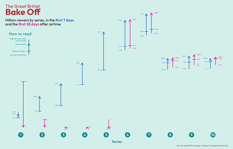
Georgios Karamanis adapted this visualisation method for another purpose: to visualise the viewership of the TV series The Great British Bake Off. Karamanis even published R code to his Github, so others can replicate this visualisation.