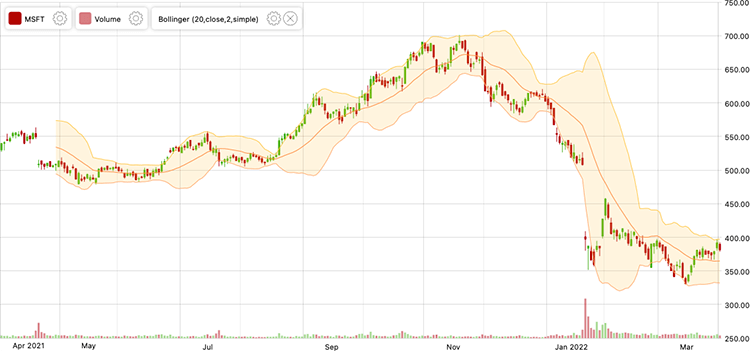
Sometimes known as a: Band Graph, Band Chart, High-Low Graph, Bollinger Bands.
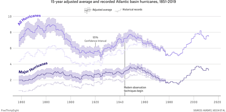
Area Bands enhance standard Line Graphs by filling the space between upper and lower value lines with a shaded area, providing a visual representation of the range boundaries. Essentially, this is a visual enhancement to a graph, which offers more detail and context to data changing over time. Area Bands can incorporate parameters like the maximum and minimum values, standard deviations, or confidence limits.
The benefits of using Area Bands include the ability to observe how minimum and maximum values evolve, assess the proximity of values to the average, and understand the relationship between the average line and the range of data points.
In investing and trading, there’s a variation of Area Bands, known as Bollinger Bands, which can be applied to OHLC Chart and Candlestick Charts. Bollinger Bands are a technical analysis tool that visually represents price volatility by displaying standard deviation levels above and below a simple moving average.
Comprising a moving average and two lines representing two standard deviations, one above and one below the moving average, Bollinger Bands adjust to fluctuations in market volatility. The upper line indicates two standard deviations added to the moving average, while the lower line represents two standard deviations subtracted from it.
Traders commonly use Bollinger Bands to identify overbought and oversold conditions, confirm discrepancies between prices and indicators, and project potential price targets. The width of the bands serves as an indicator of volatility; wider bands suggest greater volatility, while narrower bands indicate lower volatility. The moving average, calculated based on closing prices, forms the core of Bollinger Bands, making them a valuable tool for assessing market dynamics.
Examples
Why Past Hurricane Seasons Don’t Tell Us Much About The Future
FiveThirtyEight
Feature Trends of Billboard Top 200 Tracks (1963-2018)
Reddit (r/dataisbeautiful) by u/SportsAnalyticsGuy
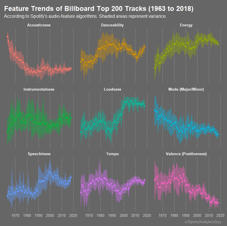
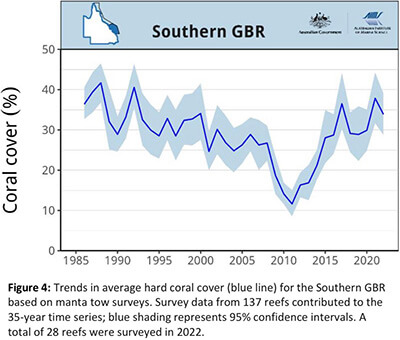
Figure 4, Trends in average had coral cover for Southern GBR based on manta tow surveys.
Long-Term Monitoring Program Annual Summary Report of Coral Reef Condition 2021/22 – Australian Government + Australian Institute of Marine Science
Stock Chart with Bollinger Bands Indicator
amCharts