Also known as: Range Area Chart, Range Chart, Band Graph.
A Range Area Graph is used to represent ranges of values changing over a given time period. This chart is particularly useful for illustrating the fluctuations in data spread, ranges, or differences changing over time.
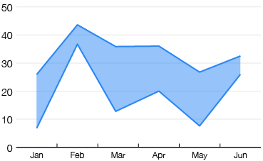
There are three main variations of a Range Area Graph. The first variation focuses on the minimum and maximum values in a variable. Here, each data point is represented by two Y-values: a low value and a high value. These values are connected by lines, and the area between them is usually filled with colour or a pattern to enhance visibility. By visualising both the minimum and maximum values simultaneously, Range Area Graphs can provide insights into the magnitude of differences between them and help identify shifting trends over time for ranged datasets.
The second variation of a Range Area Graph focuses on the gap or value differences between two variables over time. These graphs are essentially Line Graphs that have two data series (for each variable) plotted, but with the area between them shaded in to emphasise the gap or differences between them. Often, the two plotted line series are coloured differently and are directly labeled to clearly distinguish the two variables and what they represent.
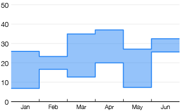
The third variation plots stepped lines (see Stepped Area Graphs), which helps the comparison of values and emphasise abrupt shifts instead of having the focus on trends over time.
Tools to generate a Range Area Graph:
amCharts
Angular
AnyChart
ApexCharts
CanvasJS
Datawrapper
FusionCharts
Highcharts
LightingChart
VisualParadigm Online
ZingChart
Examples
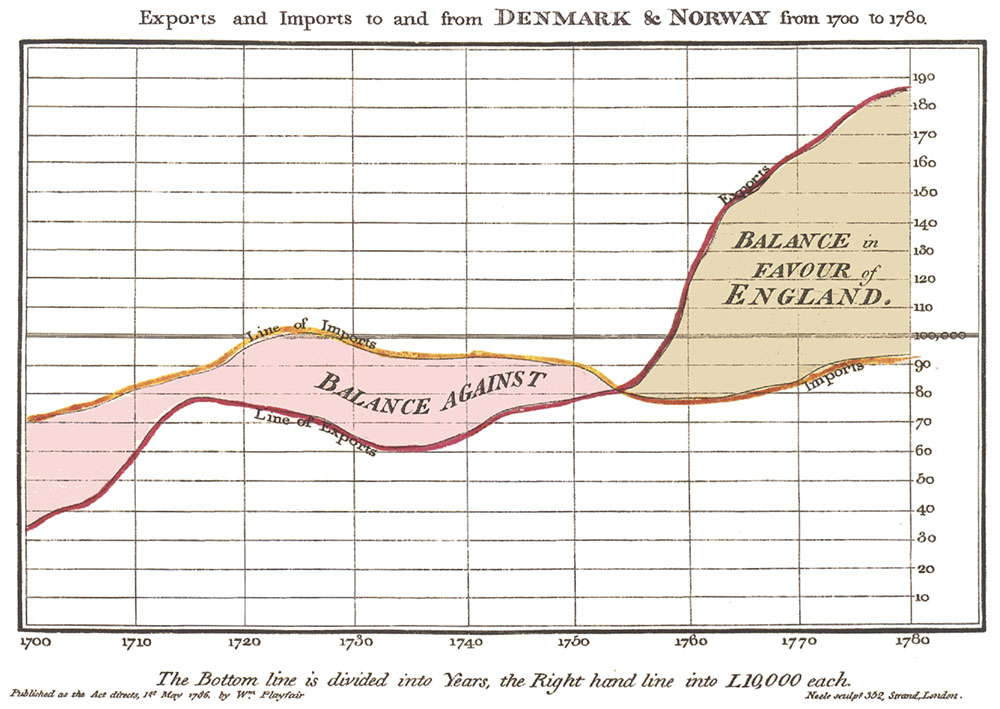
Export and Imports to and from DENMARK & NORWAY from 1700 to 1780 — William Playfair
Wikimedia Commons
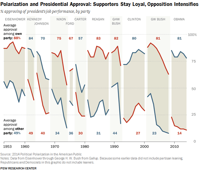
Polarization and Presidential Approval: Supporters Stay Loyal, Opposition Intensifies
Pew Research Center
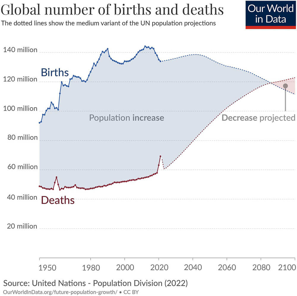
Global number of births and deaths
Our World in Data Instagram and original chart page
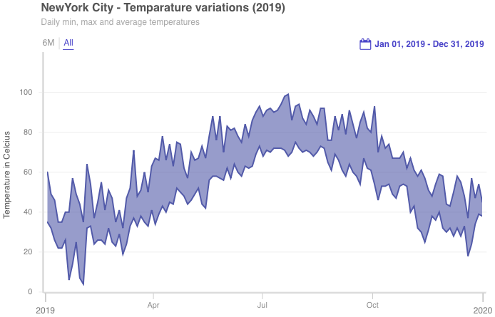
NewYork City – Temperature variations (2019)
Area Range Chart, FusionCharts
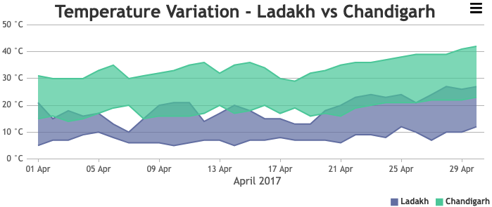
Temperature Variation – Ladakt vs Chandigarh
JavaScript Multi Series Range Area Charts, CanvasJS
Range Area Graphs examples that incorporate small multiples:
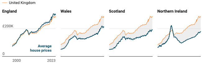
United Kingdom House Prices vs Average
Small multiple line charts in Datawrapper, Datawrapper Blog
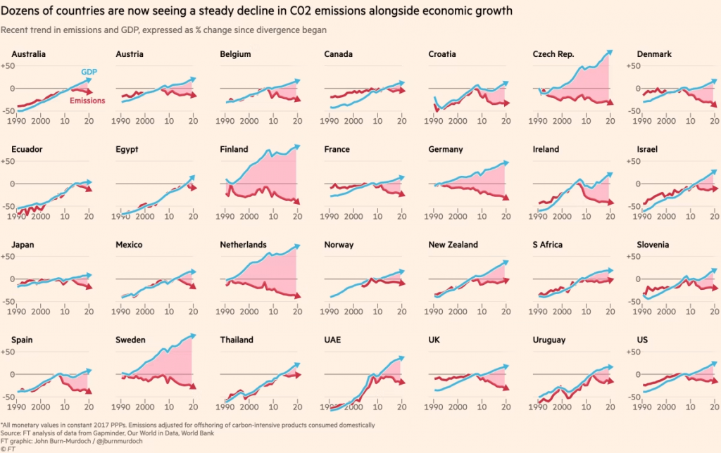
Dozens of countries are now seeing a steady decline in CO2 emissions alongside economic growth
Economics may take us to net zero all on its own, John Burn-Murdoch / Financial Times
Stepped Range Area Graph examples:
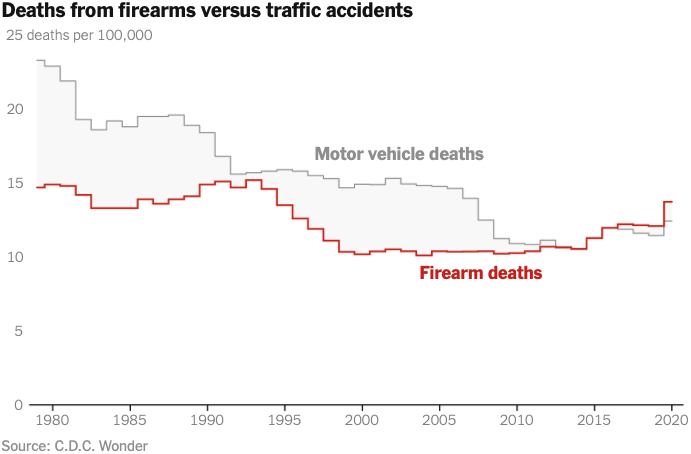
Deaths from firearms verses traffic accidents
A Smarter Way to Reduce Gun Deaths, Nicholas Kristof / The New York Times
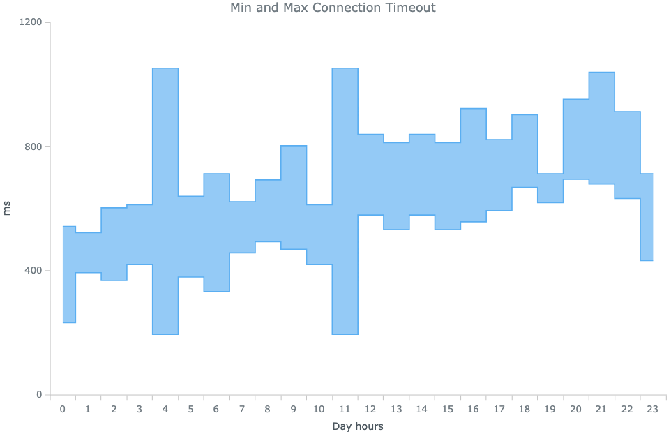
Min and Max Connection Timeout
Chart Gallery: Range Step-Area Chart, AnyChart
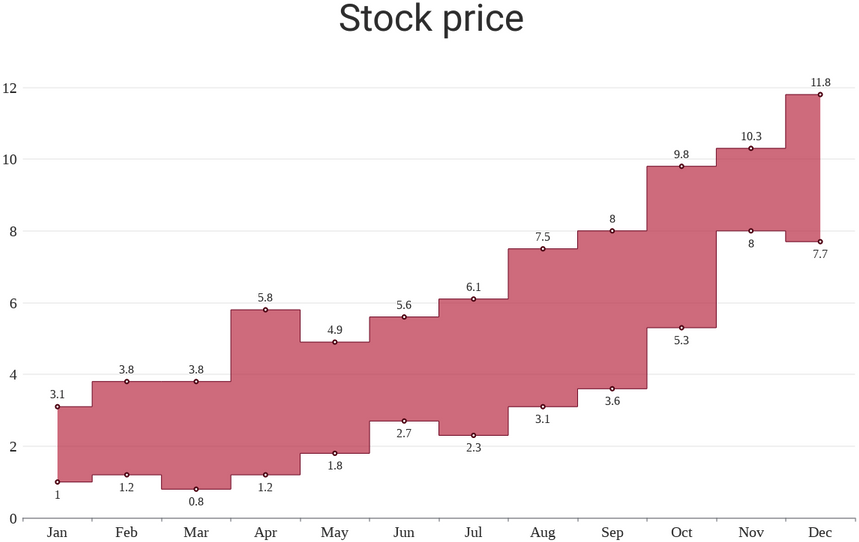
Stock price
Range Step Area Chart, VisualParadigm Online
Related posts:
Further Exploration #7 Area Graph Variations
Chart Snapshot: Area Bands

