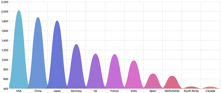
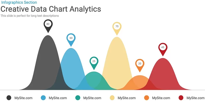
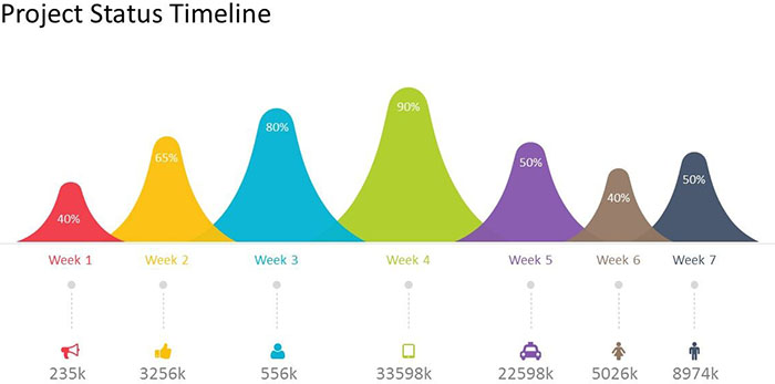
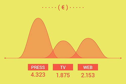
Also known as a Curved Column Chart.
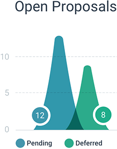
A Curved Bar Chart is a visually dynamic twist on the traditional Bar Chart. Instead of rectangular bars, this chart uses curved areas that resemble little hills to represent data values, with each hill’s height corresponding proportionally to the value it signifies. These curves can be oriented vertically or horizontally, with one axis of the chart denoting the specific categories under comparison, while the other axis represents the discrete value scale.
This chart is novel in its aesthetic but is flawed because of its potential for confusion and lack of visual precision compared to conventional bar charts. This ambiguity stems from the fact that the curved areas have no straight edges and thus sacrifice some clarity for visual appeal.
Tools to generate this chart:
amCharts
Examples:
The Visual Agency Instagram (@the.visual.agency)
Triangular / Curved shape bar chart
StackOverflow
Related posts:
Further Exploration #11: Bar/Column Chart Variations

