Also known as a Barbell Chart/Plot, Dumbbell Chart, Connected Dot Plot.
A Dumbbell Plot is a type of visualisation used to illustrate changes between two points in time, conditions, or groups. It is particularly effective for comparing quantitative value ranges across different categories, offering a clear visualisation of the differences or changes between them.
In a Dumbbell Plot, each data point is represented by a symbol, often a circle, corresponding to its quantitative value. These symbols are connected by a line, creating a visual representation of the range or difference between the two points being compared. The categories or groups are typically represented along one axis, while the quantitative values are plotted along the other axis.
One common use of Dumbbell Plots is to display changes over time or between different conditions. For example, they can be used to compare population changes in various countries between two different years. Colour can be used to emphasise the directionality of the connecting lines or to distinguish between different categories or conditions.
Tools that can generate a Dumbbell Plot:
AmCharts
Everviz
Excel
Highcharts
JSCharting
Python / Plotly
R / ggplot2
Tableau
Vizzlo
Examples
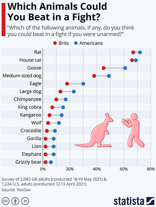
Which Animals Could You Beat in a Fight?
Statista
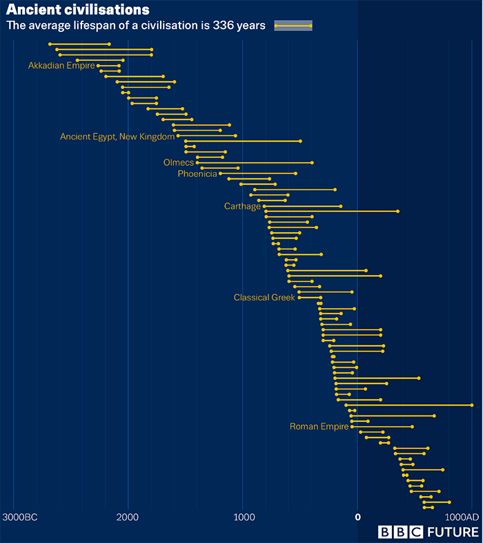
Ancient civilisations, The average lifespan of a civilisation is 336 years
The lifespan of ancient civilisations — BBC Future
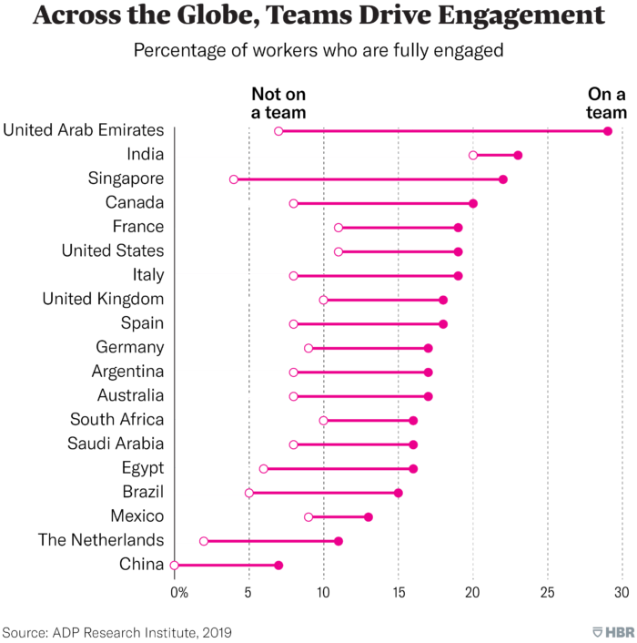
Across the Globe, Teams Drive Engagement
Engagement Around the World, Charted — Harvard Business Review
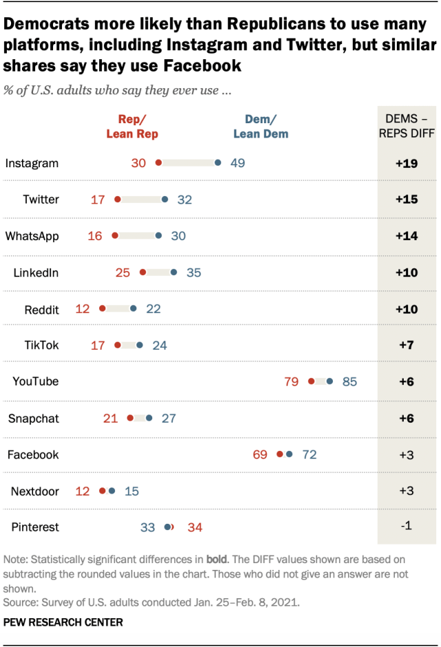
Democrats more likely than Republicans to use many platforms, including Instagram and Twitter, but similar shares say they use Facebook
Partisan differences in social media use show up for some platforms, but not Facebook — Pew Research Center
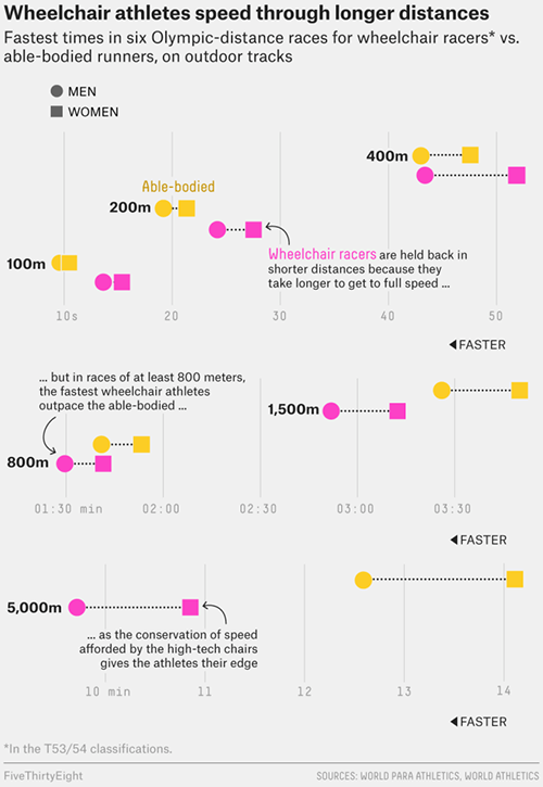
Wheelchair athletes speed through longer distances
Why Wheelchair Racers Outpace Olympic Distance Runners, But Not Sprinters — FiveThirtyEight
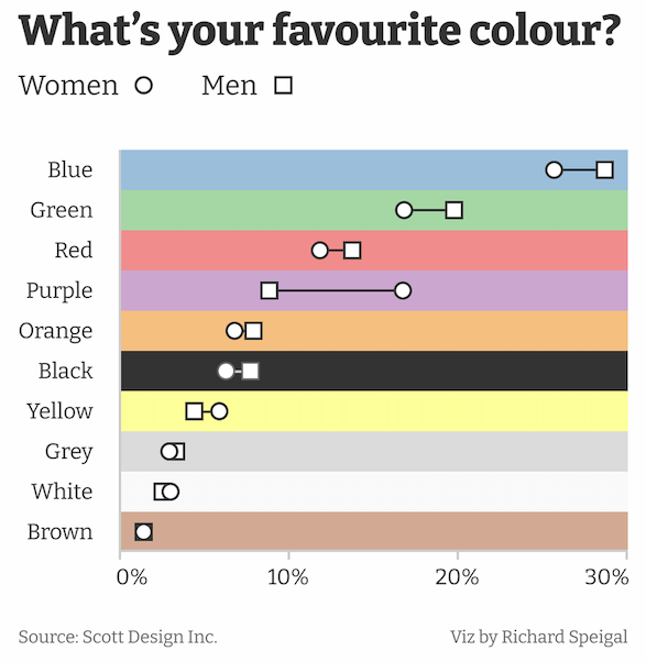
What’s your favourite colour?
In a survey about favourite colours, purple most divides opinion between the sexes — Richard Speigal on reddit.com/r/dataisbeautiful
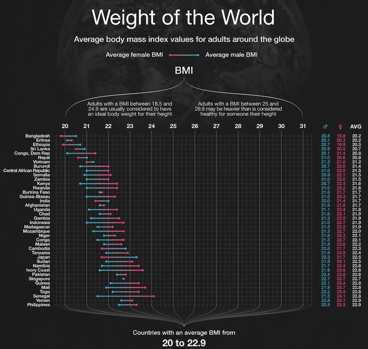
Weight of the World (top section)
Ben Willers