Geospatial visualization via Folium Library
This article was published as a part of the Data Science Blogathon
Overview
- Nowadays, there are multiple data science projects requiring the use of interactive geographical plots. Making such interactive plots is possible through various tools, one such tool is the Folium library of python
- This article focuses on the use of the Folium library for creating impressive geo visualizations.
Introduction
Geospatial visualization of geographic visualization is the use of geospatial visualization tools and techniques for the analysis of geospatial data. Geospatial data visualization aims to add interactive visualization into traditional maps, which helps explore different layers of a map and experiment with the appearance of the map while analyzing different factors of the geographic area and location.
Interpreting maps have always been a crucial part of geospatial analysis. One of the best ways to study maps is through interactive visualization. Such visualizations help us to derive important insights for solving complex data science use cases.
Multiple tools can be used for geospatial visualization, One such tool that we would be focussing on is Folium.

Folium is a powerful python library specialized in creating several types of Leaflet maps. It is one of the most common tools for interpreting and deriving insights from maps.
With Folium, a map of any location can be created by just using the latitude and longitude values. It enables both the binding of data to a map for choropleth visualizations as well as passing rich vector/raster/HTML visualizations as markers on the map.
Folium has multiple exciting features to offer, which we would explore throughout this project!!
Learning Objectives
- Understanding Geo-Visualization
- Explore Folium for map plotting
- Build Stamen Toner and Stamen Terrain Maps
- Locating and visualizing various cities throughout the World
- Applications in real life
Installation
Install the latest version of folium in your jupyter notebook by the following command and get started!
pip install folium
Import necessary libraries
Import the libraries required to carry out the project. We would be using the NumPy library which is useful for scientific computing in Python. Pandas library is the primary data structure library. Along with the Folium library for geo-visualization.
import numpy as np
import pandas as pd
import folium
Exploring basic maps
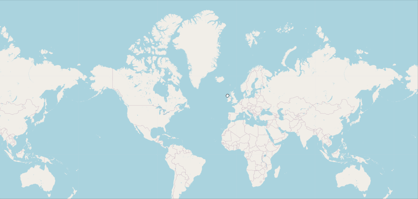
Let us start by plotting basic maps. We can create the world map by using folium.map() function. With this simple command, we can see the world map being plotted.
world_map = folium.Map()
world_map
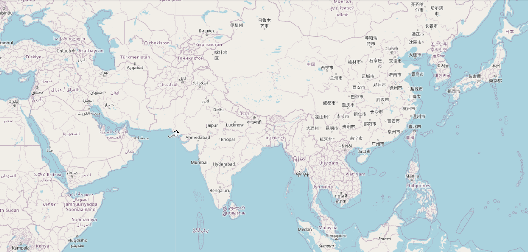
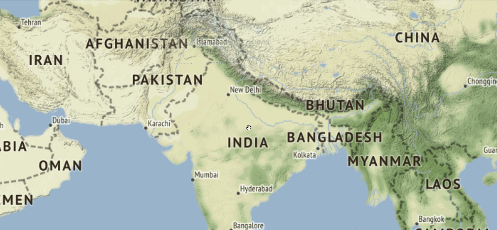
Now we can make the plot for a specific country by pre-adjusting the zoom level. For plotting specific locations we have to input the latitude and longitude of the area.
We can plot the map for India by providing the latitude as 20.5937 and longitude as 78.9629. Set the zoom level accordingly.
world_map = folium.Map(location=[20.5937, 78.9629], zoom_start=4)
world_map
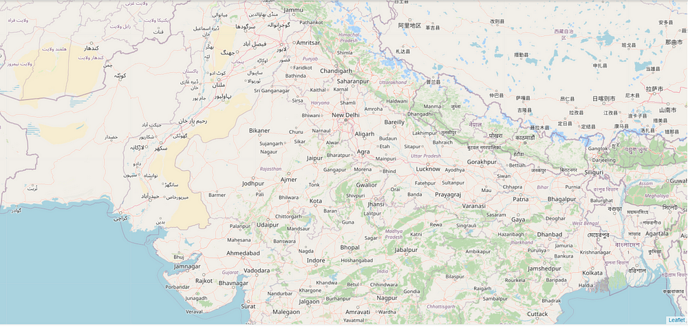
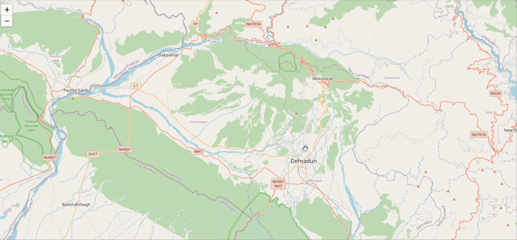
To target a more distinct area we can simply increase the zoom level. This would provide a deeper outlook on the map. We can move around the plots and increase or decrease zooming by selecting the “+” or “-” sign. We can also double-click the map to zoom the map further.
world_map = folium.Map(location=[28.7041, 77.1025], zoom_start=6)
world_map
Folium provides us with the ability to interact with the maps by custom zooming, marking, and sliding along with other features as well.
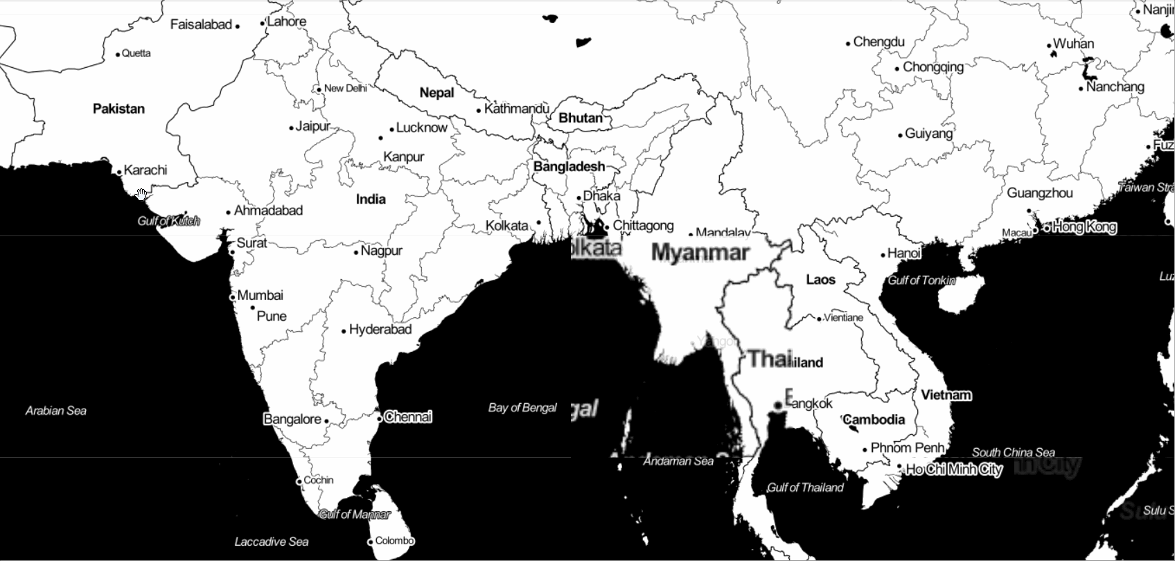
Stamen Toner Maps
Stamen toner maps are quick easy to visualize they produce beautiful highly contrasted black and white maps. They are mostly used for data mashups, exploring river meanders and coastal regions.
We can use the “Stamen Toner” tile to create the same, simply add this tile to the earlier created Map function and plot the map.
world_map = folium.Map(location=[28.7041, 77.1025], zoom_start=4, tiles = "Stamen Toner")
# display world map
world_map
Stamen Terrain Maps
The stamen terrain maps are perfect to visualize all types of terrains. They provide hill shading, natural vegetation colors and showcase advanced labeling and generalization of dual-carriageway roads.
Let us now try this out by specifying the tile as “Stamen Terrain”.
world_map = folium.Map(location=[28.7041, 77.1025], zoom_start=4, tiles = "Stamen Terrain")
world_map
Now that we have understood the basics of plotting different maps by using the Folium library. So, why not experiment some more by visualizing the specific city or area according to our project requirements!!
Here I am visualizing the beautiful Dehradun city by choosing its latitude and longitude.
latitude = 30.3165
longitude = 78.0322
# create map and display it
dehradun_map = folium.Map(location=[latitude, longitude], zoom_start=10)
# display the map
dehradun_map
Real-life Application
To understand the importance of plotting and visualizing maps, we must explore the real-life application of geo-visualization.
Data importing
Let us get started by importing a dataset, for this project we would be using the police department incidents using the Pandas library.
df = pd.read_csv('https://s3-api.us-geo.objectstorage.softlayer.net/cf-courses-data/CognitiveClass/DV0101EN/labs/Data_Files/Police_Department_Incidents_-_Previous_Year__2016_.csv')
df.head()
Display the first five records by using the df.head() function. And study the data at hand.
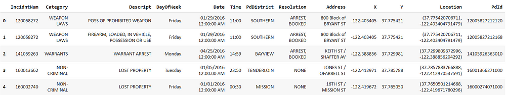
Using the shape function we can see that our dataset consists of 150500 rows and 13 columns. These are the number of incidents that took place in the year 2016. This is a huge dataset and would require a lot of computational power, so let us just work with the first 100 values.
df.shape
limit = 100
df= df.iloc[0:limit, :]
Visualization
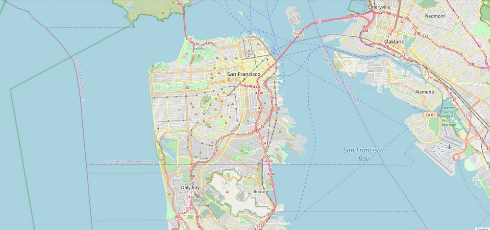
Visualize the incidents that took place in the year 2016. For plotting the map let us start with the default style and specify the latitude and longitude of San Francisco followed by initializing the zoom level to 12.
latitude = 37.77
longitude= -122.42
sanmap = folium.Map(location=[latitude, longitude], zoom_start=12)
sanmap
Adding Markers
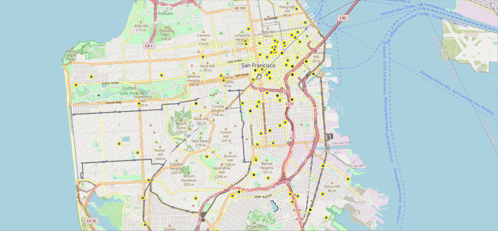
To make the map more interactive we can integrate the locations of the crimes onto the map.
This can be done by using the FeatureGroup() function of the Folium library. For this, we can create a feature group with its own features and style and add it to the map.
Firstly, instantiate a feature group for the incidents in the data frame.
incidents = folium.map.FeatureGroup()
Iterate through the crimes and add them to the incidents feature group. We can choose any desired color for the markers, and set the size of the marker by specifying the radius.
for lat, lng, in zip(df.Y, df.X):
    incidents.add_child(
        folium.CircleMarker(
            [lat, lng],
            radius=5,
            color='yellow',
            fill=True,
            fill_color='blue',
            fill_opacity=0.6
))
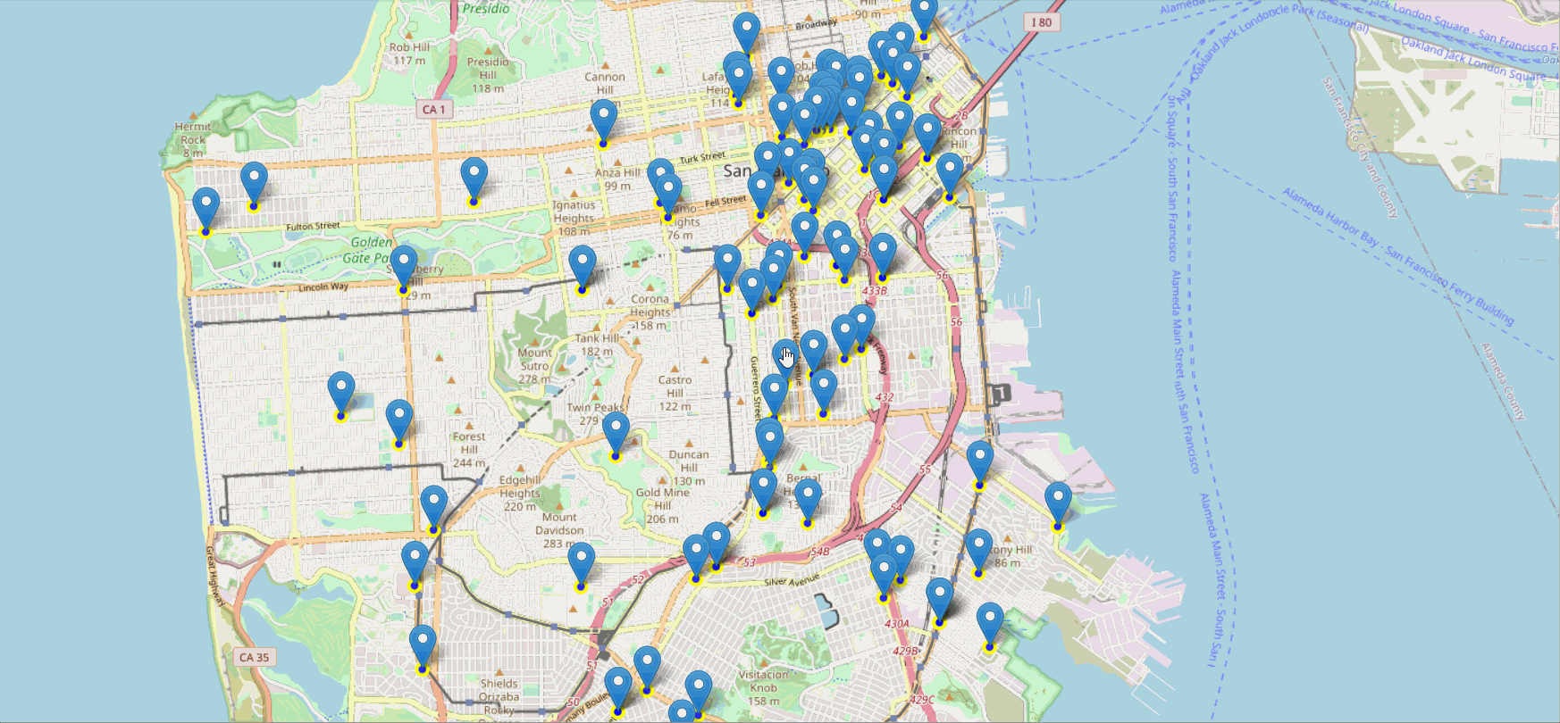
Adding pop-up text
We can also add some pop-up text that would get displayed when you hover over a marker. These pop-ups can display anything we want. Here, each marker should display the category of the crime.
for lat, lng, in zip(df.Y, df.X):
    incidents.add_child(
    folium.CircleMarker(
    [lat, lng],
    radius=5,
    color='yellow',
    fill=True,
    fill_color='blue',
    fill_opacity=0.6
))
latitudes = list(df.Y)
longitudes = list(df.X)
labels = list(df.Category)
for lat, lng, label in zip(latitudes, longitudes, labels):
    folium.Marker([lat,lng], popup=label).add_to(sanmap)
sanmap.add_child(incidents)
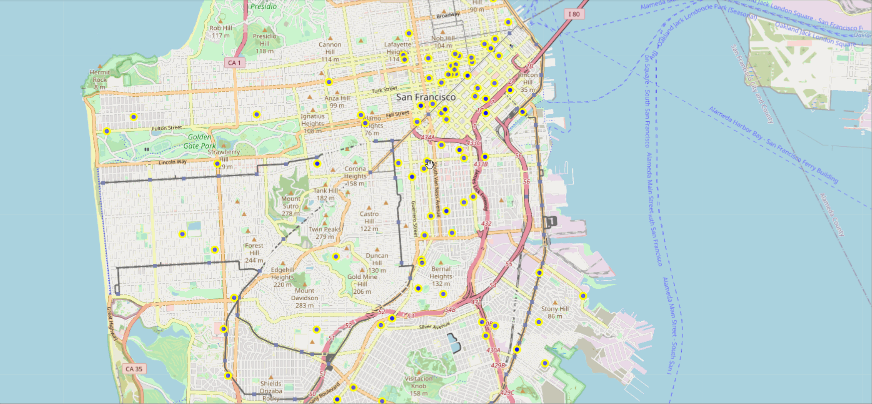
Removing Location markers
In case we don’t wish to display the location markers, we can simply add text to circle markers. And create the map and display it.
sanfmap = folium.Map(location=[latitude, longitude], zoom_start=12)
for lat, lng, label in zip(df.Y, df.X, df.Category):
    folium.CircleMarker(
        [lat, lng],
        radius=5,
        color='yellow',
        fill=True,
        popup = label,
        fill_color='blue',
        fill_opacity=0.6
    ).add_to(sanfmap)
sanfmap
End Notes
We have discussed the use cases and real-life applications of geospatial visualization. Explored the Folium library to plot various types of Maps. Folium. Further experiment with Folium to create powerful and interactive visualizations!!
For more information on the use cases and application of the Folium library do visit the official Folium GitHub page.
The media shown in this article are not owned by Analytics Vidhya and is used at the Author’s discretion.


