Data visualization for One-dimensional Data
This article was published as a part of the Data Science Blogathon.
Introduction
Data visualization is the skill that helps us to interpret the data in a creative and intrusive way. Suppose we break down more aspects of data visualization. In that case, we can see it is one of the best ways to draw a summary of the data, which can be understandable by the end user without any prior technical skills. Hence, it is preferred over playing with numbers alone.
Now, as we understand the perks of data visualization, we also should know that it adapts to one-dimensional or multi-dimensional data. Being in the scope of the topic in this article, we will majorly be focused on the charts/graphs that can help visualize the 1-D data.
Importing Relevant Libraries in Data Visualization
import numpy as np
import matplotlib.pyplot as plt
import seaborn as sb
import pandas as pd

sb.set(rc = {'figure.figsize':(10,6)})
plt.rcParams["figure.figsize"] = (10,6)
Let’s look at what each library contributes to this article.
- NumPy: For handling mathematical operations without any hassle.
- Matplotlib: Library will help implement the CDF plot (we will discuss more on this).
- Seaborn: A Data visualization library built on top of matplotlib; we will use this one more widely in this article.
- Pandas: DataFrame manipulation library, we will use it for creating DataFrame.
d1 = np.loadtxt("example_1.txt")
d2 = np.loadtxt("example_2.txt")
print(d1.shape, d2.shape)
Output:
(500,) (500,)
Inference: Reading two text-based datasets from the load txt function of NumPy and looking at the output, one can point out that there are 500 data points in each dataset.
Bee Swarm Plots in Data Visualization
Starting with the Bee Swarm Plots, The best thing about this plot is that along with showing the distribution of the dataset, we can also see each data point by managing the size of those data points; make sure you provide a suitable size; otherwise, for bigger data point distribution will tend to get out from canvas while for the relatively smaller size of data instances one will not be able to see the distribution.
dataset = pd.DataFrame({
    "value": np.concatenate((d1, d2)),
    "type": np.concatenate((np.ones(d1.shape), np.zeros(d2.shape)))
})
dataset.info()
Output:
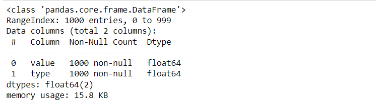
Inference: Swarm plots are like the scatter plots (which show the complete data representation) but with categorical data in the axis, which differentiate them from the general scatter plots. Hence, for that reason, we are first creating DataFrame, which has some values and its categorical type.
sb.swarmplot(data = dataset["value"], size=5);
Output:
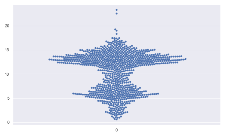
Inference: To explain the swarm plot and keep the simplicity in this example, we are plotting only one categorical type. In the above plot, we can see where the data points are more (denser) and where the data points diverge away from the center (both left and right).
sb.swarmplot(x="type", y="value", data=dataset, size=4);
Output:
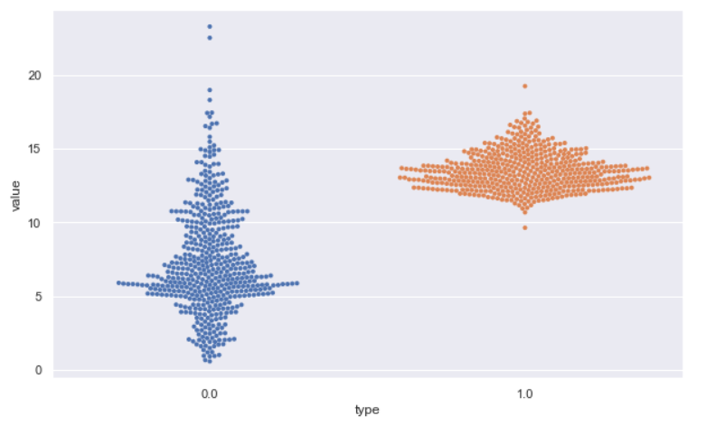
Inference: In the previous graph, we plotted only one category, this time, we are planning two, which are visible on the X axis labeled as 0.0 and 1.0, and the concept is the same, i.e., the more the density, the more diverge will be data points from the center to both left and right.
Box Plots in Data Visualization
Now it’s time to move forward and discuss another type of data visualization graph, i.e., Box plot, which is also widely known as box and whiskers plots as both the end has cat-like whiskers, along with that it put forward a wide variety of inferences in the table that we will discuss now.
sb.boxplot(x="type", y="value", data=dataset, whis=3.0);
sb.swarmplot(x="type", y="value", data=dataset, size=2, color="k", alpha=0.3);
Output:
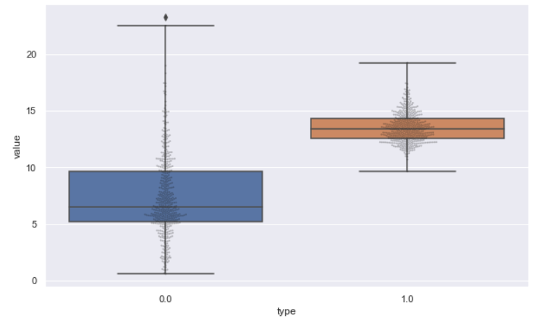
Inference: BoxPlot is yet another visualization plot best suited for 1-D data, As it demonstrates a variety of statistical measures such as outliers, median, 25th percentile, 50th percentile, and 75th percentile. One can notice that along with the boxplot, we are also imputing the swarm plot on top of that, keeping the alpha value less so that we can see more of the boxplot and the swarm should not overshadow the same. This is a perfect combination where we can see the accurate distribution of the dataset along with its density.
Violin Plots in Data Visualization
Okay, so a box plot doesn’t display too much, does it? What if we want a hint more information? The answer is – We can use the Violin plot for the same; we summoned this plot because the boxplot could not show the complete distribution. All it was showing is a summary of statistics, but in the case of the violin plot, it is best in the case of multimodal data (when data has more than one peak).
sb.violinplot(x="type", y="value", data=dataset);
sb.swarmplot(x="type", y="value", data=dataset, size=2, color="k", alpha=0.3);
Output:
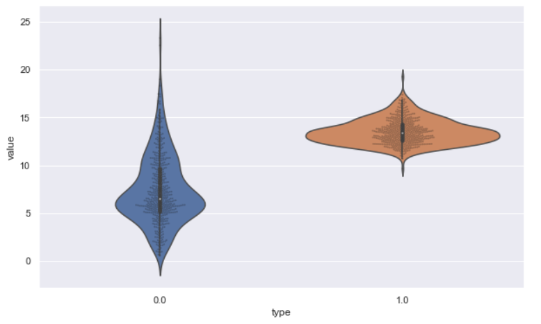
Inference: We have used a Swarm plot with a Violin plot where the swarm is doing its job, i.e., showing the data representation from each data on the other side violin plot shows us the complete distribution for both types we have in our self-created DataFrame.
sb.violinplot(x="type", y="value", data=dataset, inner="quartile", bw=0.2);
Output:
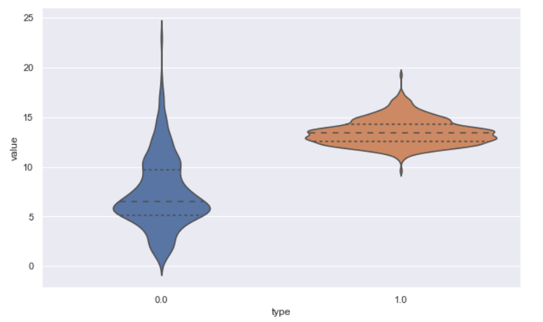
Inference: In seaborn or matplotlib, we always have the option to change the plot based on our needs by providing the required parameters. In violin plot also we have that flexibility, and for that, we have used two different parameters:
- Inner: This will stimulate how the data points will be represented in the violin plot (internally). We have multiple options like box, quartile, point, etc. A quartile is a value we chose, and the output is visible acc to us where the plot has internally changed the look and feel.
- BW: This one is to manage the kernel bandwidth and how rigid and smooth we want the corners to be in our violin plot.
Empirical Cumulative Distribution Functions
When you form a histogram, the fact that you have to bin data means that the looks can change significantly when you change in size. And each bin has statistical uncertainty. You can get past that using a CDF. It’s harder – visually – to see features in the PDF when looking at the CDF; however, it’s generally more useful when you are trying to make quantitative comparisons between multiple distributions. We’ll get on that later.
sd1 = np.sort(d1)
sd2 = np.sort(d2)
cdf = np.linspace(1/d1.size, 1, d1.size)

plt.plot(sd1, cdf, label="D1 CDF")
plt.plot(sd2, cdf, label="D2 CDF")
plt.hist(d1, histtype="step", density=True, alpha=0.3)
plt.hist(d2, histtype="step", density=True, alpha=0.3)
plt.legend();
Output:
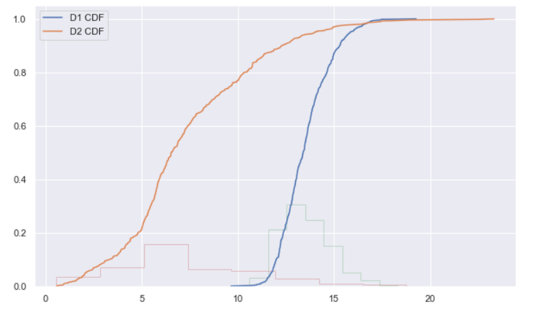
Inference: CDF plots are not usually recommended for extracting insights for business needs. They are a bit complex to understand, but they can be a good resource for further analytics. There is an exciting relationship between Histograms and CDF plots where Histograms represent the area of the bar because of its nature of representation. At the same time, CDF is cumulative as it returns the integral of PDF.
Conclusion
We are in the end game now. This is the last section of the article, where we will point out all the stuff that we have learned so far about visualizing the data when it is in format of one-dimensional. In a nutshell, we will give a brief explanation to get you to know the flow and key takeaways from the article.
- Things started with the Bee Swarm Plot, where we learned about the perks and cons of this plot which helped us know when to use this plot to represent data distribution.
- Then comes the box and violin plot, which echoed similar functionalities and output. Here we learned how the violin plot could be a better alternative when showing the data distribution completely and not only summary statistics.
- The last plot was Empirical Cumulative Distribution Functions (CDF), where we saw the usage of this plot and also came to know the interesting relationship between Histograms and CDF.
Here’s the repo link to this article. I hope you liked my article on Data visualization for one-dimensional data. If you have any opinions or questions, comment below.
Connect with me on LinkedIn for further discussion on Python for Data Science or otherwise.
The media shown in this article is not owned by Analytics Vidhya and is used at the Author’s discretion.


