The Ultimate Guide to Power BI Visualizations
Introduction
Power BI has emerged as a formidable tool within data science, enabling businesses to formulate informed decisions rooted in data-driven insights. Developed by Microsoft, Power BI Visualizations empower users to visually represent their data and disseminate insights seamlessly across organizational echelons. Its ability to seamlessly embed within applications or websites while establishing connections with extensive data sources is noteworthy.

Undoubtedly, one of the paramount facets in the field of data science is the practice of data visualization. This pertains to the graphical elucidation of information and data, wherein visual elements such as charts, graphs, and maps assume a pivotal role. By leveraging these visual tools, data visualization renders data more comprehensible and facilitates the discernment of trends, outliers, and patterns with consummate accessibility. In essence, Power BI stands as a quintessential instrument, wherein its proficiency lies in transforming raw data into visually coherent narratives, thereby enhancing the universal comprehension of complex datasets.
Want to become a full-stack data scientist? It is time for you to power ahead in your AI & ML career with our BlackBelt Plus Program!
Table of contents
- Introduction
- Understanding Power BI Visualization s
- Types of Power BI Visualizations
- A. Charts
- 1. Area chart
- 2. Bar Charts
- 3. Line Charts
- 4. Pie Charts
- 5. Waterfall Charts
- Definition
- 6. Funnel Charts
- 7. Scatter Charts
- 8. Ribbon Charts
- 9. Treemap Charts
- 10. Map Charts
- 11. Cards
- 12. Gauge Charts
- Types of Gauge Charts in Power BI
- 13. Matrix Charts
- 14. Radar Charts
- 15. Candlestick Charts
- 16. Combo charts
- 17. Box and Whisker charts
- 18. Heat Map Charts
- 19. Decomposition Tree charts
- 20. Key Influencers Charts
- 21. Q&A Visual
- B. Reports
- Choosing the Right Power BI Visualization
- Best Practices for Power BI Visualization
- Conclusion
Understanding Power BI Visualizations
Power BI Visualization is the process of representing data graphically using Power BI. It helps to understand complex data sets by displaying them in a more straightforward and visual format. Power BI Visualization is crucial as it allows users to grasp complex concepts or identify new patterns that may not be apparent in text-based data.
The benefits of Power BI Visualization are manifold. It enables users to interact with data, drill down into charts and graphs for more detail, and create and share reports with others. It also allows users to create personalized dashboards with a unique, 360-degree view of their business.
Types of Power BI Visualizations
Power BI offers a wide range of visualizations, each designed to present data in a different way.
A. Charts
Charts are graphical representations of data in Power BI. Use them to simplify complex data sets and make it easier to understand and interpret the data. Power BI offers a variety of chart types, each suited to different kinds of data and different data visualization tasks.
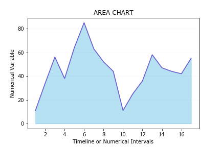
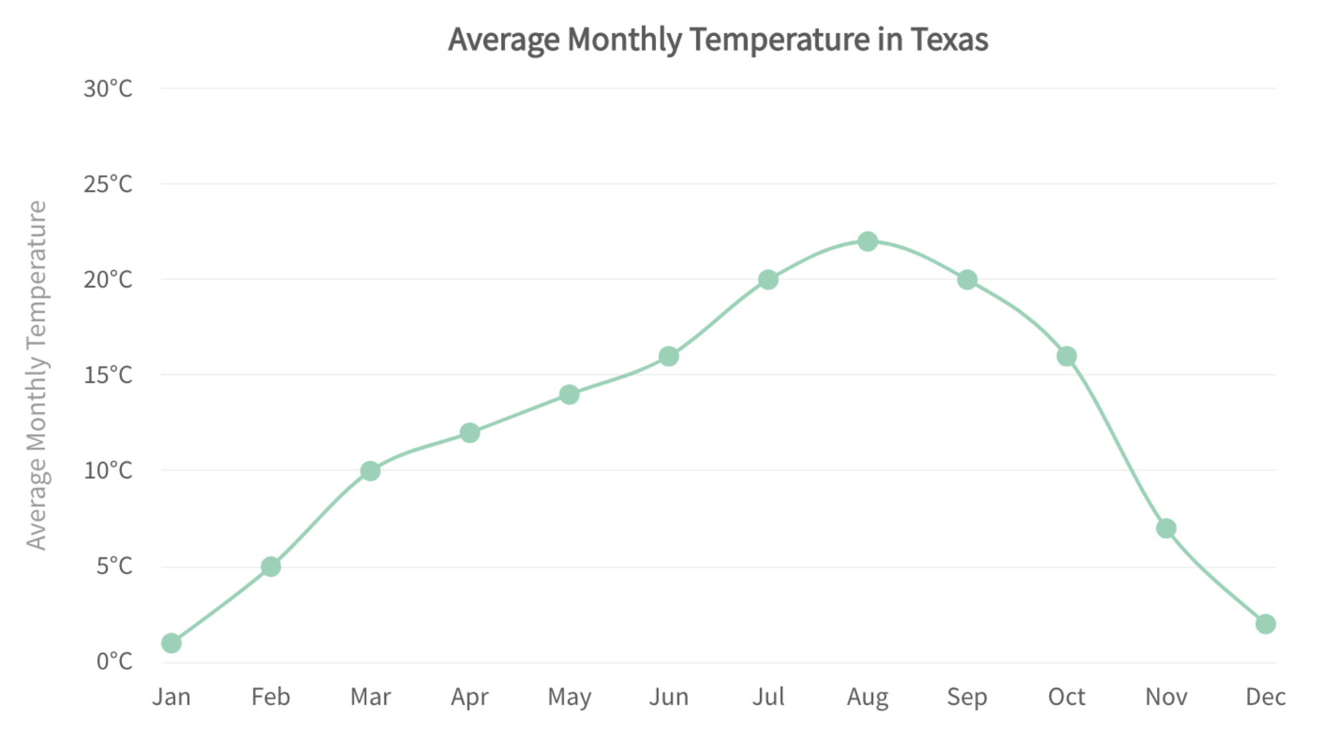
1. Area chart
There are two main types of area charts in Power BI:
Basic Area Chart
This is the most common type of area chart. It displays data points as a line, with the area between the line and the axis filled with color. Basic area charts help show trends over time or compare different categories of data.
Stacked Area Chart
A stacked area chart shows multiple categories of data stacked on top of each other. This chart type is useful for showing how different categories contribute to a whole.
Power BI Visualizations
Key Features
Area charts have several key features that make them useful for data visualization:
- They are easy to read and understand. The use of color and shading makes it easy to see trends and patterns in the data.
- They can be used to show trends over time. By using the time axis, you can easily see how data changes over time.
- They can be used to compare different categories of data. By stacking the data, you can easily see how different categories contribute to a whole.
- They can be used to create combo charts. Combo charts combine multiple types of charts, such as area charts and line charts, to show different aspects of the data.
- They are interactive. You can click on different parts of the chart to filter the data and see more details.
Limitations
While area charts have many advantages, they also have some limitations:
- They can be difficult to read when there are a lot of data points. This is because the lines and colors can start to blend together.
- They are not always the best choice for showing precise values. This is because the data points are not as easy to see as they are on a bar chart or line chart.
- They can be misleading if the data is not scaled correctly. This is because the area of the chart will give the impression that the data is more significant than it actually is.
Choosing the Right Type of Area Chart
The best type of area chart to use will depend on your specific data and needs. Here are some things to consider:
- The number of data points you have. If you have a lot of data points, you may want to use a basic area chart or a stacked area chart with a smaller number of categories.
- The type of data you have. If your data is continuous, you can use a line chart or an area chart. If your data is categorical, you can use a bar chart or a column chart.
- The purpose of your chart. If you are trying to show trends over time, you will want to use a line chart or an area chart. If you are trying to compare different categories of data, you will want to use a bar chart or a column chart.
Area charts are a versatile tool that can be used to visualize a variety of data. By understanding the different types of area charts and their limitations, you can choose the right chart for your needs.
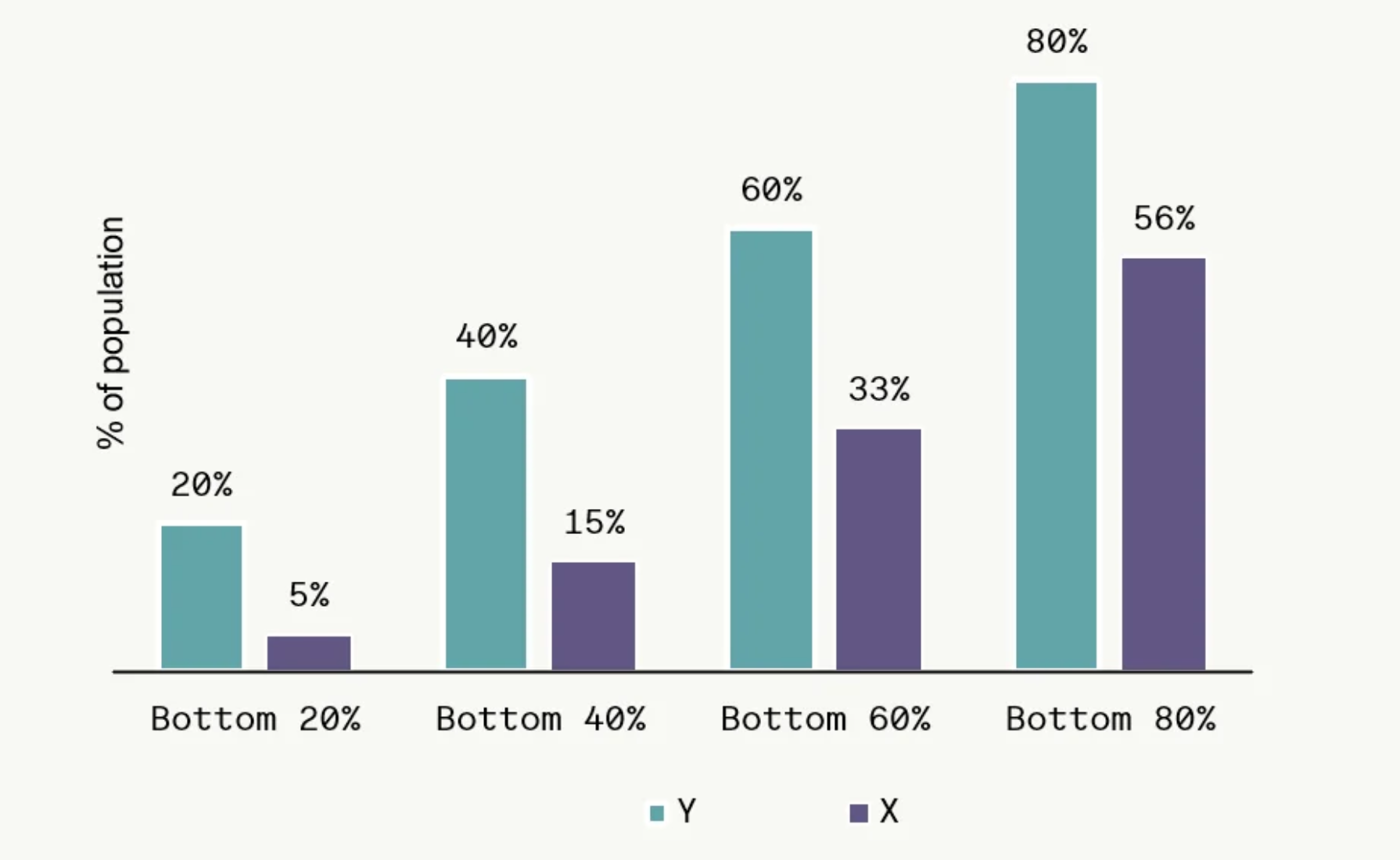
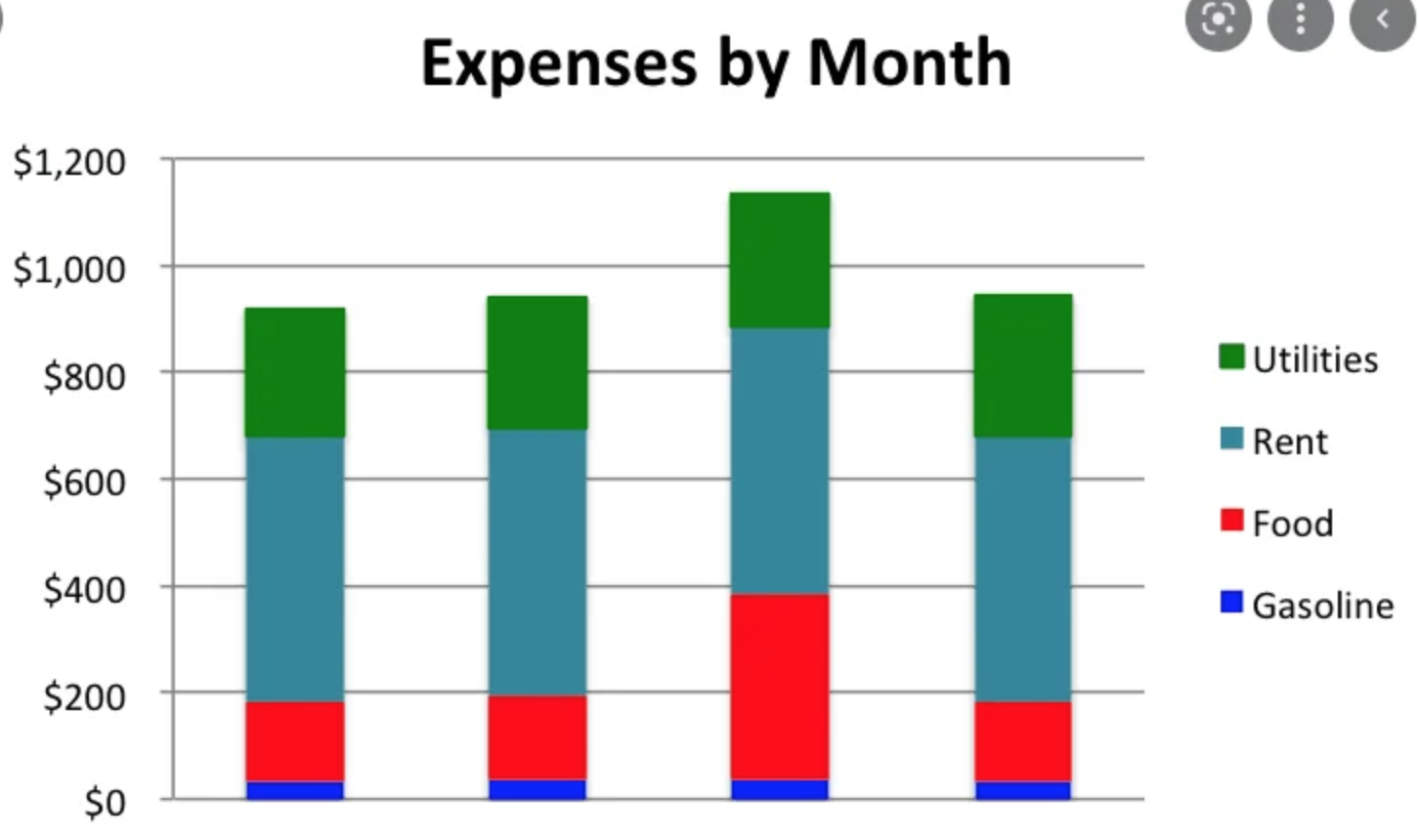
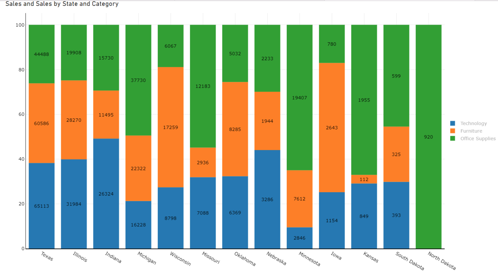
2. Bar Charts
Definition
Bar charts are one of the most fundamental and widely used visualizations in Power BI. They are a simple and effective way to display categorical data, allowing users to compare and analyze data across different categories. Bar charts are ideal for showcasing quantitative data where the values are not too large, making them suitable for various purposes like comparing sales figures, analyzing customer demographics, and visualizing performance metrics.
Types of Bar Charts
Power BI offers several types of bar charts, each catering to different needs and functionalities:
- Clustered Bar Chart: This is the most common type of bar chart, where bars are grouped for each category, allowing for easy comparison of values within the same category.
- Stacked Bar Chart: In this chart, the bars are stacked vertically, representing the contribution of each category to a total value. This is useful for visualizing the composition of a whole and identifying the dominant categories.
- 100% Stacked Bar Chart: Similar to the stacked bar chart, the bars always sum up to 100%, making it ideal for showing percentages and proportions.
Key Features
- Easy-to-Understand: Bar charts are simple to interpret, making them suitable for a broad audience, even those with limited data literacy.
- Effective for Comparison: Bar charts are excellent for comparing values across different categories, allowing users to quickly identify relationships and trends.
- Customization Options: Power BI offers various customization options for bar charts, including changing colors, adding labels, formatting axes, and implementing conditional formatting.
- Interactivity: Bar charts are interactive, allowing users to explore the data further by hovering over bars, filtering categories, and drilling down into details.
Limitations
- Limited Data Volume: Bar charts can become cluttered and difficult to interpret when dealing with a large number of categories.
- Focus on Absolute Values: Bar charts primarily focus on absolute values, making it challenging to visualize relative changes or proportions.
- Limited Data Types: Bar charts best suit discrete, numerical data and may not be ideal for presenting continuous data or complex relationships.
Overall, bar charts are powerful and versatile tools for data analysis and visualization in Power BI. With their simplicity, effectiveness in comparison, and various customization options, bar charts remain a popular choice for anyone looking to communicate insights from their data effectively.
3. Line Charts
Definition
Power BI uses a line chart to visually represent data points connected by straight lines. Users employ it to visualize trends and patterns over time or across categories, making it ideal for continuous data such as time series data, stock market trends, sales figures, etc.
Types of Line Charts in Power BI
- Single Line Chart: Displays the trend of a single measure over time or categories.
- Multi-line chart: Compares the trends of multiple measures over time or categories.
- Dual-axis Line Chart: Combines two line charts with different axes, allowing comparison of trends across different scales.
- Stepped Line Chart: Connects data points with horizontal and vertical steps instead of smooth lines, helpful in highlighting discrete value changes.
- Filled Line Chart: Fills the area under the line(s) with color, emphasizing the magnitude of change.
Key Features
- Easy to Understand and Interpret: Line charts are a familiar and intuitive way to visualize trends, making them accessible to a broad audience.
- Highlight Trends and Patterns: The lines help identify trends, increases, decreases, and seasonality in data.
- Compare Multiple Measures: Multi-line charts allow simultaneous comparison of multiple measures, revealing their relationships and interactions.
- Customization Options: Power BI offers various customization options to tailor line charts for specific needs, including formatting lines, adding markers, customizing axes, and adding annotations.
- Interactive Capabilities: Line charts in Power BI are interactive, allowing users to hover over data points for details, filter data, and explore specific periods or categories.
Limitations
- Limited to Continuous Data: Line charts are not ideal for categorical data or data with large gaps.
- Overcrowding with Multiple Lines: Multi-line charts can become cluttered and difficult to interpret with too many lines.
- Limited Ability to Show Details: Line charts primarily focus on trends and may not be suitable for revealing specific data points or anomalies.
- Potential for Misinterpretation: Depending on the scale and formatting, line charts can sometimes lead to misinterpretations of trends.
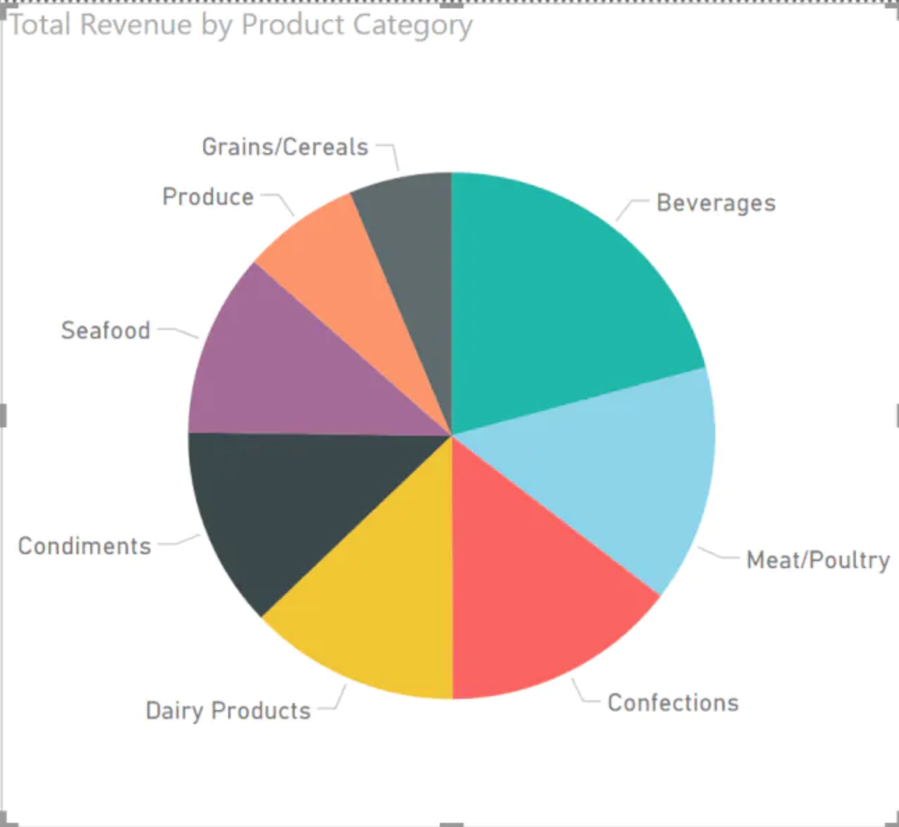
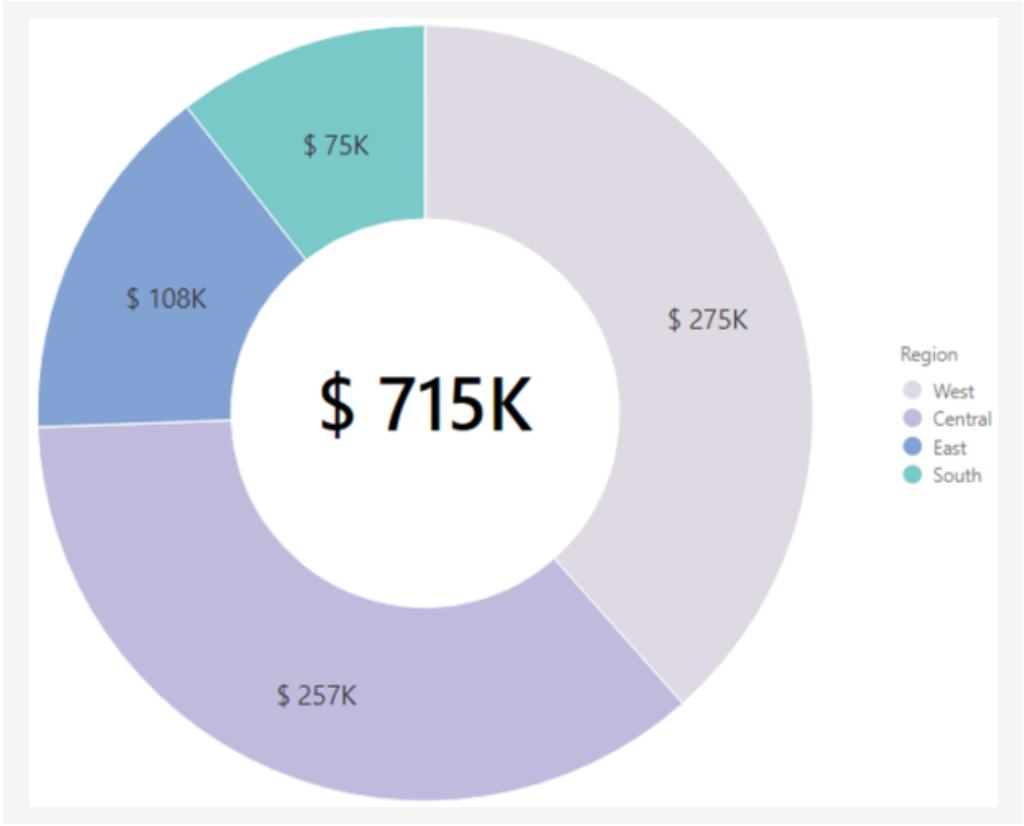
4. Pie Charts
Definition
A pie chart is a circular chart divided into slices, where each slice represents a data category and its size corresponds to the percentage it contributes to the whole. Pie charts are best suited for visualizing data with few categories (5-7 ideally) and highlighting the contribution of each category to the total.
Types of Pie Charts in Power BI
- Simple Pie Chart: Displays a single data series with each slice representing a category.
- Doughnut Chart: Similar to a pie chart, but with a blank space in the center. This allows for additional information like a title or an image to be displayed within the chart.
Key Features
- Simple and Easy to Understand: Pie charts are familiar to most people and present information in a clear and visually appealing way.
- Highlight Relationships between Parts and the Whole: The sizes of the slices readily convey the relative proportions of each category.
- Customizable: Power BI allows you to change colors, add labels, data points, and format the chart to enhance its visual appeal and clarity.
Limitations
- Limited to a Few Categories: Pie charts become difficult to read and interpret with more than 7-8 categories due to overlapping slices and small sizes.
- Difficult to Compare Proportions: It can be challenging to accurately compare the size of adjacent slices, especially when they are small.
- Not Ideal for Showing Trends or Changes Over time: Pie charts are static and don’t show how values change over time.
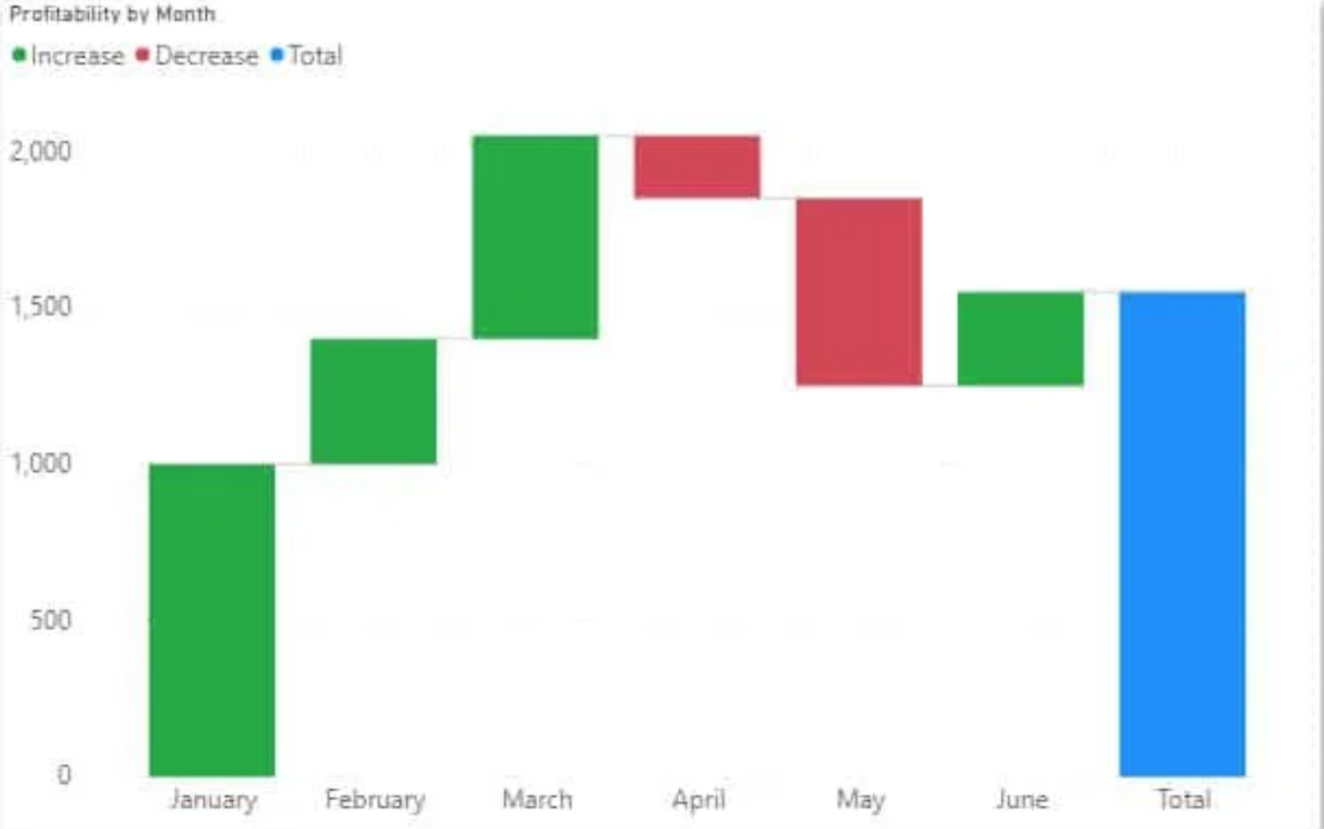
5. Waterfall Charts
Definition
A waterfall chart is a type of data visualization in Power BI that helps you understand how a starting value changes to an ending value through a series of intermediate values. Each intermediate value is represented by a bar that is stacked on top of the previous bar, creating a waterfall effect. This makes it easy to see the cumulative effect of each intermediate value on the final outcome.
Types
There are two main types of waterfall charts in Power BI:
- Simple Waterfall Chart: This type of chart shows the positive and negative contributions to the overall change. Positive values are represented by bars that extend upwards, while negative values are represented by bars that extend downwards.
- Stepped Waterfall Chart: This type of chart shows the cumulative effect of each intermediate value. The bars in a stepped waterfall chart are stacked on top of each other, with no gaps between them.
Key Features
- Easy to Understand: Waterfall charts are a visually appealing way to present complex data. They are easy to understand, even for users who are not familiar with data visualization.
- Highlight Changes: Waterfall charts are great for highlighting the changes between different values. Using color and shading makes it easy to see which values are increasing and which are decreasing.
- Identify Trends: Waterfall charts can be used to identify trends in data over time. By comparing waterfall charts for different periods, you can see how the contributions to the overall change are changing.
Limitations
- Limited Number of Categories: Waterfall charts can only display a limited number of categories. The chart will become crowded and difficult to read if you have too many categories.
- Not Suitable for Complex Data: Waterfall charts are not suitable for displaying complex data that has multiple dimensions. If you have data with multiple dimensions, you may need to use another type of chart, such as a pivot table.
- Limited Interactivity: Waterfall charts do not have as much interactivity as other charts. You cannot drill down into the data or filter the chart by category.
6. Funnel Charts
Definition
A funnel chart is a type of data visualization in Power BI that is used to track the progress of a process or system over multiple stages. The stages are represented by a series of segments that are progressively smaller in size, resembling the shape of a funnel. The size of each segment represents the number of items that have reached that stage.
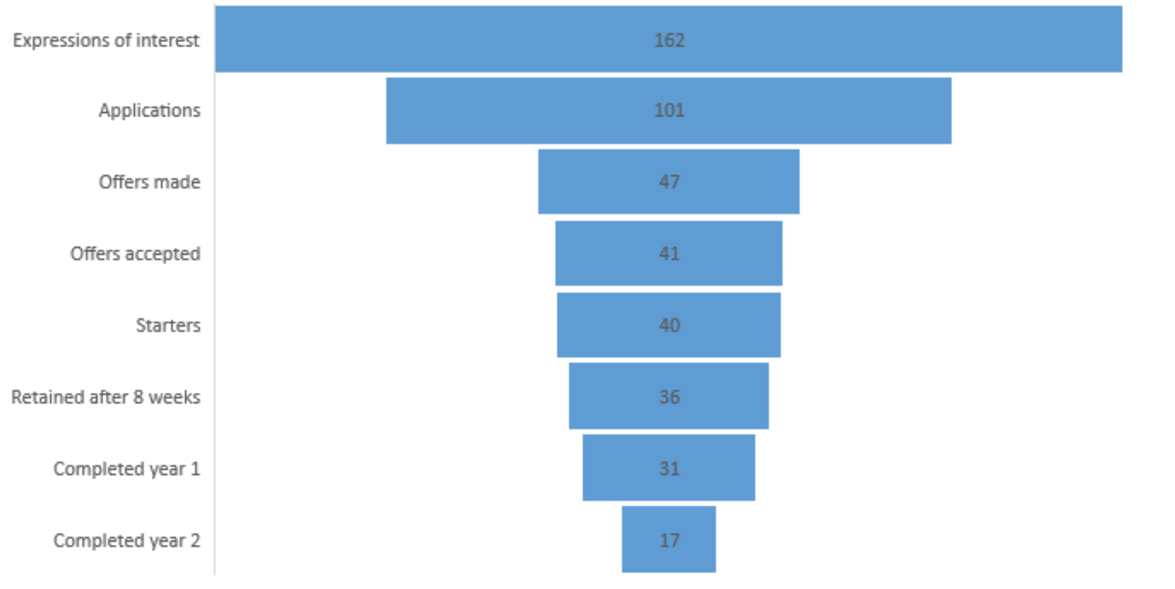
Key Features
- Visually Represent the Flow of Data through a Process: Funnel charts are effective for quickly identifying bottlenecks and areas where improvement is needed.
- Track Progress Across Multiple Stages: You can use funnel charts to track the progress of data across any number of stages, from start to finish.
- Highlight Drop-off Rates: Funnel charts visually show the percentage of items that drop off at each stage.
- Compare Different Processes: You can use comparative funnel charts to compare the performance of different processes or systems.
Limitations
- Limited to Sequential Data: Funnel charts can only be used to visualize data that flows through a sequential process.
- Data Preparation Required: Your data must be properly formatted before you can create a funnel chart.
- Limited Customization Options: Compared to other chart types, funnel charts have fewer customization options.
7. Scatter Charts
Definition
A scatter chart in Power BI is a data visualization tool used to analyze the relationship between two numerical variables. It plots data points as dots on a graph, with the x-axis representing one variable and the y-axis representing the other. The position of each dot indicates the values of both variables for that data point.
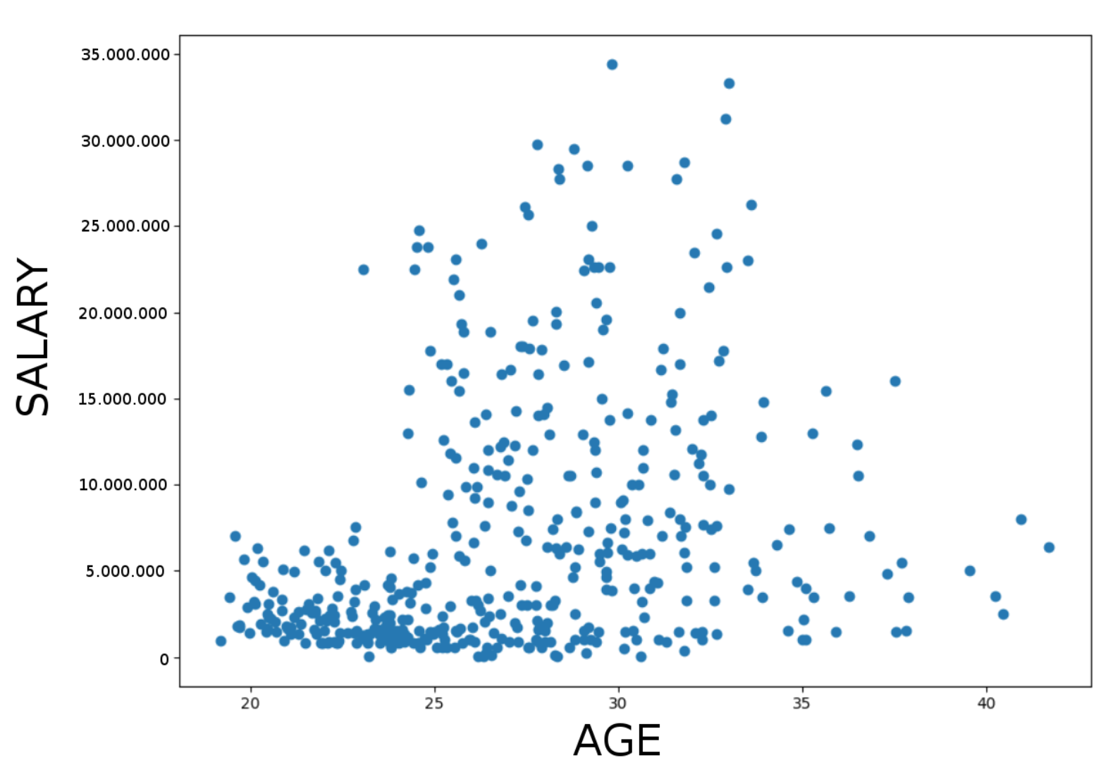
Types of Scatter Charts
- Simple Scatter Chart: This is the most basic type of scatter chart, with one series of data points plotted on the graph.
- Bubble Chart: In addition to the x and y values, bubble charts also include a third variable, represented by the bubbles’ size. This allows you to visualize three dimensions of data in one chart.
- Clustered Scatter Chart: This type of chart shows multiple series of data points plotted on the same graph, with each series represented by a different color or shape.
- High-density Scatter Chart: This type of chart is useful for visualizing large datasets. Power BI automatically subsamples the data to ensure that the chart is not cluttered.
Key Features
- Identify Correlations: Scatter charts are a good way to identify whether there is a relationship between two variables. If the data points are clustered closely together, it suggests a strong correlation. Conversely, if the data points are scattered widely, there is no significant correlation.
- Identify Outliers: Scatter charts can help you identify outliers, which are data points that are significantly different from the rest of the data. Outliers can be caused by errors in data collection or measurement, or they may represent genuine anomalies.
- Compare Groups: You can use scatter charts to compare two different groups of data. This can be helpful for identifying trends or patterns that are unique to each group.
- Trendlines: You can add trendlines to scatter charts to help visualize the overall trend in the data. This can help understand the direction in which the data is moving.
- Conditional Formatting: You can use conditional formatting to highlight specific data points on a scatter chart. This can be helpful for drawing attention to important information.
Limitations of Scatter Charts
- Large Datasets: Scatter charts can become cluttered and difficult to read with large datasets. This is because each data point is plotted individually.
- Overplotting: If you have multiple series of data points on a scatter chart, they can overlap and become difficult to distinguish from each other.
- Non-linear Relationships: Scatter charts are not good at visualizing non-linear relationships between variables. If the relationship between your variables is not linear, you may need to use a different type of chart.
8. Ribbon Charts
Definition
A ribbon chart is a visual tool in Power BI that combines the features of a stacked column chart and a waterfall chart. It displays data in a series of connected bars or ribbons, where each ribbon represents a category or segment of the data. The width of each ribbon corresponds to the value of its category, and the ribbons are stacked on top of each other in descending order of value. This stacked layout allows you to easily compare the relative values of each category and identify the top performers.
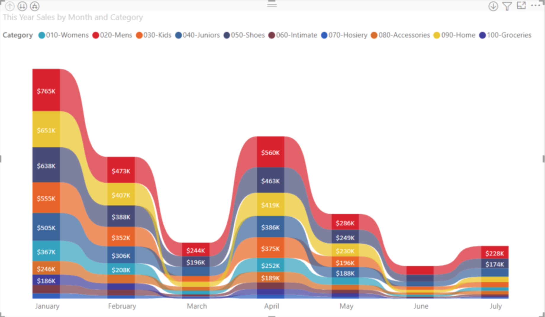
Key Features
- Visualization of Rank: Ribbon charts are particularly effective at visualizing rank or order, as the stacked layout naturally highlights the top performers.
- Comparison of Values: The width of each ribbon provides a clear visual comparison of the relative values of different categories.
- Identification of Trends: Comparative ribbon charts can be used to identify trends and patterns in your data over time.
- Easy to Interpret: Ribbon charts are visually appealing and relatively easy to interpret, even for users who are not familiar with data visualization.
Limitations
- Limited Data Density: Ribbon charts can become cluttered and difficult to read when there are many categories or data points.
- Lack of Detail: Ribbon charts do not provide much detail about the underlying data. They are best used for high-level comparisons or identifying trends.
- Not Suitable for All Data Types: Ribbon charts are not suitable for all types of data. They are best used for data that has a natural order or rank, such as sales figures, website traffic, or survey results.
9. Treemap Charts
Definition
A treemap chart is a hierarchical visualization that represents data as nested rectangles. Each rectangle corresponds to a category or value within the data, and its size is proportional to the magnitude of that category or value. This makes treemaps especially useful for visualizing large datasets with multiple levels of hierarchy.
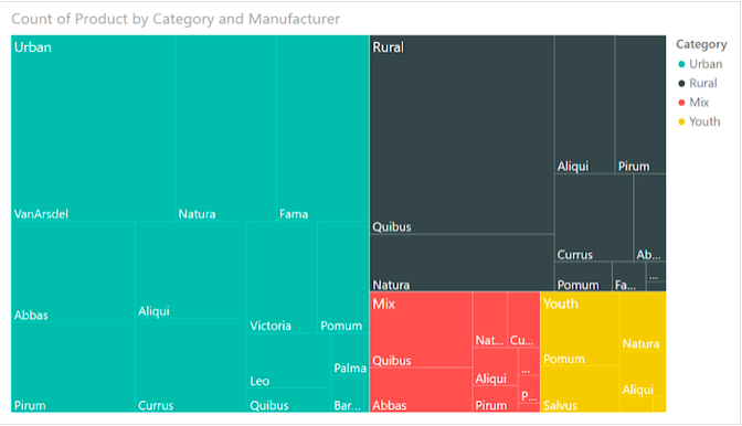
Types
There are two main types of treemap charts in Power BI:
- Squarified Treemap: This type of treemap divides the available space into squares, even if it distorts the rectangles’ aspect ratio. This can make it easier to compare the sizes of different rectangles, but it can also make the chart less visually appealing.
- Slice and Dice Treemap: This type of treemap divides the available space into rectangles with variable aspect ratios, based on the actual size of the data values. This can make the chart more visually appealing, but it can also make it more difficult to compare the sizes of different rectangles.
Key Features
- Hierarchical Data Visualization: Treemaps are ideal for visualizing data that has a hierarchical structure, such as product categories, organizational charts, or geographic regions.
- Large Datasets: Treemaps can effectively display large datasets with multiple levels of hierarchy without cluttering the chart.
- Comparative Analysis: By comparing the sizes of different rectangles, users can easily identify patterns and trends in the data.
- Drill-down Capabilities: Treemaps often have drill-down capabilities, allowing users to explore deeper levels of the hierarchy.
- Color Coding: Colors can be used to represent different categories or values within the data, making it easier for users to distinguish between different parts of the chart.
Limitations
- Limited Detail: Due to their compact nature, treemaps can be limited in the amount of detail they can display. This can be problematic for data with many categories or values.
- Aspect Ratio Distortion: Squarified treemaps can distort the aspect ratio of rectangles, making it difficult to compare the sizes of different rectangles accurately.
- Limited Interactivity: Treemaps are often less interactive compared to other charts, with limited drill-down and filtering options.
- Accessibility: People with visual impairments may have difficulty interpreting treemaps due to the reliance on color and size.
10. Map Charts
Definition
Map charts in Power BI are data visualizations that display information geographically, using maps as the visual canvas. They allow you to analyze spatial patterns and trends in your data, providing valuable insights into how location affects your business metrics.
Types
There are two main types of map charts in Power BI:
- Filled Map (Choropleth): This type of map uses color gradients to represent different data values on different geographical regions. It’s ideal for comparing values across large areas and identifying areas of high or low performance.
- Shape Map: This type of map uses different shapes and colors to represent data points on individual locations. It’s ideal for visualizing discrete values at specific locations and identifying clusters or patterns.
Key Features
- Multiple Location Fields: You can use various location fields like country, state, city, or even custom coordinates to map your data.
- Multiple Data Measures: You can visualize multiple data measures on the map simultaneously using color saturation, size, or tooltips.
- Interactive Filters: Users can filter the map by location, data value, or combination of both, allowing for focused analysis.
- Drill-Down Capabilities: Some map charts, like Drill Down Map PRO, allow users to drill down to lower geographical levels for deeper insights.
- Custom Visuals: The Power BI marketplace offers various custom map visuals with advanced features like dynamic legends, heatmaps, and territory mapping.
Limitations
- Data Accuracy: Map charts rely on accurate location data. Geocoding errors or inconsistencies can impact the accuracy of visualizations.
- Visual Complexity: Adding too much data or using complex color schemes can make the map difficult to interpret.
- Limited Customization: The built-in map options may not offer the desired level of customization for specific needs.
- Performance Issues: Maps with large datasets or complex visuals may experience performance issues, impacting responsiveness.
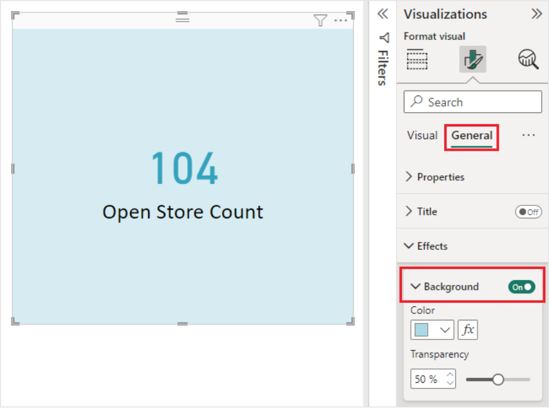
11. Cards
Definition
Card charts are data visualization elements in Power BI that display a single data point with a clear and concise format. They are often used to highlight key metrics, trends, and KPIs (key performance indicators).
Key Features
- Simple and Concise: Cards are easy to understand at a glance, making them ideal for dashboards and reports.
- Customizable: You can customize the card’s appearance, including its color, font, and size.
- Interactive: Cards can be linked to other objects in your report, allowing users to explore further.
- Conditional Formatting: You can change the appearance of a card based on the value it displays.
- Drill Down: Some card types allow you to drill down into the underlying data.
Limitations
- Limited Data: Cards are best for displaying single values or simple metrics.
- Complexity: Building complex visualizations with cards may require additional visuals.
- Limited interactivity: While some cards are interactive, the level of interactivity can vary.
- New card is in Preview: The new card is currently only available in Power BI Desktop and may change before its official release.
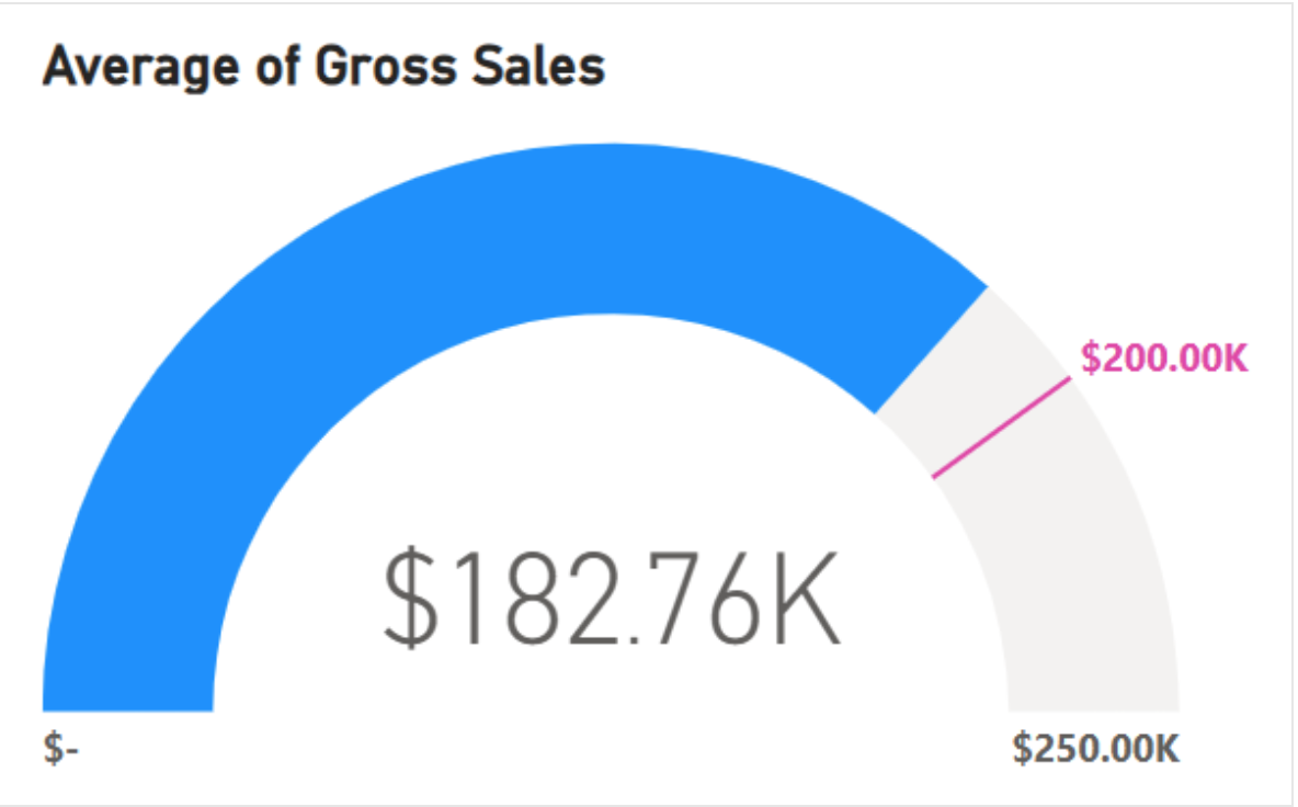
12. Gauge Charts
Definition
A gauge chart is a circular visualization primarily used to measure progress towards a specific goal or target. It visually represents the current value of a metric in relation to a defined minimum and maximum range. This makes it easy to understand at a glance how close one is to achieving the desired outcome.
Types of Gauge Charts in Power BI
- Radial Gauge: This is the most common type of gauge chart and is shaped like a half-circle. The current value is typically indicated by a needle or pointer, and the minimum and maximum values are displayed on the gauge face.
- Card Gauge: This type of gauge chart is rectangular in shape and displays the current value, minimum value, maximum value, and any additional information in a card-like format.
- Linear Gauge: This type of gauge chart is similar to a progress bar and uses a horizontal line to represent the progress toward a goal.
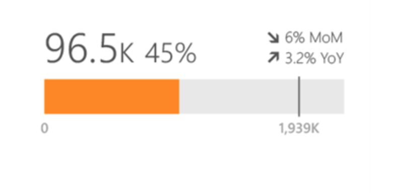
Key Features
- Intuitive and Easy to Understand: Gauge charts are visually appealing and quickly communicate the current state of a metric.
- Highlight Progress Toward Goals: They effectively show how close one is to achieving a desired outcome.
- Customizable: Gauge charts can be customized to display different colors, fonts, and styles to match the specific needs of your report.
- Interactive: Users can interact with gauge charts by hovering over different sections to see additional information.
Limitations
- Limited Data Complexity: Gauge charts are best suited for displaying simple metrics with clearly defined minimum and maximum values.
- Difficulty in Comparing Multiple Values: Comparing multiple values side-by-side can be challenging with gauge charts.
- Limited Visual Space: Gauge charts can be small and may not be suitable for displaying large amounts of data.
13. Matrix Charts
Definition
A matrix chart in Power BI is a versatile visualization tool used to display and compare data across various categories and measures. It combines the functionality of a table and a chart, offering a concise and interactive way to analyze complex datasets.
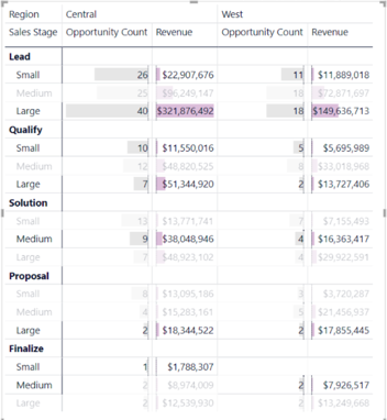
Key Features
- Data Aggregation: Automatically aggregates data by rows, columns, and grand totals.
- Drill-down: This allows you to drill down into specific data points for further analysis.
- Cross-highlighting: Highlights data points across the matrix and other visuals on the report page.
- Conditional Formatting: Apply formatting rules to emphasize specific data points visually.
- Customizable Headers: Define custom headers for rows and columns.
- Sorting: Sort data by rows, columns, or values.
- Filtering: Filter data based on specific criteria.
Limitations
- Only supports line and mini charts within the matrix cells.
- Large datasets can cause performance issues.
- Limited formatting options for individual cells.
- Not ideal for displaying complex relationships between variables.
14. Radar Charts
Definition
A radar chart, a spider or web chart, is a multivariate data visualization that helps compare multiple variables for different categories. It displays the data points on axes radiating from a central point, like a spider web. Each axis represents a variable and the distance of a data point from the center on that axis represents the value of the variable. A polygon is then created by connecting the data points.
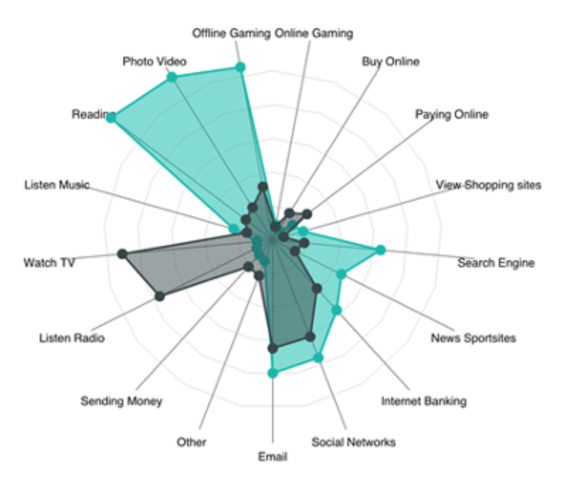
Types
There are three main types of radar charts in Power BI:
- Filled Radar Chart: This is the most common type of radar chart. The area enclosed by the polygon is filled with a color, which can help highlight differences between categories.
- Line Radar Chart: This radar chart only shows the lines connecting the data points. This can be useful for showing the trends of the data over time.
- Area Radar Chart: This type of radar chart is a combination of the filled and line radar chart. It shows both the filled area and the lines connecting the data points.
Key Features
- Radar charts are good for comparing multiple variables for different categories.
- They can help identify patterns and trends in the data.
- They are relatively easy to understand and interpret.
- Power BI offers several customization options for radar charts, such as color, labels, and grid lines.
Limitations
- Radar charts can become cluttered and difficult to read if there are too many variables or categories.
- They are not ideal for showing the absolute values of variables.
- They can be misleading if the axes are not scaled correctly.
15. Candlestick Charts
Definition
A candlestick chart is a specialized chart type used to visualize financial data, particularly stock prices. It uses candles or bars to represent the high, low, open, and close prices of a security over a specific period. This visual representation allows investors and analysts to quickly identify trends and patterns in price movements.
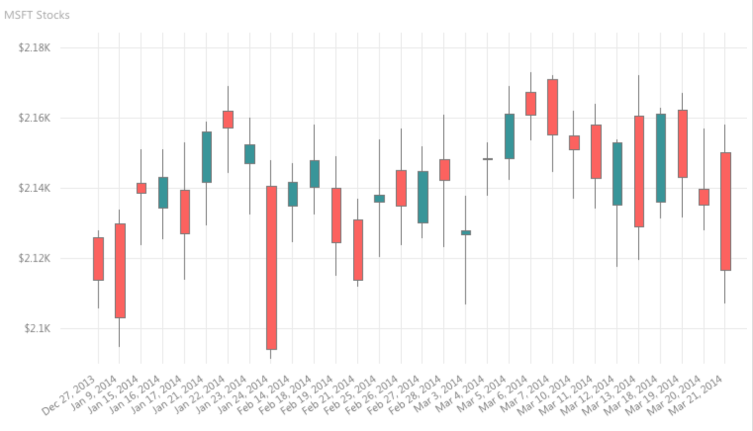
Key Features
- Visualize Price Movements: Candlestick charts make it easy to see the relationship between open, high, low, and close prices for security. This allows investors to identify trends and patterns quickly.
- Highlight Price Gaps: Candlestick charts clearly show any gaps in price data, which can help identify potential trading opportunities.
- Provide Technical Analysis Indicators: Candlestick charts can be used with various technical analysis indicators, such as Bollinger Bands and moving averages, to analyze price movements further.
- Customization Options: Power BI allows users to customize candlestick charts’ colors, styles, and sizes to suit their preferences.
Limitations
- Complexity: Candlestick charts can be complex to understand for beginners. They require some knowledge of technical analysis terminology and concepts.
- Limited Data: Candlestick charts are most effective with large amounts of historical data. They may not be as useful for analyzing short-term price movements.
- Focus on Price: Candlestick charts primarily focus on price movements. They do not provide information about other factors influencing the price, such as news events or company announcements.
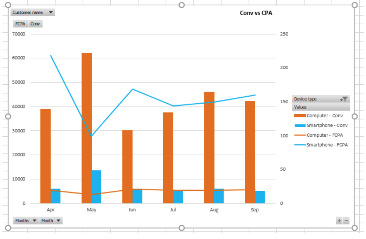
16. Combo charts
Definition
A combo chart in Power BI is a single visualization that combines two different chart types, typically a line chart and a column chart. This allows you to display different types of data in the same context, making it easier to identify trends and relationships between them.
Types of Combo Charts in Power BI
There are two main types of combo charts available:
- Line and Stacked Column Chart: This chart helps compare two measures on different scales. The line chart represents one measure, and the stacked column chart illustrates the other.
- Line and Clustered Column Chart: This chart helps compare multiple measures on the same scale. The line chart represents one measure, and each cluster of columns represents a different measure.
Key Features
Combo charts offer several advantages over traditional chart types:
- Increased Data Density: Combining two charts in one allows you to display more data without cluttering your report.
- Improved Trend Analysis: The line chart makes it easier to identify trends over time, while the column chart provides a snapshot of the data at specific points.
- Enhanced Clarity: By using different chart types for different measures, distinguishing between them and identifying relationships can be easier.
Limitations
Despite their advantages, combo charts also have some limitations:
- Complexity: Combo charts can be more complex to create and understand than traditional charts.
- Limited Chart Types: Only two types of combo charts are currently available in Power BI.
- Potential for Misinterpretation: Combo charts can be misleading or difficult to interpret if not designed carefully.
17. Box and Whisker charts
Definition
Box and Whisker charts, also known as box plots, are visual representations of the distribution of a quantitative variable. They summarize the data and identify patterns, outliers, and central tendency.
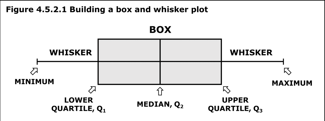
Key Features
- Summary of Data Distribution: Quickly visualize the data’s central tendency, spread, and skewness.
- Outlier Identification: Easily identify outliers and data points outside the expected range.
- Comparison of Multiple Groups: Easily compare data distribution across categories or groups.
- Customizable Appearance: Box and whisker charts with different colors, labels, and formatting options can be customized.
Limitations
- Limited Detail: Box and whisker charts do not show the individual data points, which can help understand the data in more detail.
- Not Suitable for Small Datasets: Box and whisker charts are not as effective for small datasets, as they may not show a clear distribution.
- Potential for Misinterpretation: Box and whisker charts can be misinterpreted without properly labeling and explaining.
18. Heat Map Charts
Definition
A heatmap in Power BI is a data visualization that uses color gradients to represent the magnitude of a measure across two dimensions. It is a powerful tool for identifying patterns, trends, and outliers in your data.
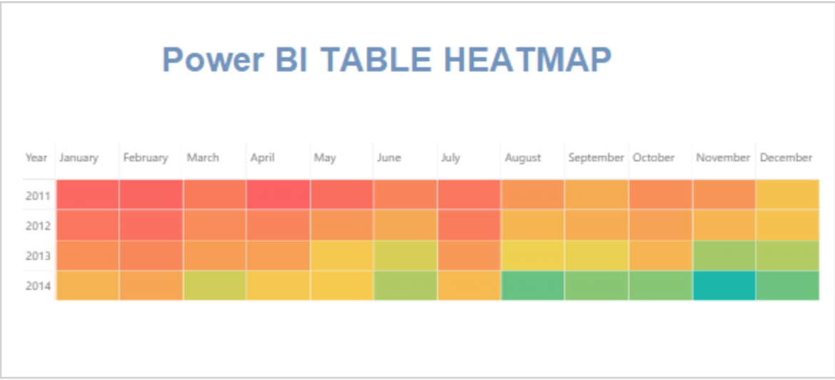
Key Features
- Visual Representation of Relationships: Heatmaps can quickly and easily reveal patterns and trends in your data, making it easier to understand relationships between variables.
- Highlighting Outliers: Highlighting cells with colors that deviate significantly from the average can help you identify outliers and anomalies in your data.
- Customization Options: Power BI heatmaps offer a variety of customization options, including color gradients, cell sizes, and tooltips.
- Interaction: You can interact with heatmaps by hovering over cells to see the underlying data. You can also filter and slice the data to focus on specific areas of interest.
Limitations
- Limited Data Size: Heatmaps can become difficult to read and interpret when there are too many data points.
- Color Perception: Color perception can vary depending on the individual, which may make it difficult to accurately interpret the data.
- Accessibility: Heatmaps can be difficult to access for people with visual impairments.
19. Decomposition Tree charts
Definition
A decomposition chart, also known as a decomposition tree, is a hierarchical visualization tool in Power BI used to analyze the breakdown of a single measure into multiple contributing factors. It presents data in a nested structure, where each level provides a deeper understanding of the composition of the overall value.
Types
There are two main types of decomposition charts in Power BI:
- Single measure decomposition tree: This type analyzes the breakdown of a single measure into several contributing factors.
- Comparative decomposition tree: This type compares the decomposition of two or more measures across different levels, allowing for the identification of similarities and differences.
Key Features
- Hierarchical Structure: Data is presented in a nested hierarchy, making it easy to drill down and analyze contributing factors at different levels.
- Interactive Drill-down: Users can click on nodes in the tree to explore the breakdown at different levels, providing deeper insights into the data.
- Flexible Configuration: Users can customize the tree structure, including the levels of detail displayed and the order of nodes.
- Data Aggregation: Aggregate Values at each level of the hierarchy, summarizing the contributing factors.
- Visual Representation: The tree structure and color gradients help users quickly identify patterns and trends in the data.
Limitations
- Data Complexity: Decomposition charts can become complex and difficult to read with a large number of contributing factors.
- Limited Comparison: While comparing two measures is possible, the visualization can become crowded and difficult to interpret with more than a few comparisons.
- Limited Customization: While some customization options are available, the overall structure and design of the decomposition chart are limited.
- Premium Capacity Requirement: Decomposition charts require Power BI Premium capacity to function.
20. Key Influencers Charts
Definition
A Key Influencers chart is an AI-powered visualization in Power BI that helps you identify the key factors influencing a specific metric. It uses machine learning algorithms to analyze your data and uncover hidden relationships and patterns that contribute to the chosen metric’s value.
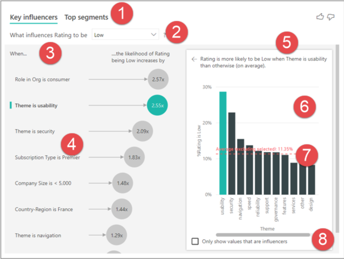
Key Features
- Uncover Hidden Insights: Key Influencers help you discover hidden relationships and patterns in your data that you might not have found otherwise. This can provide valuable insights into the factors driving your business outcomes.
- Visualize Complex Data: The visual presentation of the chart makes it easy to see the relationships between different variables. This can be especially helpful for understanding complex data sets.
- Interactive Exploration: You can interact with the chart to explore the data further. For example, you can filter the data by specific segments or influencers to see how they affect the metric.
- AI-powered Insights: The machine learning algorithms used in the chart can provide more accurate and insightful results than traditional methods of analysis.
Limitations
- Data Dependency: The Key Influencers chart relies heavily on the quality and completeness of your data. The chart may not provide accurate results if your data is inaccurate or incomplete.
- Black Box Nature: The AI algorithms used in the chart are not easily interpretable. This can make understanding why the chart gives you the results is difficult.
- Limited Customization: The chart offers limited customization options. This can make it difficult to tailor the chart to your specific needs.
- New Technology: Key Influencers is still a relatively new technology. It may not be as well-developed or widely used as other Power BI visuals.
21. Q&A Visual
Definition
Q&A charts are a special type of visual in Power BI that allows users to explore their data using natural language. Instead of relying on predefined visualizations and filters, users can ask questions in their own words, and Q&A will automatically generate a chart that best answers their query. This makes it a powerful tool for users unfamiliar with data visualization’s intricacies or who want quick answers from their data.
Key Features
- Natural Language Queries: Ask questions in plain English. There is no need to learn specific formulas or syntax.
- Interactive Exploration: Refine your questions and explore different aspects of your data without recreating visuals.
- Visual Discovery: Q&A automatically generates the most appropriate chart based on your question.
- Accessibility: Makes data exploration easier for users unfamiliar with data analysis tools.
- Embedded Visuals: Embed Q&A charts within reports and dashboards for further analysis.
Limitations
- Limited Visualization Types: Currently, Power BI does not support all visualizations.
- Data Understanding: Q&A requires a good understanding of the underlying data structure and relationships between fields.
- Complex Queries: Interpreting more complex questions may require trial and error to achieve accurate understanding.
- Limited Customization: Once you convert a Q&A visual to a standard visual, its customization options become limited.
- Performance: Q&A performance may decrease with large datasets or complex queries.
B. Reports
Reports in Power BI are collections of visuals, reports, and other data that provide a consolidated view of business data. Reports are highly customizable in Power BI. Users can pin visuals, tables, and other data to their reports and customize the report’s layout and appearance to suit their needs.
Choosing the Right Power BI Visualization
Choosing the right Power BI Visualization depends on the data you are working with and the insights you want to gain. Understanding the data, the audience and the message you want to convey is essential.
Best Practices for Power BI Visualization
Following best practices in Power BI Visualization ensures your visuals are appealing and effectively convey the correct information. Some of these practices include choosing the right chart type, using colors effectively, keeping it simple, and focusing on the data.
Conclusion
Power BI Visualizations is a powerful tool that can transform raw data into meaningful insights. It offers a wide range of visualization options, from simple charts to complex reports, allowing users to choose the best way to present their data. By understanding and applying the principles of Power BI Visualization, you can make the most of this tool and take your data analysis to the next level.
Want to become a full-stack data scientist? It is time for you to power ahead in your AI & ML career with our BlackBelt Plus Program!


