article thumbnail

I Am Done Using Visual Studio!

Paul Turley

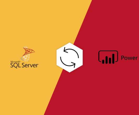
For several years, Visual Studio has been my go-to tool for designing semantic data models used for Business Intelligent reporting. Back in 2005, I used the Business Intelligence Development Studio (BIDS) Visual Studio add-in for SSIS, SSRS and SSAS projects to develop BI solutions with multidimensional cubes.

article thumbnail

Chart Snapshot: Functional Box Plots

The Data Visualisation Catalogue

While this visualisation technique is a variation of the classic Box Plot , a Functional Box Plot is visually very different and instead plots a combination of lines and areas to communicate the various data ranges. 2012, Environmetrics, 23: 54-64. and Genton, M.G., link] Functional boxplots for multivariate curves Sun, Y.

Snapshot 101
Insiders

Sign Up for our Newsletter

This site is protected by reCAPTCHA and the Google Privacy Policy and Terms of Service apply.

Trending Sources

article thumbnail

Designing Visual Appendices for Your Next Report—In Under an Hour

Depict Data Studio

Here’s what tables in the back of reports typically look like: Tiny font sizes, cluttered tables, and no visuals to help readers spot the key patterns. Introducing… Visual Appendices! Here’s my wish for your next report: Visual appendices! Third, add visuals! 3 Quick Visuals to Include in Appendices.

article thumbnail

A Guide To The Methods, Benefits & Problems of The Interpretation of Data

datapine

In fact, a Digital Universe study found that the total data supply in 2012 was 2.8 Through the art of streamlined visual communication, data dashboards permit businesses to engage in real-time and informed decision-making and are key instruments in data interpretation. trillion gigabytes! agree, strongly agree, disagree, etc.).

article thumbnail

Understanding The Value Of Column Charts With Examples & Templates 

datapine

2) Pros & Cons Of Column Charts 3) When To Use A Column Graph 4) Types Of Column Charts 5) Column Graphs & Charts Best Practices 6) Column Chart Examples Data visualization has been a part of our lives for many many years now. They are easy to understand: Column graphs are one of the easiest visualizations to understand.

article thumbnail

Orchestrate an end-to-end ETL pipeline using Amazon S3, AWS Glue, and Amazon Redshift Serverless with Amazon MWAA

AWS Big Data

Add this policy to the AWS Glue role and Amazon MWAA role: { "Version": "2012-10-17", "Statement": [ { "Effect": "Allow", "Action": [ "s3:GetObject", "s3:PutObject", "s3:PutObjectAcl" ], "Resource": "arn:aws:s3:::sample-inp-bucket-etl- /*" } ] } In Account B, create the IAM policy policy_for_roleB specifying Account A as a trusted entity.

Metadata 101
article thumbnail

Accelerate analytics on Amazon OpenSearch Service with AWS Glue through its native connector

AWS Big Data

AWS Glue provides both visual and code-based interfaces to make data integration effortless. You can now use data stored in OpenSearch Service indexes as a source or target within the AWS Glue Studio no-code, drag-and-drop visual interface or directly in an AWS Glue ETL job script. Choose Create job and Visual ETL.