Remove 2013 Remove Key Performance Indicator Remove Metrics Remove Slice and Dice
article thumbnail

Great Storytelling With Data: Visualize Simply And Focus Obsessively

Occam's Razor

Second, between 2012 and 2013. You are just comparing performance, and the numbers would only clutter the slide. When I present it, I'll say something like "Our peak investment, in Aquantive in 2013, was 700k." Despite that, I bet it was still harder than necessary for you to figure out what is going on.

article thumbnail

It's Not The Ink, It's The Think: 6 Effective Data Visualization Strategies

Occam's Razor

Too many bars, inside them too many slices, odd color choices, all end up with this question: what the heck's going on here? There is only one simple message above, and just two metrics that matter. We throw off a lot of data as a subtle way of earning a great job performance review. Reach for the higher order bit.

article thumbnail

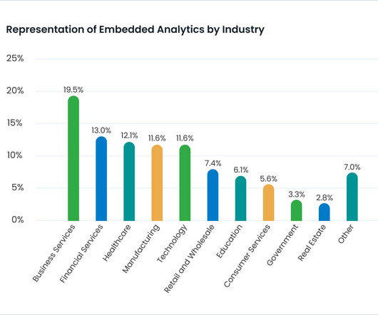
What Is Embedded Analytics?

Jet Global

Companies like Tableau (which raised over $250 million when it had its IPO in 2013) demonstrated an unmet need in the market. As a result, end users can better view shared metrics (backed by accurate data), which ultimately drives performance. Interactivity can include dropdowns and filters for users to slice and dice data.