Remove 2014 Remove Dashboards Remove Data Collection Remove Interactive
article thumbnail

6 Case Studies on The Benefits of Business Intelligence And Analytics

datapine

BI software uses algorithms to extract actionable insights from a company’s data and guide its strategic decisions. BI users analyze and present data in the form of dashboards and various types of reports to visualize complex information in an easier, more approachable way.

article thumbnail

QlikView vs Qlik Sense vs FineReport, who is better BI tool in 2023?

FineReport

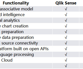
Introduction to Qlik Sense Qlik Sense is an interactive BI product released by QlikTech in 2014. After the business department submits the requirements for reporting or data analysis to the IT department, the IT department develops reports in the design interface. FineReport has more unique features on mobile devices.

Insiders

Sign Up for our Newsletter

This site is protected by reCAPTCHA and the Google Privacy Policy and Terms of Service apply.

Trending Sources

article thumbnail

Euro Soccer Special: What Football Teaches Us About Analytics

Sisense

Sensors in these devices connect to cellular phone transmitters or the club’s Wi-Fi network to monitor the data feeds. The data collected by these devices is used to design personalized training plans. On 8 July 2014, Brazil suffered its worst ever defeat at the hands of Germany, losing 7-1 in the World Cup semifinal.

article thumbnail

Optimizing clinical trial site performance: A focus on three AI capabilities

IBM Big Data Hub

It offers enhanced capabilities to analyze complex and large volumes of comprehensive recruitment data to accurately forecast enrollment rates at study, indication, and country levels. Recommendations can be presented through an interactive dashboard to facilitate understanding and enable stakeholders to make informed decisions.

article thumbnail

Benchmarking Performance: Your Options, Dos, Don'ts and To-Die-Fors!

Occam's Razor

Make sure you don't have anything on your strategic dashboards that does not have a pre-identified target. I can't think of a better way to identify which content we create (pages, videos, interactive quizzes, comparison charts, op ed articles, flash magic thingies) is adding the most value… Again, same strategy.

article thumbnail

Magnificent Mobile Website And App Analytics: Reports, Metrics, How-to!

Occam's Razor

In blue is how much time we spent in 2010 and in blue the time spent in 2014. was the dramatic shift between 2010 to 2014 to mobile content consumption. In this post we will look mobile sites first, both data collection and analysis, and then mobile applications. Repeat, click on that link to play with actual data!).

Metrics 141