Remove 2016 Remove Metrics Remove Testing Remove Visualization
article thumbnail

Why the Data Journey Manifesto?

DataKitchen

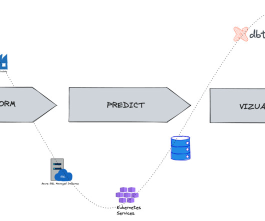
We wrote the first version because, after talking with hundreds of people at the 2016 Strata Hadoop World Conference, very few easily understood what we discussed at our booth and conference session. The Customer Journey visually represents the total sum of experiences any given customer has with a brand. Why should I care?

Testing 130
article thumbnail

13 Essential Data Visualization Techniques, Concepts & Methods To Improve Your Business – Fast

datapine

“By visualizing information, we turn it into a landscape that you can explore with your eyes. 90% of the information transmitted to the brain is visual. Data visualization methods refer to the creation of graphical representations of information. That’s where data visualization comes in. A sort of information map.

Insiders

Sign Up for our Newsletter

This site is protected by reCAPTCHA and the Google Privacy Policy and Terms of Service apply.

article thumbnail

The Top 20 Data Visualization Books That Should Be On Your Bookshelf

datapine

Now that you’re sold on the power of data analytics in addition to data-driven BI, it’s time to take your journey a step further by exploring how to effectively communicate vital metrics and insights in a concise, inspiring, and accessible format through the power of visualization. That’s a colossal number of books on visualization.

article thumbnail

Towards optimal experimentation in online systems

The Unofficial Google Data Science Blog

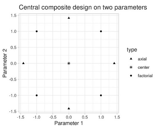
the weight given to Likes in our video recommendation algorithm) while $Y$ is a vector of outcome measures such as different metrics of user experience (e.g., Experiments, Parameters and Models At Youtube, the relationships between system parameters and metrics often seem simple — straight-line models sometimes fit our data well.

article thumbnail

No one knows where America’s helipads are, except this neural network

Insight

In 2016, Uber published its Uber Elevate White Paper , setting its aspirations on providing on-demand air taxis from San Francisco to San Jose for about $130. Alexander | June 1, 2016 Training a c onvolution neural network (CNN) to spot helipads The solution I developed rests on retraining a CNN to recognize helipads in aerial images.

article thumbnail

Techniques for Collecting, Prepping, and Plotting Data: Predicting Social Media-Influence in the NBA

Domino Data Lab

Knowing that the ultimate goal is to compare the social-media influence and power of NBA players, a great place to start is with the roster of the NBA players in the 2016–2017 season. You can add a Makefile command test that will run all of your notebooks by issuing. test: py.test --nbval notebooks/*.ipynb. 35,vjust=1).

article thumbnail

Unlock The Power of Your Data With These 19 Big Data & Data Analytics Books

datapine

And with that understanding, you’ll be able to tap into the potential of data analysis to create strategic advantages, exploit your metrics to shape them into stunning business dashboards , and identify new opportunities or at least participate in the process. It was lately revised and updated in January 2016.

Big Data 263