
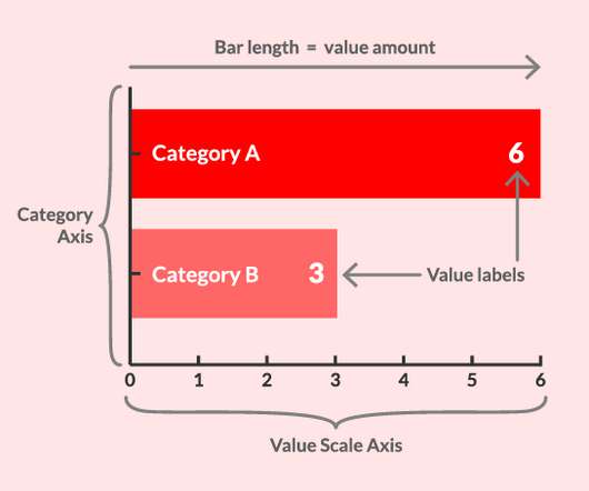
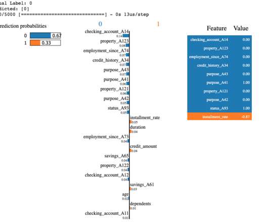
Chart Snapshot: Variable Width Bar Charts
The Data Visualisation Catalogue
MARCH 25, 2024
Here’s how far we have to go — The Washington Post In almost all countries men smoke more than women Visualizing The Smoking Population of Countries — Visual Capitalist The post Chart Snapshot: Variable Width Bar Charts appeared first on The Data Visualisation Catalogue Blog.


Let's personalize your content