article thumbnail

Top 6 Data Analytics Tools in 2019

FineReport

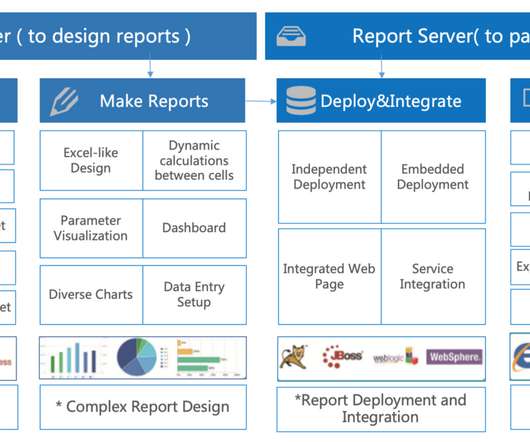
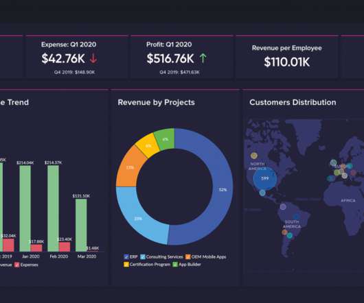
You will find that they are designed according to the data analysis process. First, data processing, data cleaning, and then data modeling, finally data visualization that uses presentation of charts to identify problems and influence decision-making. Comparison of Data Analysis Tools: Excel, R, Python and BI.

article thumbnail

Top 5 BI tools of 2019: Comparison and How to decide

FineReport

In this article, I compared the top 5 BI tools of 2019 based on the overall ease-of-use, BI features, and the price. Pro: Stunning Data Visualization . Unparalleled capabilities of visualizing information are on top of the list of Tableau software benefits. Pro: R script visualization. From Google. Big Data Platform .

Insiders

Sign Up for our Newsletter

This site is protected by reCAPTCHA and the Google Privacy Policy and Terms of Service apply.

article thumbnail

How Do Super Rookies Start Learning Data Analysis?

FineReport

At the same time, it also advocates visual exploratory analysis. The visualization component library of FineReport is very rich. It can be used as a portal for data reporting, or as a platform for business analysis. Besides, Matplotlib and Seaborn are the main visualization tools of Python.

article thumbnail

Top 3 Tableau Alternatives for Data Analysis in the 21st Century

FineReport

It was an American interactive data visualization software company of business intelligence. In 2019, the company was acquired by Salesforce. With the Desktop CS architecture, Tableau runs more smoothly in the design of business analysis. It suits IT staff and business personnel.

KPI 52
article thumbnail

PASS Financials: past, present and the Future:

Jen Stirrup

I went through four years of personal hell as a PASS Board member, taking s**t from people who just did not believe that business analysis, business analytics or similar related technologies such as Power BI had any place at the PASS table. I have visualized the data below so you can see it below. Current Ratio.

Metrics 104
article thumbnail

Great Storytelling With Data: Visualize Simply And Focus Obsessively

Occam's Razor

Avoid complex visualizations – they get in the way! My goal is that you'll learn a set of filters you'll use as you think about the best ways to create your stories, however you choose to tell them with whatever visual output you most love. We added to your analytical skills a demand for business savvy.

article thumbnail

Top 10 Key Features of BI Tools in 2020

FineReport

The metadata here is focused on the dimensions, indicators, hierarchies, measures and other data required for business analysis. Create highly interactive dashboards and content with visual exploration operations and embedded advanced geospatial analysis. Interactive visual exploration. Analytics dashboards.