Remove Analytics Remove Article Remove Statistics Remove Visualization
article thumbnail

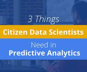
Introduction to Statistics Using the R Programming Language

Analytics Vidhya

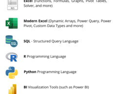
From foundational concepts to advanced techniques, this article is your comprehensive guide. R, an open-source tool, empowers data enthusiasts to explore, analyze, and visualize data with precision.

article thumbnail

Must Known Data Visualization Techniques for Data Science

Analytics Vidhya

ArticleVideo Book This article was published as a part of the Data Science Blogathon Introduction In applied Statistics and Machine Learning, Data Visualization is one. The post Must Known Data Visualization Techniques for Data Science appeared first on Analytics Vidhya.

Insiders

Sign Up for our Newsletter

This site is protected by reCAPTCHA and the Google Privacy Policy and Terms of Service apply.

Trending Sources

article thumbnail

Misleading Statistics Examples – Discover The Potential For Misuse of Statistics & Data In The Digital Age

datapine

1) What Is A Misleading Statistic? 2) Are Statistics Reliable? 3) Misleading Statistics Examples In Real Life. 4) How Can Statistics Be Misleading. 5) How To Avoid & Identify The Misuse Of Statistics? If all this is true, what is the problem with statistics? What Is A Misleading Statistic?

article thumbnail

Descriptive statistics | A Beginners Guide!

Analytics Vidhya

ArticleVideo Book This article was published as a part of the Data Science Blogathon Let us see a short intro about this blog, Descriptive Statistics. The post Descriptive statistics | A Beginners Guide! appeared first on Analytics Vidhya.

article thumbnail

Programming in R – From Variables to Visualizations

Analytics Vidhya

This article was published as a part of the Data Science Blogathon R programing language was developed for statistical computing and graphics which makes it one of the desired candidates for Data Science and Analysis. The post Programming in R – From Variables to Visualizations appeared first on Analytics Vidhya.

article thumbnail

How to Plot Heatmaps in Seaborn?

Analytics Vidhya

Introduction Within the domain of data visualization, heatmaps distinguish themselves for their adeptness in portraying intricate data sets in a visually intuitive manner. This article discusses the nuances of crafting and tailoring […] The post How to Plot Heatmaps in Seaborn? appeared first on Analytics Vidhya.

article thumbnail

How to Use Data Visualization in Infographics?

Analytics Vidhya

Data visualization in infographics is a dynamic way to do so. This article delves into data visualization within infographics and showcases ways to present information both aesthetically and comprehensively. What is Data Visualization? appeared first on Analytics Vidhya.