Remove category
article thumbnail

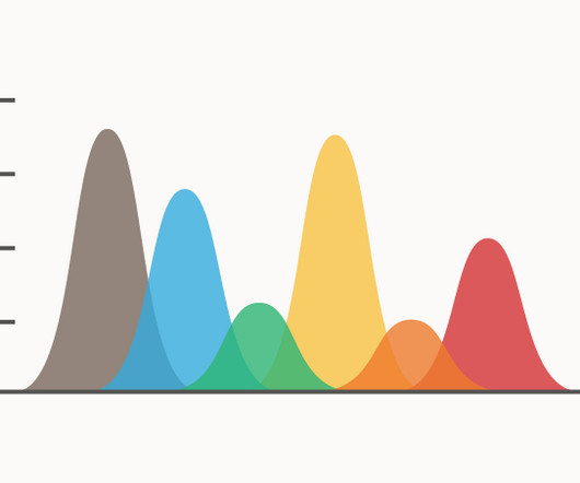
A Complete Guide To Bar Charts With Examples, Benefits, And Different Types 

datapine

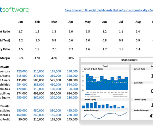
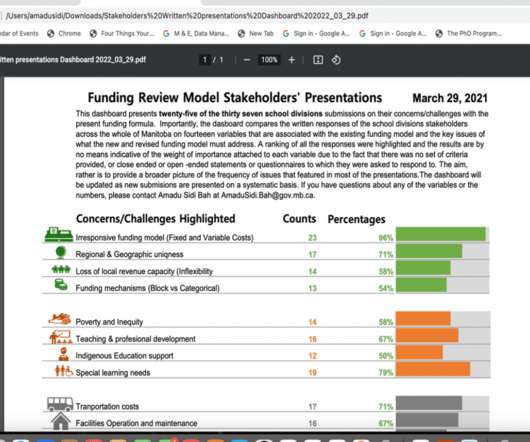
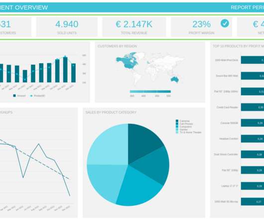
2) Pros & Cons Of Bar Charts 3) When To Use A Bar Graph 4) Types Of Bar Charts 5) Bar Graphs & Charts Best Practices 6) Bar Chart Examples In today’s fast-paced analytical landscape, data visualization has become one of the most powerful tools organizations can benefit from to be successful with their analytical efforts.

article thumbnail

Ultimate List of CFO Blogs and Resources – 2023 Edition

Jet Global

Blogs Podcasts Whitepapers and Guides Tools and Calculators Webinars Sample Reports The Evolution of the CFO into the Chief Data Storyteller View Insight Now Our Favorite CFO Blogs The Venture CFO Blog Link: [link] Are you looking for blog posts for CFOs by CFOs? Then you have come to the right place.

KPI 105
Insiders

Sign Up for our Newsletter

This site is protected by reCAPTCHA and the Google Privacy Policy and Terms of Service apply.

article thumbnail

Understanding The Value Of Column Charts With Examples & Templates 

datapine

2) Pros & Cons Of Column Charts 3) When To Use A Column Graph 4) Types Of Column Charts 5) Column Graphs & Charts Best Practices 6) Column Chart Examples Data visualization has been a part of our lives for many many years now. They are easy to understand: Column graphs are one of the easiest visualizations to understand.

article thumbnail

Chart Snapshot: Curved Bar Charts

The Data Visualisation Catalogue

A Curved Bar Chart is a visually dynamic twist on the traditional Bar Chart. These curves can be oriented vertically or horizontally, with one axis of the chart denoting the specific categories under comparison, while the other axis represents the discrete value scale. Also known as a Curved Column Chart.

article thumbnail

Visualizing 24 School Divisions’ Submissions with a Dashboard in Microsoft Excel

Depict Data Studio

This is because the reports contain little or no visuals. They’re often written in a language style that is not easily comprehensible, boring, and has little consideration for formatting to increase visual appeal. The Idea: Visualizing the Findings. Let me now explain what I did today as I am writing this blog.

article thumbnail

Understanding Data Drill Down And Drill Through Analysis And Their Role In Efficient Reporting

datapine

From automated reporting, predictive analytics, and interactive data visualizations, reporting on data has never been easier. Drill down is an analytical practice that allows you to visualize granular levels of data in one chart. In general, data drills can be added to any chart or data visualization. click to enlarge**.

Reporting 173
article thumbnail

New Format for The Bar Chart Reference Page

The Data Visualisation Catalogue

First, locate the value scale axis and the category axis, to identify what is being visualised. Each category is assigned its own bar and the length of each bar is proportional to the value it represents. Colour-coding can be assigned to the bars to distinguish each category in the dataset. ” in each category.