Remove category python
article thumbnail

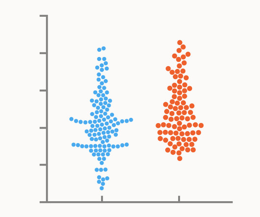
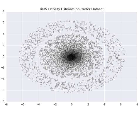
Chart Snapshot: Beeswarm Plot

The Data Visualisation Catalogue

Additionally, colour can be used to represent different categories or an additional variable. This method ensures all data points remain visible, enhancing the visibility of density and variation.

article thumbnail

Chart Snapshot: Dumbbell Plot

The Data Visualisation Catalogue

It is particularly effective for comparing quantitative value ranges across different categories, offering a clear visualisation of the differences or changes between them. The categories or groups are typically represented along one axis, while the quantitative values are plotted along the other axis.

Insiders

Sign Up for our Newsletter

This site is protected by reCAPTCHA and the Google Privacy Policy and Terms of Service apply.

article thumbnail

Chart Snapshot: 100% Stacked Area Graphs

The Data Visualisation Catalogue

The X-axis is used for the time scale, which makes this chart ideal for showing the changing overall percentages of categories over time. The data series for each category is colour-coded, which helps to illustrate a part-to-whole relationship. One solution to this issue could be to group minor categories under an ‘other’ category.

article thumbnail

New Format for The Bar Chart Reference Page

The Data Visualisation Catalogue

First, locate the value scale axis and the category axis, to identify what is being visualised. Each category is assigned its own bar and the length of each bar is proportional to the value it represents. Colour-coding can be assigned to the bars to distinguish each category in the dataset. ” in each category.

article thumbnail

Top BOB Blog Posts of 2018: Data Science, Machine Learning and the Net Promoter Score

Business Over Broadway

All of my top blog posts of 2018 (most reads) are all related to data science, with posts that address the practice of data science, artificial intelligence and machine learning tools and methods that are commonly used and even a post on the problems with the Net Promoter Score claims. Click image to enlarge.

article thumbnail

Data Science Tools: Understanding the Multiverse

Domino Data Lab

While there are certainly engineers and scientists who may be entrenched in one camp or another (the R camp vs. Python, for example, or SAS vs. MATLAB), there has been a growing trend towards dispersion of data science tools. Key categories of tools and a few examples include: Data Sources. They range from flat files (e.g.

article thumbnail

Combine AWS Glue and Amazon MWAA to build advanced VPC selection and failover strategies

AWS Big Data

For the connection name, enter MWAA-Glue-Blog-Subnet1. Repeat these steps using PrivateSubnet2 and name the connection MWAA-Glue-Blog-Subnet2. Replace the placeholder script with the following Python code: import ipaddress import socket subnets = { "PrivateSubnet1": "10.192.20.0/24", Use the default security group. Choose Next.