Remove category spreadsheets
article thumbnail

Move Beyond Excel, PowerPoint And Static Business Reporting with Powerful Interactive Dashboards

datapine

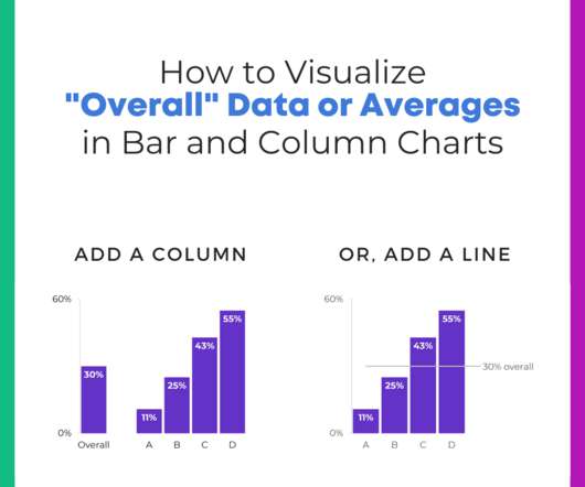
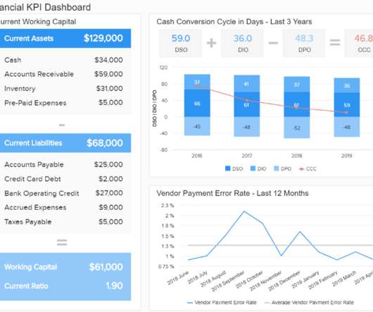
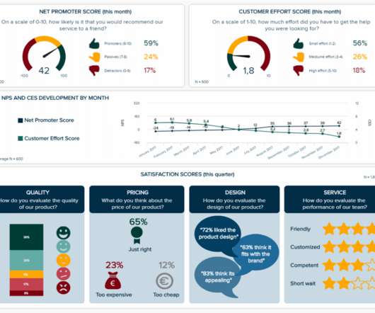
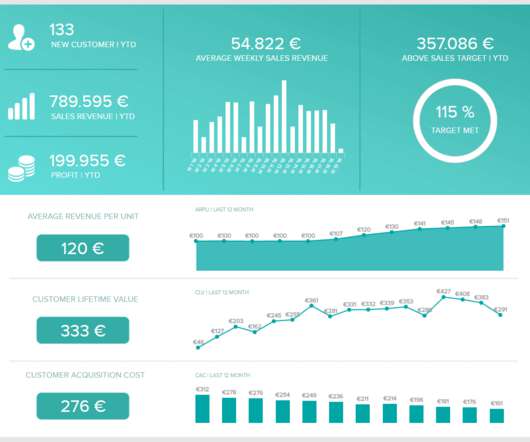
Take a comfortable seat, enjoy the power of interactive business dashboards , leave your spreadsheets behind, and utilize the advantages of interactive dashboard design and its features. Thankfully, it’s also time to take a step back from your spreadsheets and slides. With modern reporting tools , there is no need to do so.

article thumbnail

How to Visualize “Overall” Data or Averages in Bar Charts

Depict Data Studio

You can learn more about adding intentional gaps in this blog post. Bold the Key Words & Color-Code by Category For extra skimmability, we bolded a few key words. Separate colors for separate categories of information. Color-coding by category is one of my all-time favorite dataviz techniques!

Insiders

Sign Up for our Newsletter

This site is protected by reCAPTCHA and the Google Privacy Policy and Terms of Service apply.

article thumbnail

How to Make Interactive Dashboards in Excel

Depict Data Studio

Step 1: Build the Clean, Contiguous Dataset From previous blog posts , you know that table is a tricky term. You can learn more about cleaning, recoding, and transforming datasets inside Simple Spreadsheets , my prerequisite course. You can learn more about the pros and cons of each approach in this blog post.

article thumbnail

Discover 20 Essential Types Of Graphs And Charts And When To Use Them

datapine

2) Charts And Graphs Categories 3) 20 Different Types Of Graphs And Charts 4) How To Choose The Right Chart Type Data and statistics are all around us. Below we will discuss the graph and chart categories. These categories will build a solid foundation that will help you pick the right visual for your analytical aims.

article thumbnail

Using Dashboards to Make a Family Trivia Event Even Better

Depict Data Studio

Before: Compiling the Data in a Spreadsheet. I decided because I had one time point and wanted to compare categories (i.e., I remembered that in the Dashboard Design course Ann had a video on how to compare categories using heatmaps. Here’s a blog post tutorial you can read.). teams) that bars would likely be best.

article thumbnail

How to Organize Your PowerPoint Slides by Adding Sections

Depict Data Studio

I started to write a blog post with screenshots about sections… but that felt impossible. Sections help us organize our slides into meaningful groups, categories, chunks, buckets, or chapters of a presentation. I personally like using sections so I can think about an entire category of slides that should be shown or hidden.).

IT 94
article thumbnail

What is zero-based budgeting?

IBM Big Data Hub

In this blog post, we will delve into the concept of zero-based budgeting, exploring its definition, advantages, disadvantages, implementation steps, and tools needed. By evaluating each expense category, decision-makers gain better visibility into the cost structure of the organization.