Remove top-5-static-visualizations
article thumbnail

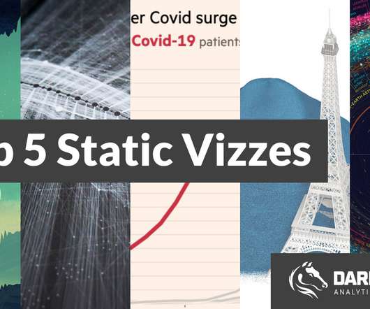
Most Inspiring: Top 5 Static Visualizations

Darkhorse

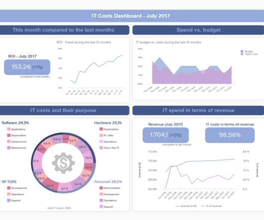
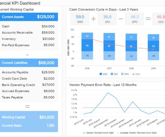
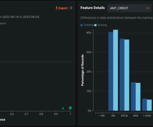
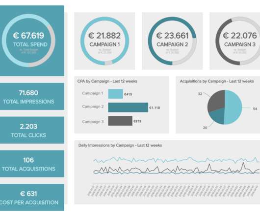
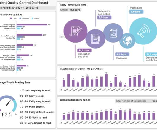
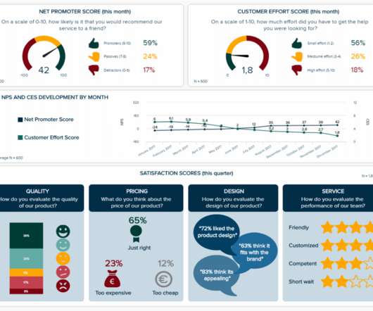
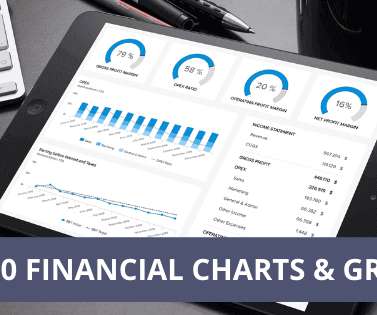
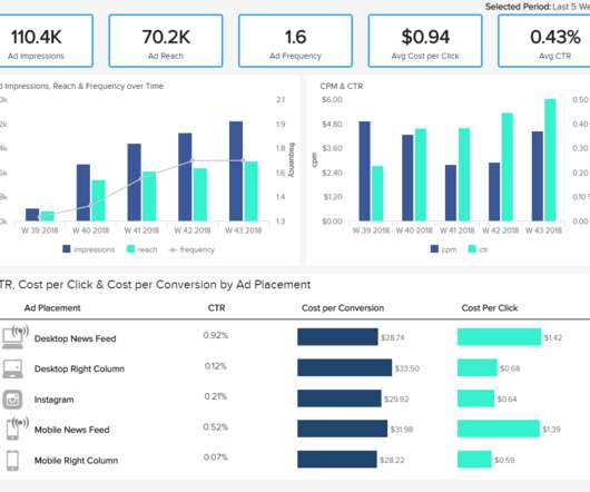
Bar charts, pie charts, and line charts are the most common types of visualizations. What are some other charts or ways to make your static data more interesting? 6 minute video: 5 of the Most Inspiring Static Visualizations we’ve come across. Different charts and colors can make visualizations more engaging.

article thumbnail

Discover The Power Of Modern Performance Reports – See Examples & Best Practices 

datapine

At the time, this was not an issue, as the static nature of reporting was the norm. It is no longer enough to get a static view of the past. A performance report is an analytical tool that offers a visual overview of how a business is performing in a specific strategy, project, or department. What Is A Performance Report?

Reporting 207
Insiders

Sign Up for our Newsletter

This site is protected by reCAPTCHA and the Google Privacy Policy and Terms of Service apply.

article thumbnail

Understanding Data Drill Down And Drill Through Analysis And Their Role In Efficient Reporting

datapine

From automated reporting, predictive analytics, and interactive data visualizations, reporting on data has never been easier. Drill down is an analytical practice that allows you to visualize granular levels of data in one chart. In general, data drills can be added to any chart or data visualization. click to enlarge**.

Reporting 173
article thumbnail

Take Advantage Of Modern CEO Dashboards – Examples And Templates

datapine

Here, we’ll consider what a leadership dashboard is, what it does, explore a selection of real-world CEO dashboard examples to demonstrate the power of this valuable leadership tool followed by top tips to create CEO reports. The right design & visualizations. CMO Dashboard For Top Marketing Performance. Return on Equity.

article thumbnail

Utilize The Undeniable Power Of Professional COO Dashboards & Reports

datapine

That’s why using a modern dashboard tool is vital for monitoring and analyzing multiple touchpoints and presenting data in real-time, visually, and with strong interactivity levels so any operational activity can’t be left unnoticed. Top COO Dashboard & Report Examples. What is a COO report? What Is A COO Dashboard?

article thumbnail

Get Started With Business Performance Dashboards – Examples & Templates

datapine

That said, if you’re looking to evolve your empire, increase brand awareness, and boost your bottom line, embracing business performance dashboards and big data should be at the top of your priority list. Exclusive Bonus Content: Stay on top of your business performance! Download our pocket-sized summary and improve your operations!

article thumbnail

Designing Charts and Graphs: How to Choose the Right Data Visualization Types

datapine

Modern dashboard software makes it simpler than ever to merge and visualize data in a way that’s as inspiring as it is accessible. Knowing what story you want to tell (analyzing the data) tells you which data visualization type to use. Let’s assume you have the right data and the right data visualization software. Distribution.