Remove towards-better-visualizations-part-2
article thumbnail

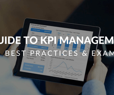
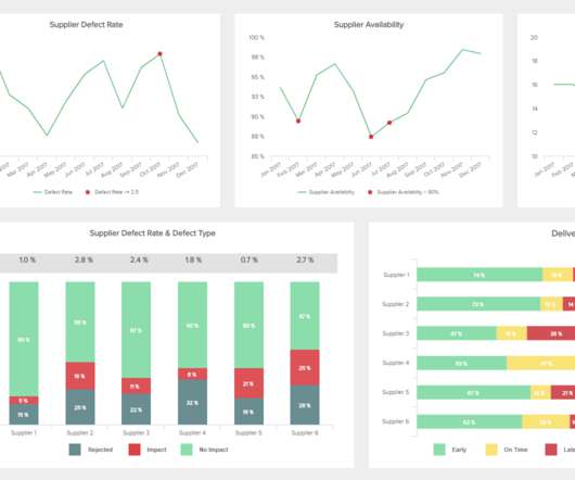
KPI Management And Best Practices: How To Find The Perfect KPI Solutions?

datapine

2) Why Do KPIs Matter? 4) How to Select Your KPIs 5) Avoid These KPI Mistakes 6) How To Choose A KPI Management Solution 7) KPI Management Examples Fact: 100% of statistics strategically placed at the top of blog posts are a direct result of people studying the dynamics of Key Performance Indicators, or KPIs. What happens next?

KPI 221
article thumbnail

Take Advantage Of The Best Interactive & Effective Data Visualization Examples

datapine

Table of Contents 1) The Benefits Of Data Visualization 2) Our Top 27 Best Data Visualizations 3) Interactive Data Visualization: What’s In It For Me? 4) Static vs. Animated Data Visualization Data is the new oil? ” – David McCandless Humans are visual creatures. No, data is the new soil.”

Insiders

Sign Up for our Newsletter

This site is protected by reCAPTCHA and the Google Privacy Policy and Terms of Service apply.

article thumbnail

Customer Retention Dashboard & Metrics Examples For Modern Companies

datapine

A customer retention dashboard and metrics depicted in a neat visual will help you in monitoring, analyzing, and managing multiple customer-centric points and how they echo in your business. A professional dashboard maker can help in the process, but let’s see this through some visual examples of customer retention.

article thumbnail

A Complete Guide To Driving Digital Transformation In Marketing

datapine

An accounting department may consider leveraging electronic contracts, data collecting, and reporting as a part of the digital transition. First, they need to pick up the right tools that allow marketing teams to assess the organization’s progress and better understand the behavior of its clients. Create A Marketing Funnel.

article thumbnail

Get Started With Interactive Weekly Reports For Performance Tracking

datapine

2) Why Are Weekly Progress Reports Important? Armed with powerful visualizations and real-time data, modern weekly summary reports enable businesses to closely monitor their performance and the progress of their strategies to extract relevant insights and optimize their processes to ensure constant growth. Table of Contents.

article thumbnail

13 Essential Data Visualization Techniques, Concepts & Methods To Improve Your Business – Fast

datapine

“By visualizing information, we turn it into a landscape that you can explore with your eyes. 90% of the information transmitted to the brain is visual. Data visualization methods refer to the creation of graphical representations of information. That’s where data visualization comes in. A sort of information map.

article thumbnail

Your Introduction To CFO Dashboards & Reports In The Digital Age

datapine

CFO reports provide a mix of visual KPIs geared towards helping financial officers make confident, informed decisions based on a variety of core financial activities. The berry ratio is a CFO KPI that visualizes and quantifies the ratio of gross profit in relation to operating expenses. 2) Financial KPIs.