Remove category data-visualization
article thumbnail

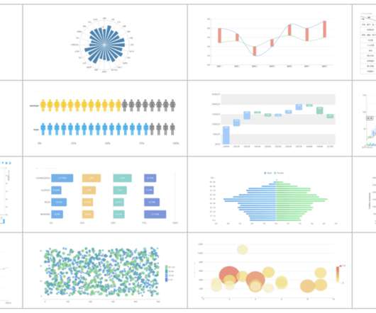
Pie Chart Matplotlib: A Guide to Create and Customize Pie Charts

Analytics Vidhya

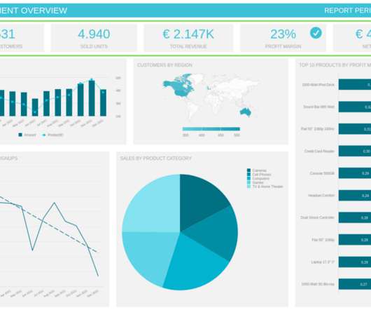
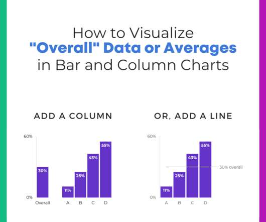
Introduction Pie charts, a widely used visualization tool, represent data proportions in a circular format. Each slice corresponds to a category, facilitating quick comparisons. Importance of Pie Charts in Data Visualization Pie charts play a crucial role in data visualization for several reasons.

article thumbnail

Area Chart in Python

Analytics Vidhya

Introduction Data visualization is a crucial aspect of data analysis, aiding in comprehending and communicating complex datasets. Among the myriad visualization techniques available, area charts stand out for effectively representing quantitative data over time or categories.

Insiders

Sign Up for our Newsletter

This site is protected by reCAPTCHA and the Google Privacy Policy and Terms of Service apply.

article thumbnail

A Complete Guide To Bar Charts With Examples, Benefits, And Different Types 

datapine

2) Pros & Cons Of Bar Charts 3) When To Use A Bar Graph 4) Types Of Bar Charts 5) Bar Graphs & Charts Best Practices 6) Bar Chart Examples In today’s fast-paced analytical landscape, data visualization has become one of the most powerful tools organizations can benefit from to be successful with their analytical efforts.

article thumbnail

Discover 20 Essential Types Of Graphs And Charts And When To Use Them

datapine

2) Charts And Graphs Categories 3) 20 Different Types Of Graphs And Charts 4) How To Choose The Right Chart Type Data and statistics are all around us. That is because graphical representations of data make it easier to convey important information to different audiences. Below we will discuss the graph and chart categories.

article thumbnail

How To Build A Treemap In 3 Ways Using Python

Analytics Vidhya

This article was published as a part of the Data Science Blogathon Introduction Quite often we have a requirement to visualize categorical data in a dataset. The post How To Build A Treemap In 3 Ways Using Python appeared first on Analytics Vidhya.

article thumbnail

Understanding The Value Of Column Charts With Examples & Templates 

datapine

2) Pros & Cons Of Column Charts 3) When To Use A Column Graph 4) Types Of Column Charts 5) Column Graphs & Charts Best Practices 6) Column Chart Examples Data visualization has been a part of our lives for many many years now. They are easy to understand: Column graphs are one of the easiest visualizations to understand.

article thumbnail

Chart Snapshot: Beeswarm Plot

The Data Visualisation Catalogue

A Beeswarm Plot is a type of visualisation that displays individual data points in a way that they don’t overlap, resulting in a plot that resembles a swarm of bees. The main aim of a Beeswarm Plot is to display the distribution and density of data along a numerical axis more clearly.