Remove category r
article thumbnail

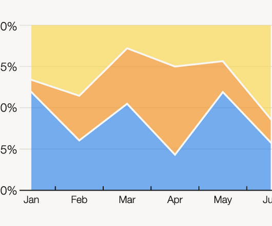
Chart Snapshot: 100% Stacked Area Graphs

The Data Visualisation Catalogue

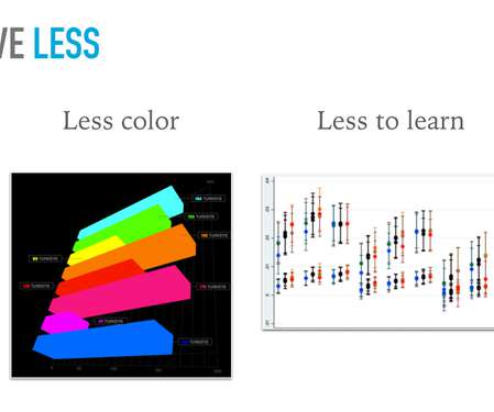
The X-axis is used for the time scale, which makes this chart ideal for showing the changing overall percentages of categories over time. The data series for each category is colour-coded, which helps to illustrate a part-to-whole relationship. One solution to this issue could be to group minor categories under an ‘other’ category.

article thumbnail

New Format for The Bar Chart Reference Page

The Data Visualisation Catalogue

First, locate the value scale axis and the category axis, to identify what is being visualised. Each category is assigned its own bar and the length of each bar is proportional to the value it represents. Colour-coding can be assigned to the bars to distinguish each category in the dataset. ” in each category.

Insiders

Sign Up for our Newsletter

This site is protected by reCAPTCHA and the Google Privacy Policy and Terms of Service apply.

article thumbnail

10 Open Source and Free Data Visualization Tools You Can’t-Miss

FineReport

Free data visualization tools are professional in different categories: dashboard, chart, maps, network, and so on. FineReport provides more than 19 categories and 50+ styles of HTML5 charts. Category : Reports and Dashboards. Category : charts and graphs. Category : charts and graphs. From FineReport. From Google.

article thumbnail

The Syntax, Semantics, and Pragmatics Gap in Data Quality Validation Testing 

DataKitchen

To understand the time crunch that data engineers face and how it prevents them from testing their data sufficiently, we can think about three categories of data tests, using linguistics as an analogy: data syntax vs. semantics vs. pragmatics. In linguistics, Syntax is the study of sentence structure and grammar rules.

article thumbnail

Huabao sniffs out the ultimate efficiency formula

CIO Business Intelligence

Scents of the future Based in Hong Kong, the Huabao Group was established in 1996, specializing in research and development (R&D), production, and sales of fragrances and flavors. These are among the factors that led to the Huabao Group winning a 2023 SAP Innovation Award in the Transformation Titan category.

article thumbnail

A Sales Dashboard Tells You What People Like Most to Buy for Christmas 2019

FineReport

The bar chart below shows the sales of each category of products, and the line chart above shows the annual sales of a certain category of products. In the upper right corner of the dashboard is a word cloud diagram showing the categories of Christmas gifts people most want. We can also customize the style of the flow lines.

article thumbnail

Data Science Journey Walkthrough – From Beginner to Expert

Smart Data Collective

Programming Language (R or Python). Programmers can start with either R or Python. For academics and domain experts, R is the preferred language. For academics and domain experts, R is the preferred language. R being a statistical language is an easier option. Python can be added to the skill set later.