Remove courses dashboard-design
article thumbnail

Designing Templates to Improve Workflow and Efficiency

Depict Data Studio

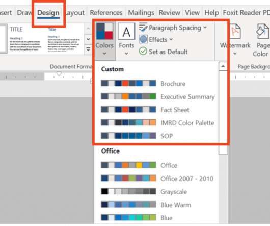
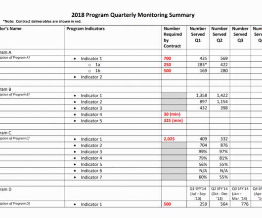
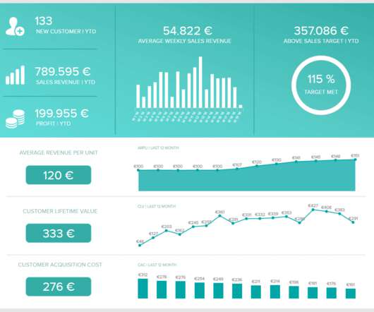
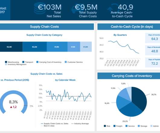
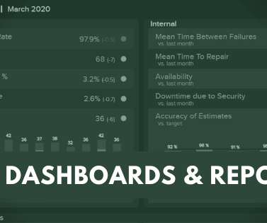
An important part of my job is identifying and creating the appropriate communication products for each program, such as standard operating procedures, desk guides, fact sheets, and dashboards. When I first joined the team, we had no style guide to dictate what fonts, colors, or design to use for our signature products.

article thumbnail

Creating Reports for Grant Deliverables Using Excel Dashboards

Depict Data Studio

She enrolled in our Dashboard Design course and is sharing how she uses her new skills in real life. Save time and energy by using static Excel dashboards to design your grant deliverables. Read on to learn more about my journey implementing static dashboards in a non-profit context. Formatting Matters.

Insiders

Sign Up for our Newsletter

This site is protected by reCAPTCHA and the Google Privacy Policy and Terms of Service apply.

article thumbnail

Using Dashboards to Make a Family Trivia Event Even Better

Depict Data Studio

She enrolled in our Dashboard Design course and is sharing how she used her new skills in her personal life. I decided to apply some of the lessons I learned in the Dashboard Design course to make the sheet more accessible. After: My Trivia Night Dashboard. Now it was time to make the dashboard.

article thumbnail

Visualizing 24 School Divisions’ Submissions with a Dashboard in Microsoft Excel

Depict Data Studio

This guest post comes from Amadu Sidi Bah, who’s graduated from our Simple Spreadsheets, Great Graphs, Report Redesign, and Dashboard Design courses. I then wasted no time in deciding on a one-pager dashboard. The Final Dashboard. Great work, Amadu! — Ann K. Enough of this long story.

article thumbnail

Looking Ahead to 2022: What’s Coming to Depict Data Studio 

Depict Data Studio

Here’s what’s in store for 2022 related to: Online Courses, Private Training, Data Visualization Consulting, and Personal and Professional Goals. Online Courses. This is our complimentary mini course. It’s a why-to mindset course that prepares you for the how-to courses you’ll take later on. Dashboard Design.

article thumbnail

Applying Data Visualization Principles to Your Business: A Before/After One-Pager Makeover

Depict Data Studio

So, I sufficed with Ann’s free Soar Beyond the Dusty Shelf Report course and blog posts. Ann’s Dashboard Design was one of the first courses I wanted to sign up for. I registered for the Dashboard Design course along with Simple Spreadsheets , Great Graphs: Design Principles , and Great Graphs: Excel How-To’s.

article thumbnail

Sisense and Profusion Partner to Create new Data Academy to Scale Up Services to Global Customers

Sisense

Profusion is a data science and multichannel marketing services consultancy that will now manage virtual courses like UX Dashboard Design and Blox. Profusion will now be responsible for all course administration and delivery. The courses will help current customers learn how to optimize customer engagement and operations.