Design a Dashboard example – How to Design a Dashboard
The Data School
MAY 9, 2019
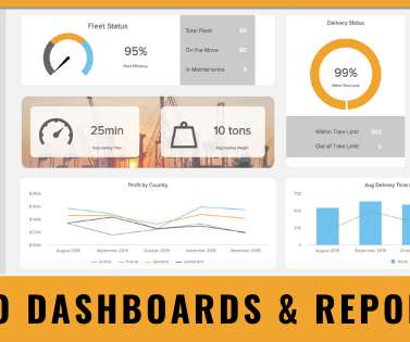
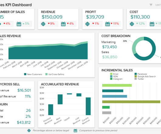
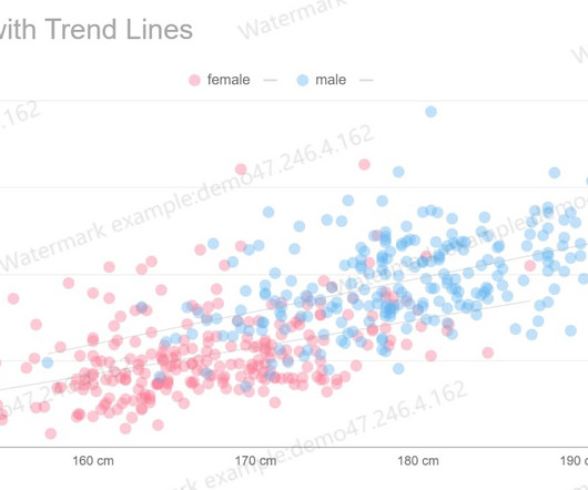
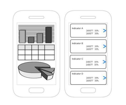
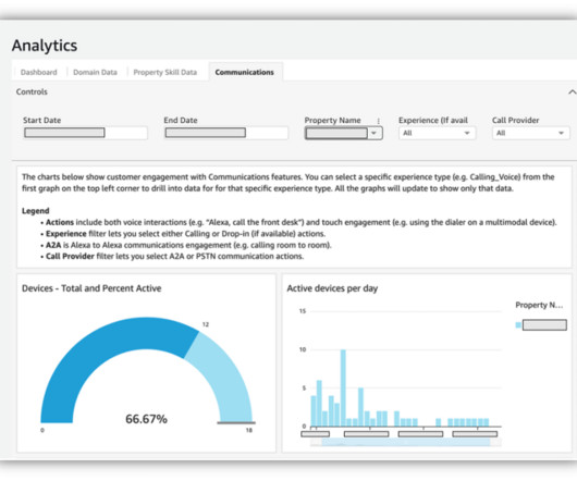
Example of how applying design thinking improves dashboard design

 how-to-design-a-dashboard design-a-dashboard-example
The Data School
MAY 9, 2019
Example of how applying design thinking improves dashboard design
datapine
FEBRUARY 9, 2023
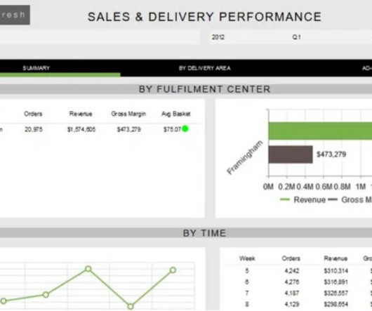
2) Benefits Of White Label Reports 3) Key White Label Reporting Features 4) White Label Dashboards & Report Examples In today’s competitive business environment, building a brand that is trusted, recognizable, and loved by many is not an easy task. The answer is white labeling.
This site is protected by reCAPTCHA and the Google Privacy Policy and Terms of Service apply.
datapine
JUNE 23, 2020
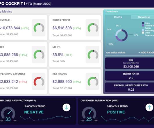
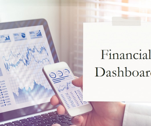
CFO dashboards exist to enhance the strategic as well as the analytical efforts related to every financial aspect of your business. Here, we’ll explore the dynamics of reports for CFOs, look at CFO reporting tools, and consider real-world examples of both CFO dashboards and reports. What Is A CFO Dashboard?

datapine
JANUARY 28, 2020
With so much data available to today’s brands and businesses, to extract every drop of value from an ever-growing raft of digital insights and set the kind of KPIs that will drive your venture forward, having an easy to use, a visually-stunning dashboard is key. Exclusive Bonus Content: 15 Powerful Dashboard Ideas: A Summary.
datapine
JUNE 27, 2019
Exclusive Bonus Content: Reap the benefits of dashboards for CEOs! But how can you achieve this? CEO dashboards and CEO reports are the answer. By leveraging the power of an online dashboard , an executive story can be written effortlessly, and within minutes. What Is A CEO Dashboard? Let’s get started.

datapine
JUNE 5, 2019
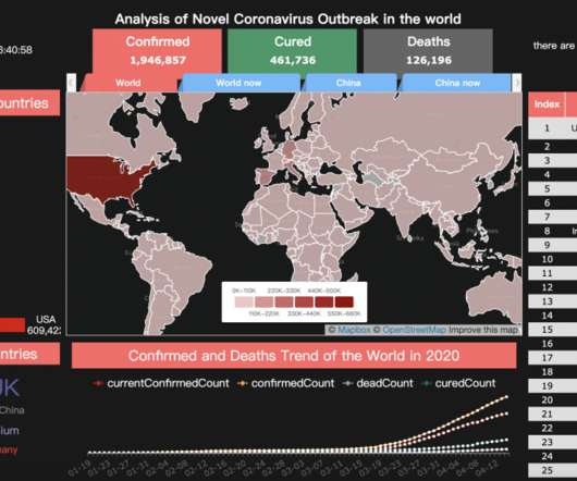
Enter data dashboards – one of history’s best innovations in business intelligence. To help you understand this notion in full, we’re going to explore a data dashboard definition, explain the power of dashboard data, and explore a selection of data dashboard examples. What Is A Data Dashboard?
datapine
APRIL 13, 2021
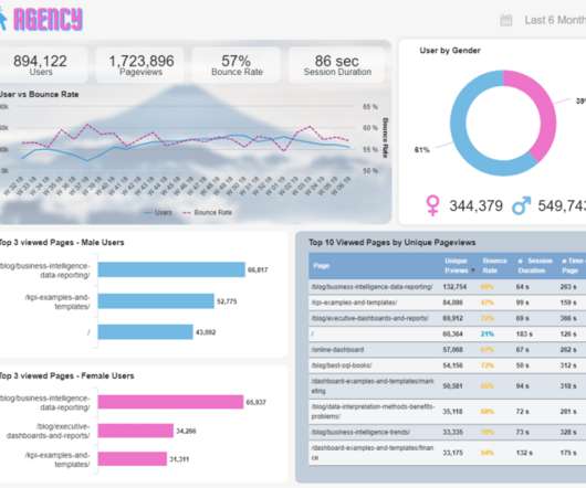
But how do you manage all your new clients while still focusing on giving them a good service and their expected results? The answer is modern agency analytics reports and interactive dashboards. Starting with its definition, following with the benefits of agency reports, a list of tools, and a set of agency dashboard examples.

Expert insights. Personalized for you.


Let's personalize your content