article thumbnail

Super-charged pivot tables in Amazon QuickSight

AWS Big Data

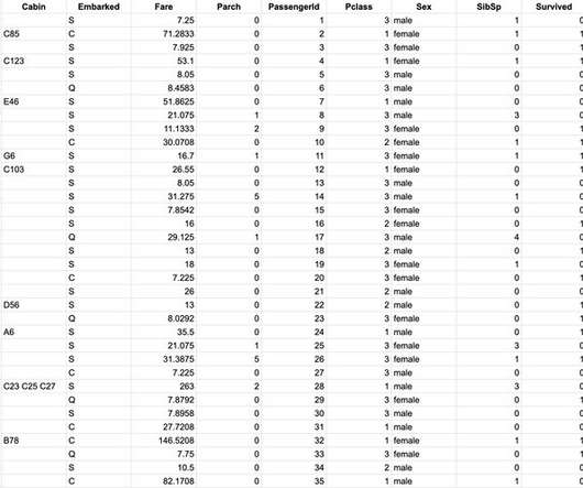
Additionally, with Amazon QuickSight Q , end-users can simply ask questions in natural language to get machine learning (ML)-powered visual responses to their questions. This involved migrating complex tables and pivot tables, helping them slice and dice large datasets and deliver pixel-perfect views of their data to their stakeholders.

article thumbnail

Know Your Data Ingredients

Juice Analytics

This is an often overlooked step on the rush to visualize data. In an effort to lay a strong foundation for your visualizations, here are three steps to understand and evaluate your data fields before you throw it into the Cuisinart that is your visualization tool. (1) 1) Separate your metrics from your dimensions.

Insiders

Sign Up for our Newsletter

This site is protected by reCAPTCHA and the Google Privacy Policy and Terms of Service apply.

article thumbnail

5 tips for excelling at self-service analytics

CIO Business Intelligence

Having that roadmap from the start helps to trim down and focus on the actual metrics to create. Have a data governance plan as well to validate and keep the metrics clean. As soon as one metric is not accurate it is hard to get the buy-in again, so routinely confirming accuracy on all analytics is extremely important.”

Analytics 136
article thumbnail

Data Storytelling: What's Easy and What's Hard

Juice Analytics

Gathering a collection of visualizations and calling it a data story is easy (and inaccurate). Making it meaningful is so much harder. Making data-driven narrative that influences people.hard. Schedule a demo.

article thumbnail

Move Beyond Excel, PowerPoint And Static Business Reporting with Powerful Interactive Dashboards

datapine

Visualizing the data and interacting on a single screen is no longer a luxury but a business necessity. They enable you to easily visualize your data, filter on-demand, and slice and dice your data to dig deeper. Maps are important data visualizations and at datapine, we love utilizing them in our dashboards.

article thumbnail

The How-To Guide for Cleaning and Preparing Data for Analysis

Juice Analytics

Change the data field names to give them a label that is around 5-15 characters — abbreviations can be confusing, long labels will be hard to show in your visualizations. The same metric is broken out into separate columns. The preferred structure is to have a column that represents that dimension and a single column for the metric.

article thumbnail

It's Not The Ink, It's The Think: 6 Effective Data Visualization Strategies

Occam's Razor

Too many bars, inside them too many slices, odd color choices, all end up with this question: what the heck's going on here? There is only one simple message above, and just two metrics that matter. What you want to do instead is to do all the slicing, dicing, segmentation, beautiful math, and then step above it.