article thumbnail

Learn Data Visualization Techniques for Impactful Visual Representations

FineReport

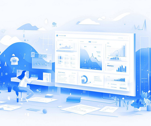
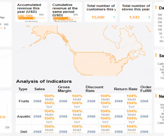
Learn Data Visualization Understanding the Importance of Visualizing Data Data visualization is a powerful tool for conveying complex information in a clear and impactful manner. Whether it’s through charts, graphs, maps, or other visual formats, mastering data visualization is crucial for anyone working with data.

article thumbnail

Visual Business Intelligence Workshop in the United States

Perceptual Edge

For the first time since I retired from teaching data visualization workshops in 2018, Nick Desbarats of Practical Reporting Inc. The workshop will take place in Portland, Oregon from October 28-31, 2019. will be teaching my courses publicly in the United States. I’m particularly thrilled about Nick’s first U.S.

Insiders

Sign Up for our Newsletter

This site is protected by reCAPTCHA and the Google Privacy Policy and Terms of Service apply.

article thumbnail

The Data Visualization Design Process: A Step-by-Step Guide for Beginners

Depict Data Studio

Visualizing data in charts, graphs, dashboards, and infographics is one of the most powerful strategies for getting your numbers out of your spreadsheets and into real-world conversations. But it can be overwhelming to get started with data visualization. If so, this step-by-step data visualization guide is for you!

article thumbnail

Utilize The Effectiveness Of Professional Executive Dashboards & Reports

datapine

By gaining the ability to gather, organize and analyze the metrics that are most important to your organization, you stand to make your business empire more intelligent than ever before – and executive reporting and business dashboards will help you do just that. Exclusive Bonus Content: Executive Dashboards & Reports: A Summary.

article thumbnail

Use Icons to Visualize Data, Not Just Decorate

Depict Data Studio

Or they bring me in for private workshops. I love adding photographs to reports, slideshows, and infographics. We can also use icons as the visualization itself. The primary icons (the collages of squares or circles) are used to visualize the data, not just decorate it. (7) And they start applying what they learned.

article thumbnail

24 Conditional Formatting Visuals in Microsoft Excel that Should Be Retired

Depict Data Studio

I can’t tell you how many times I’ve heard this from workshop participants. I’m normally very zen about data visualization. But with some behind-the-scenes editing, we can still make powerful visualizations inside Excel.”. Conditional Formatting is a fancy way of saying “if-then visuals.”. It was 8pm at night.

article thumbnail

What Is An Operational Report? A Complete Guide

FineReport

Operational reports have the potential to greatly enhance business performance through the utilization of data-driven insights. These reports offer a structured and comprehensible representation of data, enabling a clearer understanding of complex issues that might otherwise remain elusive. What Is An Operational Report?