Remove writing simple-font-framework
article thumbnail

Getting Started with Data Storytelling

Juice Analytics

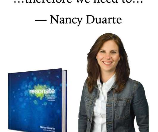
Check out our Data Personality Profile for a framework for evaluating your audience. Data Storytelling is Writing I hate to take you back to your writing classes but data storytelling isn’t just a collection of data visualizations, it is a form of writing. But every audience is different. What to next?

article thumbnail

How Data Storytelling Can Build Better Customer Connections

Juice Analytics

But what if Hubspot’s reporting had more ambitious goals than a simple data access interface? Frameworks like the “North Star Metric” force a product organization to understand the key measures of customer value. Check out our Data Personality Profile for a framework for evaluating your audience. But every audience is different.

Insiders

Sign Up for our Newsletter

This site is protected by reCAPTCHA and the Google Privacy Policy and Terms of Service apply.

article thumbnail

7 Must-Have Data Visualization Skills for Data Analysts

Juice Analytics

Learn how to properly use color and contrast in your charts, apply our Simple Font Framework to make your text look great, and remove distracting visual elements (e.g. Our collection of lessons on data storytelling includes guidance around structuring your data stories, choosing the right metrics, and writing a guided narrative.

article thumbnail

Analyze This: 5 Rules For Awesome Impromptu Web Analysis

Occam's Razor

So at the end of my 10 Fundamental Web Analytics Truths blog post I requested readers who were interested in the scholarship to complete this simple task: Pick a site you love and tell me three things you would change about it, and why. Reduce font size / increase font size. The font type is not great. Not your boss.

Testing 112
article thumbnail

Big Data Creates Many Great Opportunities With Sales Automation

Smart Data Collective

You must develop a framework of the ideal consumer and specify the criteria by which leads will be scored. Businesses have access to a low-cost, simple, and effective technique of reaching out to their users, and customized, well-timed communication makes consumers feel appreciated. It’s a no-lose situation.

Sales 133
article thumbnail

Reports Before (So Embarrassing) and After (So Exciting) Taking Great Graphs by Ann K. Emery

Depict Data Studio

I do a lot of evaluation work as a consultant, but it’s usually more evaluation training, preparation, and capacity building than it is evaluation report writing. And I love to write, so they tend to get long. The whole thing was black and white except for the headings that were in green font. It was very dense and wordy.

article thumbnail

7 Data Presentation Tips: Think, Focus, Simplify, Calibrate, Visualize++

Occam's Razor

More on that here: DC-DR-DA: A Simple Framework For Smarter Decisions.). We will look at some simple errors, and some much more subtle ones that end up limiting our ability to communicate effectively with data. I'm sure like me you have a favorite custom font you use to make your presentations really yours.).