Dashboards aren’t supposed to take forever.
They’re not supposed to cost an arm and a leg.
They don’t even need to be outsourced to a consultant.
Dashboards are supposed to be fast and easy. We make ’em quickly. We give the numbers to leaders. They make data-driven decisions. That’s it! Stop overthinking it.
In this article, you’ll see examples of real dashboards that you can use as inspiration for your own workplace. No need to start from scratch. Adapt one of these dashboards instead.
Grant Deliverables
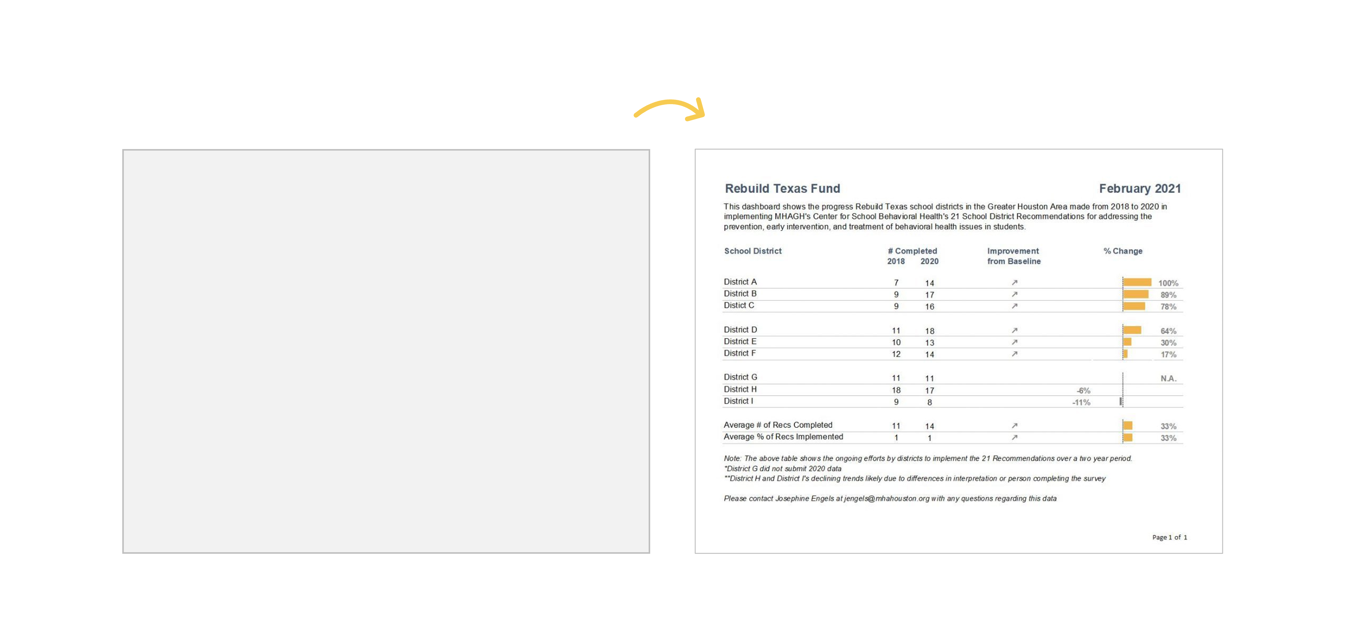
In this blog post, you’ll see how Josephine Engels did need to start from scratch — she was visualizing these metrics for her organization for the first time — and then made several dashboards to track grant deliverables.
Josephine writes, “My colleagues have given very positive feedback, as the dashboards have made it easier to analyze their program data more comprehensively. They especially appreciate one-pagers that can be shared with different stakeholders, including board members and program collaborators.”
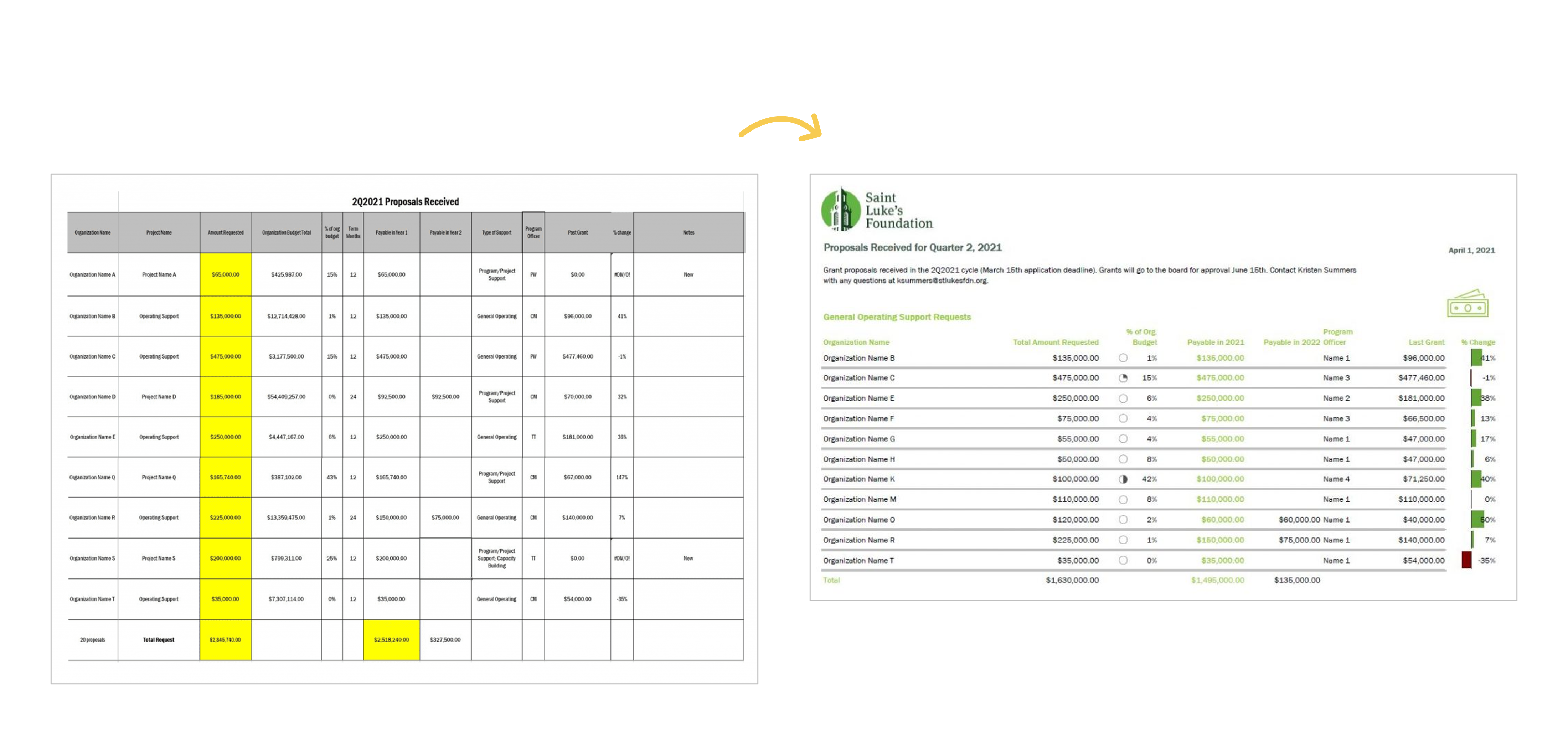
Board Packets
In this blog post, you’ll see how Kristen Summers used “better storytelling with the same data” to transform a couple packets for her board.
Kristen writes, “This resulted in a much more well-received document with lots of compliments from board members! I have begun creating a cohesive aesthetic for all the documents I produce for the board to give them the information they need but in the most streamlined way possible.”
University Monthly Reports
In this blog post, you’ll see how I transformed a university library’s monthly report.
I write, “The before version only looked at one month at a time… I visualized the percentage of the goal that had been achieved so far… In some areas, the library has already exceeded their goal, so the bars spill past the 100% mark—a cause for celebration!”

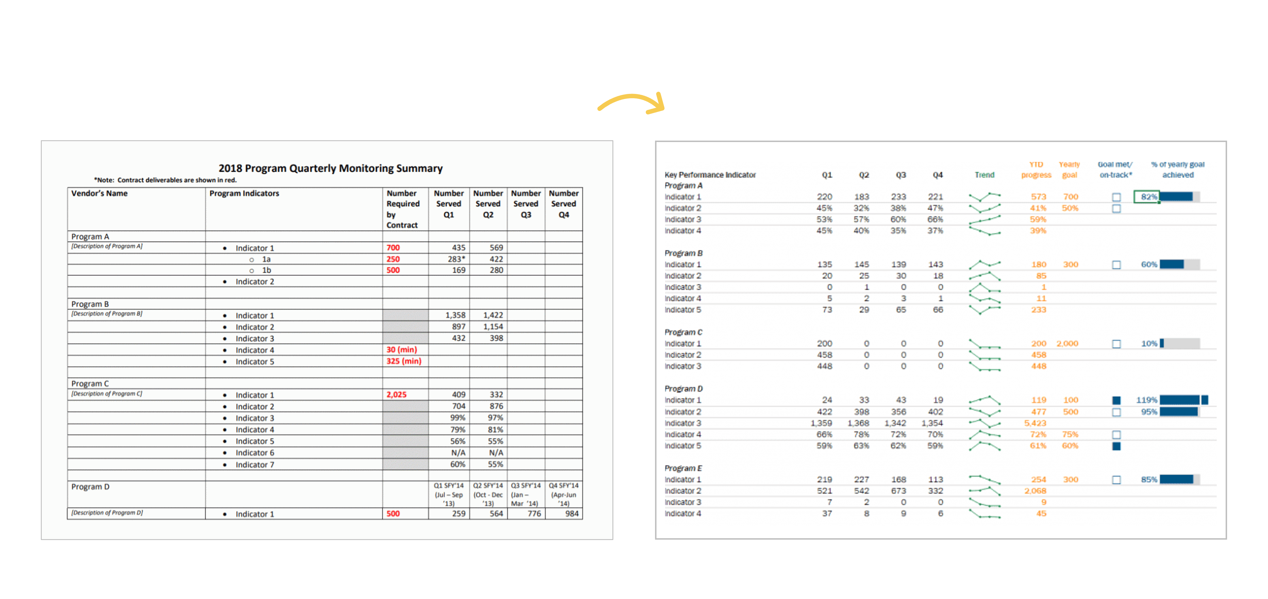
Quarterly Monitoring
In this blog post, you’ll see how Shawna Rohrman designed “a prettier and more effective dashboard” with Excel.
Shawna writes, “Even with just these few changes (and using a program nearly everyone can access!), our new performance monitoring dashboard has made it so much easier for our team to review quarterly progress in one place and visualize how our system of early childhood programs are working for children and families in the county. The dashboard has become a quarterly staple at our staff meetings, where we review as a group and use the data to generate next steps. It is also easy to share with senior leadership, so they can see at-a-glance the important work our programs are doing.”
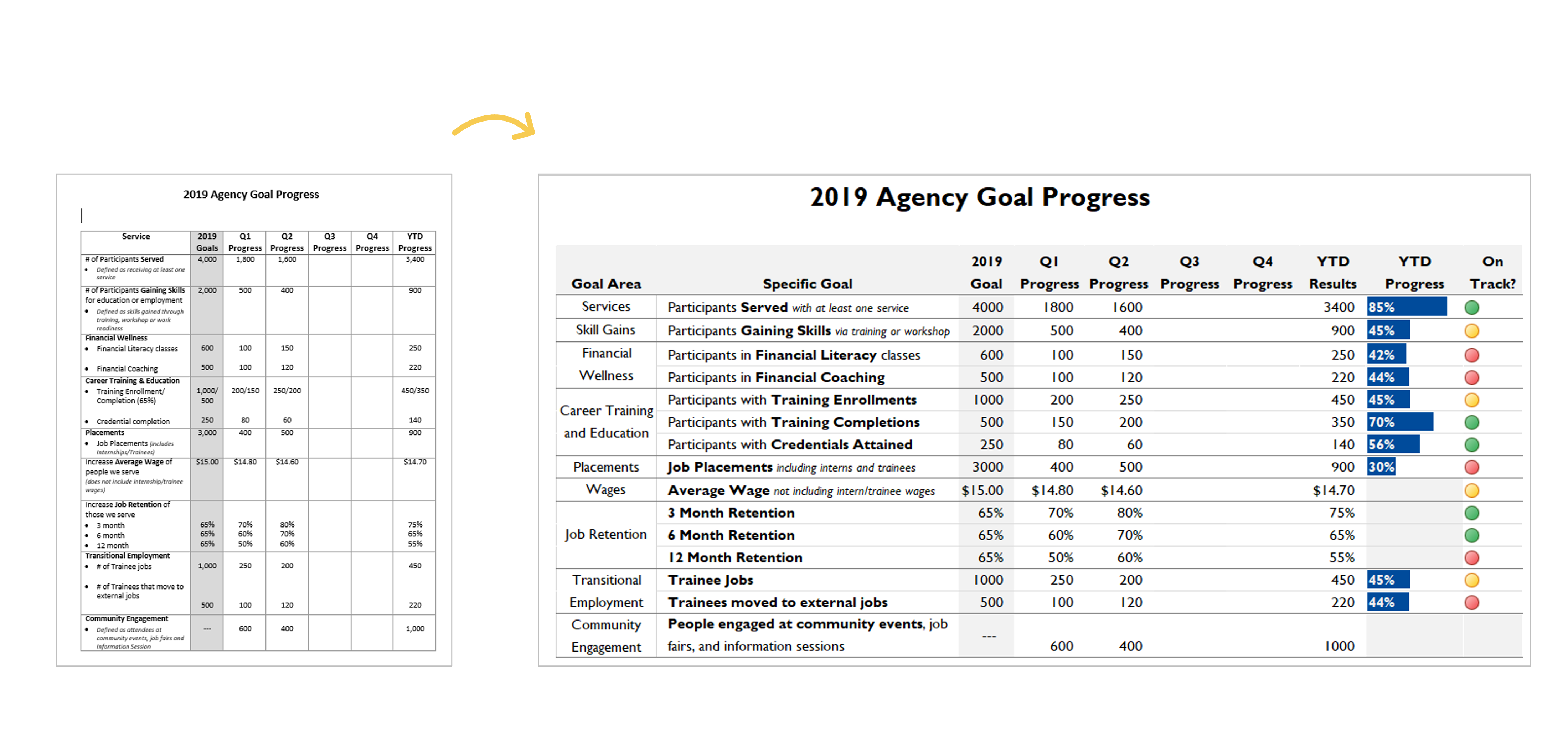
Agency Progress
In this blog post, you’ll see how Danci Greene, Emily Rose Barter, and Britani Baker used “an iterative process to hone the perfect data visualization.”
They write, “[We] recently used an iterative process to turn my agency’s annual goals document into a dynamic visual dashboard… Our iterative process has taken us all the way from a Word document to this dynamic, visual dashboard that uses length and color to bring the numbers to life.”
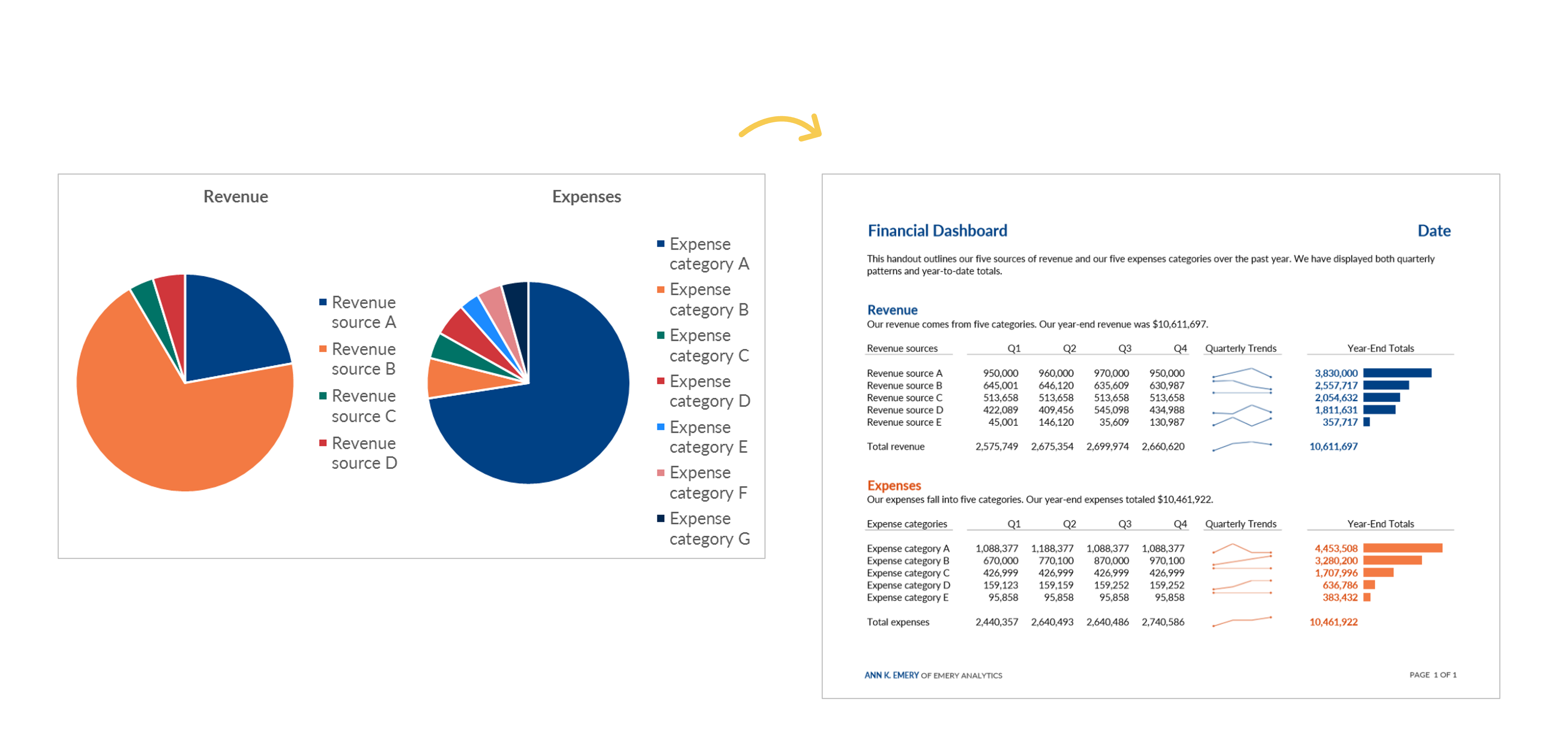
Revenue and Expenses
In this blog post, you’ll see how “transforming your pie charts into a dashboard – built in good ol’ Microsoft Excel – can be more useful for your organization’s leaders.”
I write, “The pie charts and bar charts above were only giving the viewers a single snapshot in time. To manage effectively, leaders need to monitor trends over time… Viewers should never have to lay two pages beside each other or scroll through documents to make comparisons.”
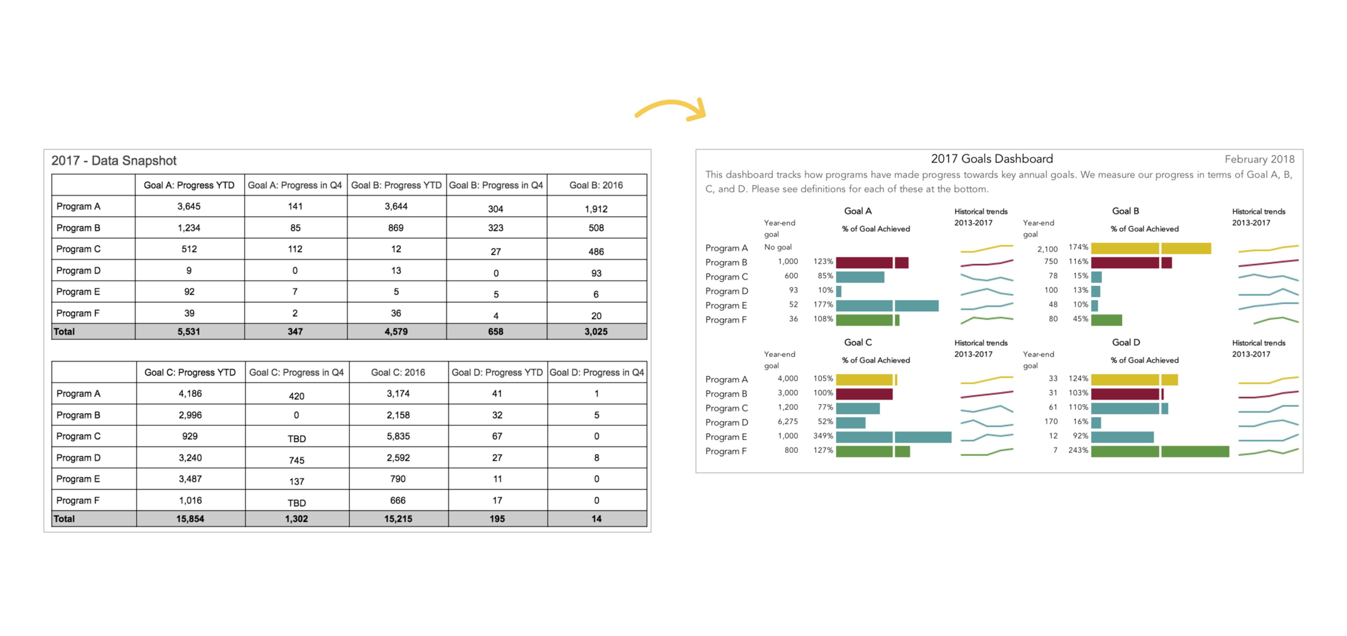
A Tired Data Table
In this blog post, you’ll see how Mia Schmid revamped a “tired data table” that “did a terrible job of communicating what we needed to know.”
Mia writes, “This is a huge improvement to how we have tracked organization-wide goals! The dashboard is so much easier to read compared to the table format and is a much more engaging way to communicate our progress than merely throwing a bunch of numbers into a table and expecting staff to make sense of it. This dashboard also communicates more than just progress towards goals. When I first put this dashboard together I was struck by how many of our programs either exceeded or under-achieved on their goals for 2017. Goal setting is one area we have been working on with each program and this dashboard has also enabled us to communicate to leadership why appropriate goal setting is so important—achieving a goal by 349% signals to me that the target set by the program is questionable.”
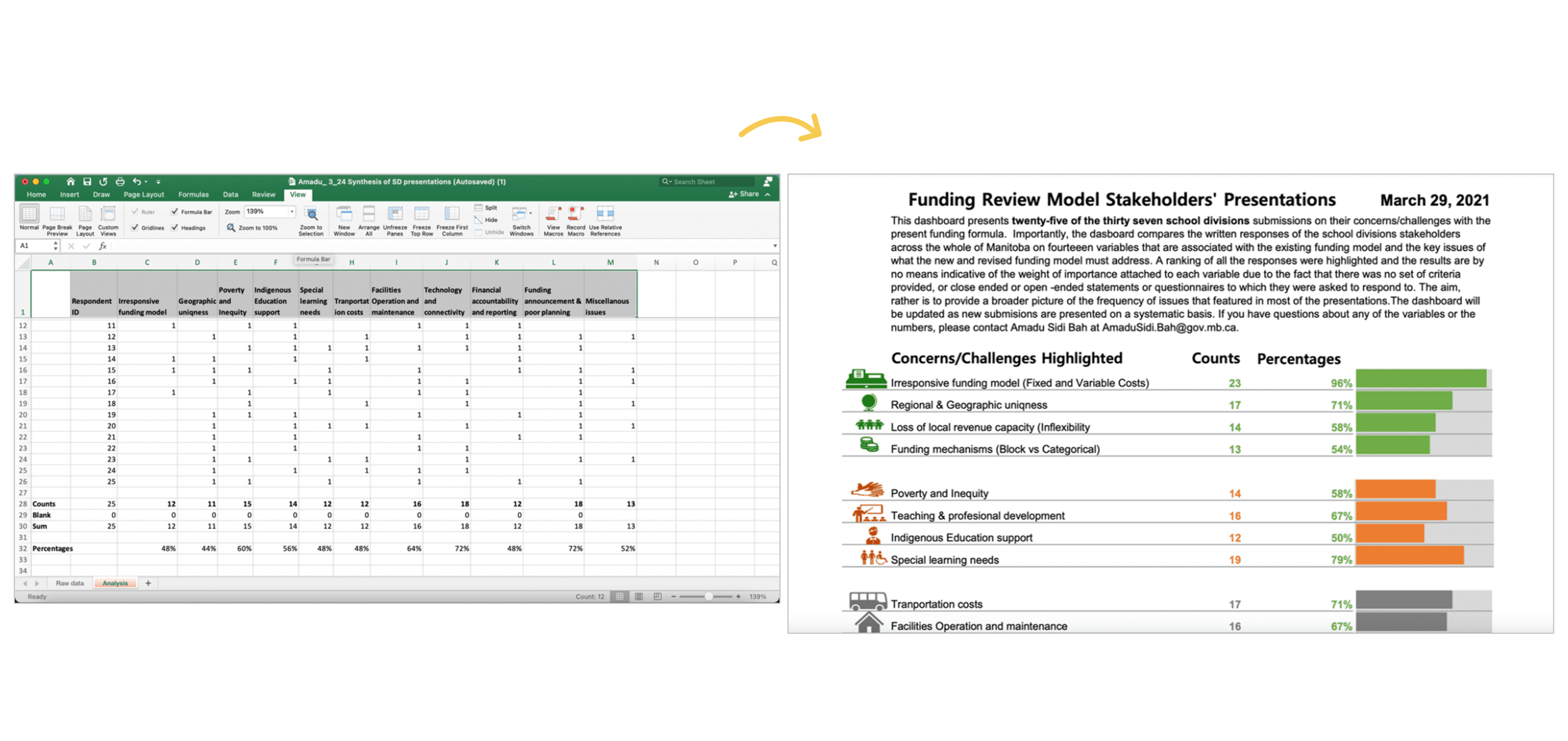
24 School Districts
In this blog post, you’ll see how Amadu Sidi Bah visualized 24 school districts’ submissions with a dashboard in Excel.
Amadu writes, “On sending this final dashboard to the project manager and colleagues, the project manager sent a reply in less than five minutes, and I quote him: ‘…Wow, comprehensive and nice visuals! This should help us prepare for the Review Team meeting and help shape the option paper.’”
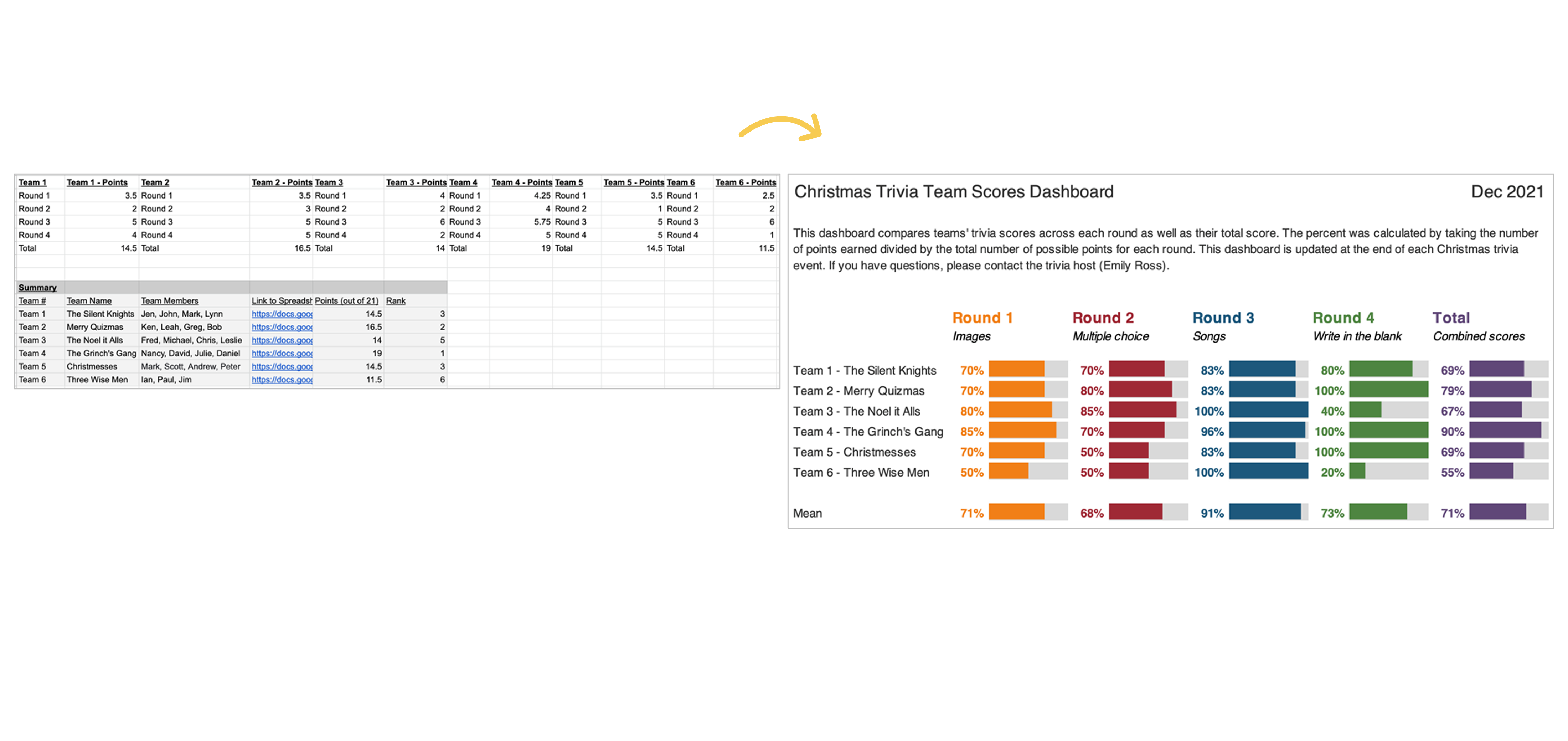
Family Trivia Event
In this blog post, you’ll see how Emily Ross used dashboards “to make a family trivia event even better.”
Emily writes, “I can’t wait to continue to apply the tips and techniques I learned both at work and for fun! Maybe at next year’s trivia I’ll have to test some of the dashboard designs for comparing change over time.”
Learn More
Want to transform your tired tables into effective dashboards? Learn how inside Dashboard Design.
Leave a Reply