Remove courses soar-beyond-the-dusty-shelf-report
article thumbnail

Applying Data Visualization Principles to Your Business: A Before/After One-Pager Makeover

Depict Data Studio

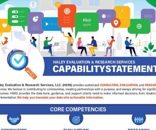
They poked fun at common reporting shortcomings in a relatable, engaging manner. So, I sufficed with Ann’s free Soar Beyond the Dusty Shelf Report course and blog posts. Ann’s Dashboard Design was one of the first courses I wanted to sign up for. Lillian Haley, Ph.D., I was sold!

article thumbnail

Looking Ahead to 2022: What’s Coming to Depict Data Studio 

Depict Data Studio

Here’s what’s in store for 2022 related to: Online Courses, Private Training, Data Visualization Consulting, and Personal and Professional Goals. Online Courses. Soar Beyond the Dusty Shelf Report. This is our complimentary mini course. This is our complimentary mini course.

Insiders

Sign Up for our Newsletter

This site is protected by reCAPTCHA and the Google Privacy Policy and Terms of Service apply.

article thumbnail

Upping Your Reporting Game–with PowerPoint!

Depict Data Studio

She is committed to creating usable reports that accurately report evaluation findings in a way that engages clients, supports program improvement, and promotes organizational learning. I’m not sure about you, but sometimes when I look at my early reports, I cringe. Writing Reports in PowerPoint Instead of Word.

Reporting 101
article thumbnail

Ending Dusty Shelf Reports: Interview on James Pann’s YouTube Show

Depict Data Studio

I recently had the opportunity to be a guest on James Pann’s YouTube show to talk about reports. Here’s a recap of our conversation: My Introduction to Dusty Shelf Reports. I’ve noticed you’re working really late on this evaluation report. Ask yourself: what is the impact of your reports (if any).

Reporting 105
article thumbnail

Teaching + Knowledge = Passion for Data Viz

Depict Data Studio

One of the primary reasons for taking Ann’s data visualization course, Great Graphs , was to learn better ways to use Microsoft Excel as a visualization tool. Here’s how my own work and my students’ work evolved after taking the data visualization course. My Own Challenges to Communicating Results.

article thumbnail

Presenting Data While Working Remotely: Audio, Lighting, and Speaking Tips

Depict Data Studio

We can’t just write reports and make pretty slides. Reports and slides aren’t enough anymore… and have never been enough. How do you help them move past just creating the report? As a group, we reached consensus that we needed more than just a report, or more than just a dashboard. Check out the full line. Keep reading!

article thumbnail

The Data Visualization Design Process: A Step-by-Step Guide for Beginners

Depict Data Studio

Visualizing data in charts, graphs, dashboards, and infographics is one of the most powerful strategies for getting your numbers out of your spreadsheets and into real-world conversations. But it can be overwhelming to get started with data visualization. Does data visualization leave you feeling like the numbers are about to topple over on you??