If you’re a Tableau fan, you should be following Lee Feinberg of DecisionViz. He’s an expert dashboard designer, adjunct professor at NYU, and hosts a deep-dive podcast with industry experts (and me).
He’s also the kind of pragmatic data practitioner that I really appreciate.
Lee recently shared a spot-on list of The 10 Tableau Dashboard Fixes You Need To Be An Analytics Hero.
Lee has inadvertently gotten to the crux of why we created Juicebox: It should be easy to create data communications that are audience-ready right out of the box.
More time conveying your message; less time fiddling layouts, charts, color, and labels.
Of course this isn’t a problem created by Tableau. Long before Christian Chabot, Chris Stolte, and Pat Hanrahan made Tableau the defacto “IBM” it is today, we spent our time fixing Excel dashboards and PowerPoint slides to make them readable. The source of the problem is un-thoughtful design options, a belief that more flexibility is always better, and little consideration of the end-user audience. As a result, you get more design decisions and more “opportunities” to fix them.
Lee offers 10 checks on your dashboard design using a 1-5 performance scale, and you shouldn’t share your dashboard until you’ve gotten 40 points (out of 50).
Here’s the good news! We can get you 40 points right out of the (Juice)box. Let me show you how by reviewing each of Lee’s criteria.
“1. The information on each dashboard ties to one main idea, and the audience should be able to read the dashboard in about 30 seconds.”
Instant Juicebox Score: 2
Focusing on one main idea is ultimate up to the author.
However, we make sure to give you a nudge in this direction: When creating a report or dashboard in Juicebox, we ask you to give it a name and description. This information shows up in an automatically-generated header.


“2. Each chart uses the least amount of space needed to see the data legibly and most importantly, to communicate the insight / intended message.”
Instant Juicebox Score: 3
Visualizations in Juicebox are lovingly-designed to emphasize the data with minimal distraction.
To do this, we have made our charts automatically responsive to work beautifully on mobile devices.
We also make visual space for the text descriptions and insights that will help your readers know what the data means.
“3. Remove visual elements that don’t add clarity, such as : too many digits or decimal places, gridlines, tick marks, axis labels, field and column labels. Less is more.”
Instant Juicebox Score: 5
Our design team has done the work to remove extraneous details. We’ve taken out extraneous ‘chartjunk’ to deliver data legibility.
We even make smart choices for number formats to ensure that large numbers are presented with the level of detail that will make it easy to read.

“4. No horizontal or vertical scrolling. Explore other chart types that do not scroll or enlarge the chart to minimize scrolling.”
Instant Juicebox Score: 5
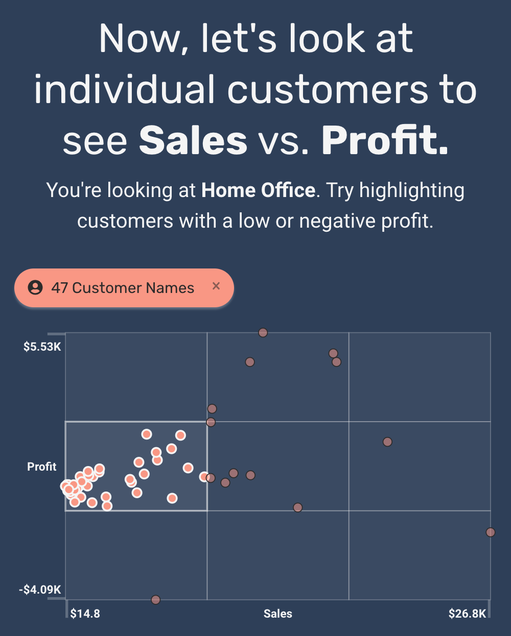
Our charts automatically size to fit on screen. One of the best examples is our bar chart. When you have a long list of items to show, a small, scrollable version of the full bar chart is displayed on the left. Now you can see the shape of the values without sacrificing readability.
It takes some clever design engineering to elegantly handle data can be big or small. We’ve got it covered.

“5. Apply color to make information stand out, not to make charts pretty. Use a color only once and be consistent, i.e. blue has the same meaning on every dashboard.”
Instant Juicebox Score: 5
Color choices can be hard. What colors go together? How do I make color choices consistent?
We have an industry-leading approach to theming your dashboards and reports. You can instantly try out our pre-build color themes, or add your own. The colors will be applied consistently across everything you make.
“6. Rename or alias field names to be clear and simple, especially for Quick Tableau Calcs. Don’t accept the default name the database admin created.”
Instant Juicebox Score: 4
This is an important concept: you don’t want to expose your dashboard audience to the messy data field labels that come from your spreadsheet or database.
In Juicebox, we automatically rename field names, removing that junk and even adding plurals. We also make it quick and easy to update those labels throughout your dashboard.

“7. Avoid charts that look “cool,” e.g. treemaps, starbursts, Sankey, packed bubbles. They may be unfamiliar to your audience and can get in the way of seeing insights.”
Instant Juicebox Score: 5
A great point, and a lesson I learned long ago when I had fallen in love with treemaps. “If you are explaining, you are losing.”
Fewer choices is sometimes better. In Juicebox, we include the most common and useful charts — then we make it easy to connect those charts. The result: you can present complex data in an interactive way without having to resort to complex charts.

“8. Show brief ‘operating’ instructions, especially for action, highlight, parameter, and set filters. They may be unfamiliar with Tableau; to them it’s a website with charts.”
Instant Juicebox Score: 3
You may need to do most of this on your own. But you’ll get some built-in explanations when you use Juicebox.
For example, legends come standard and we automatically include instructions on how to interact with charts.

“9. When using a dimension on color or shape, make sure the dimension has at most seven elements, else the chart can be visually overwhelming and hard to interpret.”
Instant Juicebox Score: 5
We impose limits on how many parameters you can add into charts. This can seem draconian at time — but it is for everyone’s good.
Here’s the secret: when you can automatically link together different chart types, you can still do sophisticated things with data without having to show all the data once.
Simple parts, easily connected.

“10. Place filters, parameters, and legends that affect all charts next to or below the dashboard title. Else, place in the left column and/or within the related chart(s).”
Instant Juicebox Score: 5
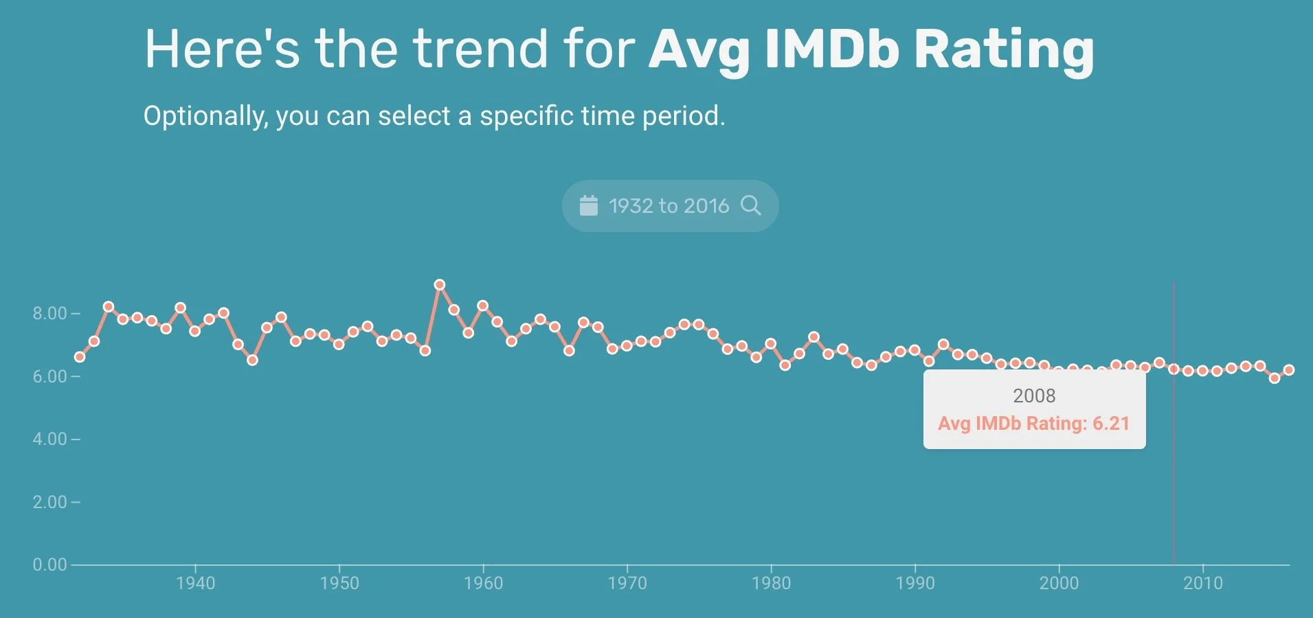
As Lee points out: Context is everything. You can’t understand the numbers on a dashboard without explaining how the data has been filtered.
That’s why we created our “Sticky Bar”. When you navigate through a Juicebox dashboard, you’ll always be able to see how the values and charts are being filtered.