Remove Blog Remove Metrics Remove Slice and Dice Remove Visualization
article thumbnail

How Model Observability Provides a 360° View of Models in Production

DataRobot Blog

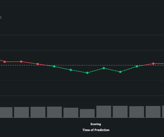
By tracking service, drift, prediction data, training data, and custom metrics, you can keep your models and predictions relevant in a fast-changing world. Model Observability compounds performance stats and metrics across the entire model lifecycle to provide context to problems that can threaten the integrity of your models.

article thumbnail

12 Marketing Reports Examples You Can Use For Annual, Monthly, Weekly And Daily Reporting Practice

datapine

As we have already talked about in our previous blog post on sales reports for daily, weekly or monthly reporting, you need to figure out a couple of things when launching and executing a marketing campaign: are your efforts paying off? Structure your metrics. That way you can choose the best possible metrics for your case.

Reporting 280
Insiders

Sign Up for our Newsletter

This site is protected by reCAPTCHA and the Google Privacy Policy and Terms of Service apply.

Trending Sources

article thumbnail

Move Beyond Excel, PowerPoint And Static Business Reporting with Powerful Interactive Dashboards

datapine

Visualizing the data and interacting on a single screen is no longer a luxury but a business necessity. They enable you to easily visualize your data, filter on-demand, and slice and dice your data to dig deeper. Maps are important data visualizations and at datapine, we love utilizing them in our dashboards.

article thumbnail

How Newcomp Analytics partners with IBM to advance clients’ supply chain insights

IBM Big Data Hub

Left to their own devices, they had resorted to using legacy reporting tools such as Excel that required manual gathering, slicing and dicing of data. Newcomp drew on their technical ability and extensive industry experience with CPG metrics, collaborating with Lindt to understand their business challenges and where to optimize.

article thumbnail

Great Storytelling With Data: Visualize Simply And Focus Obsessively

Occam's Razor

Avoid complex visualizations – they get in the way! My goal is that you'll learn a set of filters you'll use as you think about the best ways to create your stories, however you choose to tell them with whatever visual output you most love. Avoid complex visualizations – they get in the way! Teddy ready?

article thumbnail

It's Not The Ink, It's The Think: 6 Effective Data Visualization Strategies

Occam's Razor

Too many bars, inside them too many slices, odd color choices, all end up with this question: what the heck's going on here? There is only one simple message above, and just two metrics that matter. What you want to do instead is to do all the slicing, dicing, segmentation, beautiful math, and then step above it.

article thumbnail

Do I Need Both BI Tools and Augmented Analytics?

Smarten

Data Discovery including self-serve data preparation, smart data visualization with charts, graphs and other visualizations for clarity and decisions. Users should have access to stunning visualizations, alerts for exceptions and trends, and deep dive analysis using highly interactive dashboards. Smart Data Visualization.