The book Made to Stick set forth 6 principles essential to making ideas connect and spread. I was reminded of this list by a recent LinkedIn post and blog post by Gilbert Eijkelenboom. Then I was pleased to realize that all these ‘S-U-C-C-E-S’ principles are represented in the functionality of Juicebox. Check it out…
Simple
Strip an idea down to its core
Old-school dashboards have a prime directive: show all the information on one page. Just as a complex idea won’t stick, too much data also tends to overwhelm your audience.
This is the (Juicebox) Way:
In contrast to dashboards and reports, data stories focused on specific audiences with simple, clear messages.
We’ve made creating a data story as easy as sending an email. Easy-bake means you don’t need to cram everything into one cake.
Unexpected.
Get the attention with surprise. Keep attention by creating knowledge gaps, make people wonder. Fill the gaps later.
Don’t start with a wall of charts. Instead, introduce your data story with a powerful, evocative image, a bold statement, or a surprising data point.
This is the (Juicebox) Way:
We encourage and enable visually strong titles, big bold images, and full-width color. Bring personality to your data presentation.
Concrete
Make it tangible. Describe the impact in every-day terms. Avoid abstract words like high-performance, delivery, and process.
Data can make your story concrete. But you still need to make it relevant and relatable. Here are some ideas.
This is the (Juicebox) Way:
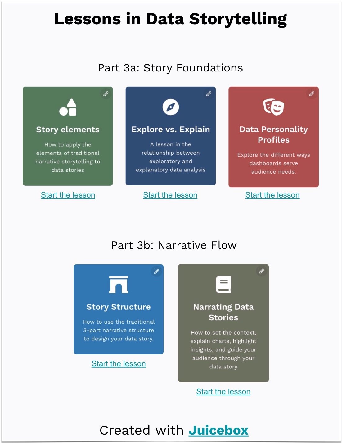
We make beautiful, intuitive visualizations — and provide training and resources to make the most of those capabilities.
Credible
Do people believe your idea? Why should people trust you on this subject?
Rather than “telling” with a static data presentation, when you offer the ability to explore data together, it builds trust.
This is the (Juicebox) Way:
We made drill-down exploration the default model for the user experience. Data visualizations are automatically connected together, so slicing-and-dicing is de-facto.
Emotional
Make people feel something.
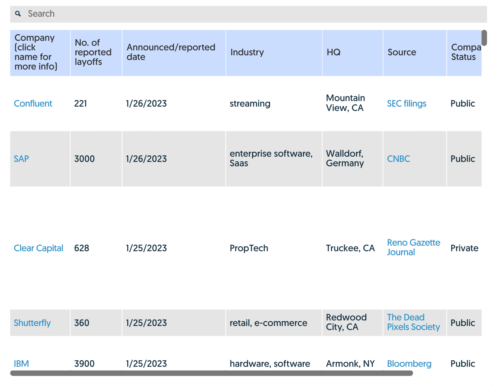
Let’s get real: data can be boring — especially if it is presented as a collection of charts. You may be more in love with your data than your audience.
In contrast, if you share specific examples, you can deliver emotional impact. After all, “specificity is the soul of narrative”.
This is the (Juicebox) Way:
We believe the data visualizations are only part of your story. You need to combine text, images, even emojis to help people connect with your data-driven message. See how my 10-yo daughter brings the fun.
Stories
Stories burn an idea into our mind. Tell a story instead of focusing on dry data.
What is the essence of a story? A propulsive narrative that carries the audience from beginning to end.
This is the (Juicebox) Way:
We designed around the concept of a story flow. A data story needs a beginning (why should I care?) and an end (what action should I take?). And each step along the way should connect together. That’s precisely how Juicebox works, giving you a data story that sticks!


