Do you need to share statistics in presentations?
Maybe you’re getting ready for a talk at a conference.
Or, maybe you’re sharing updates with coworkers in a staff meeting.
In this blog post, you’ll learn how to explain dense graphs one slide at a time, which makes it easier for our audience to follow along.
Before
Last summer, I was keynoting the National Birth Defects Prevention Network’s annual conference in Atlanta.
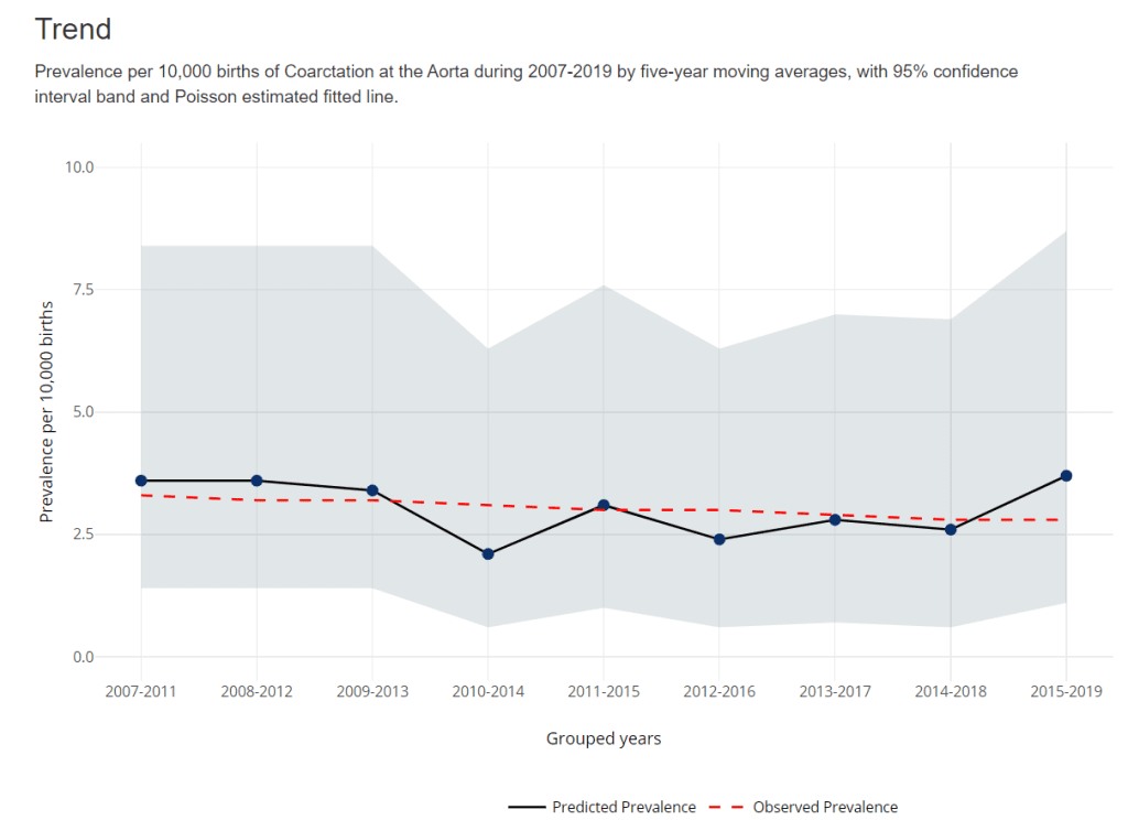
Here’s what one of the health department’s original graphs looked like.
We wanted to make a presentation-ready version.
If you work in public health, then you know that the tiny text and statistical terminology is pretty common in scientific graphs. (BUT IT DOESN’T HAVE TO BE!!!)
After
We don’t need a complete overhaul.
I made some very light edits to the existing graph:
- Direct labels (instead of legends) ensure that the graph is “Big A” Accessible (a.k.a. 508/ADA compliant).
- Horizontal text (instead of vertical text) is faster to read.
- I removed the grid lines.
- I enlarged the font (the body font is size 18, which is my bare-minimum font size for presentation slides).

Storyboarding for a Live Presentation
Now that we’ve tackled the quick edits, we’re ready to adjust the graph for a presentation.
We’ve already done the hardest part: Getting the “final” slide ready.
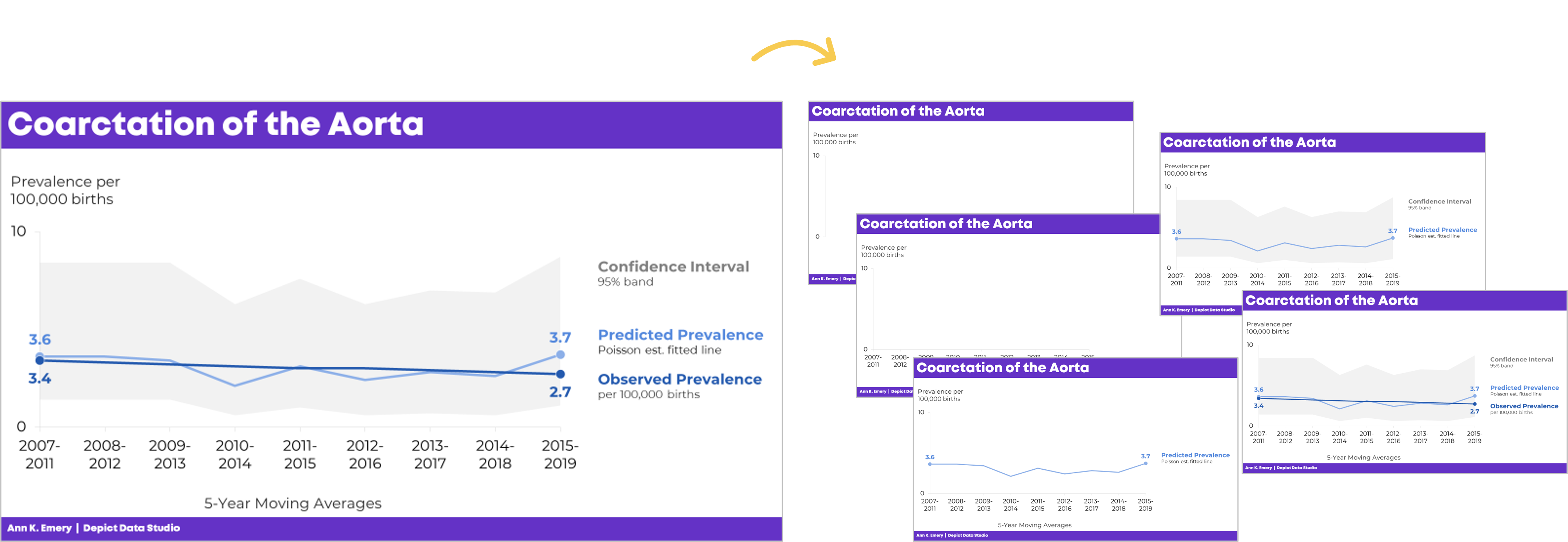
Now, with a few more minutes of planning time, we’ll create the “build-up” slides, like this:

What the Presentation Will Look & Sound Like
For statistical graphs, I often begin by explaining the axes.
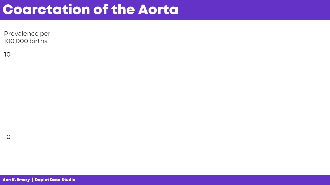
I’d show the y-axis, and say, “Next, let’s talk about coarctation of the aorta. We’re going to look at the prevalence per 100,000 births.”
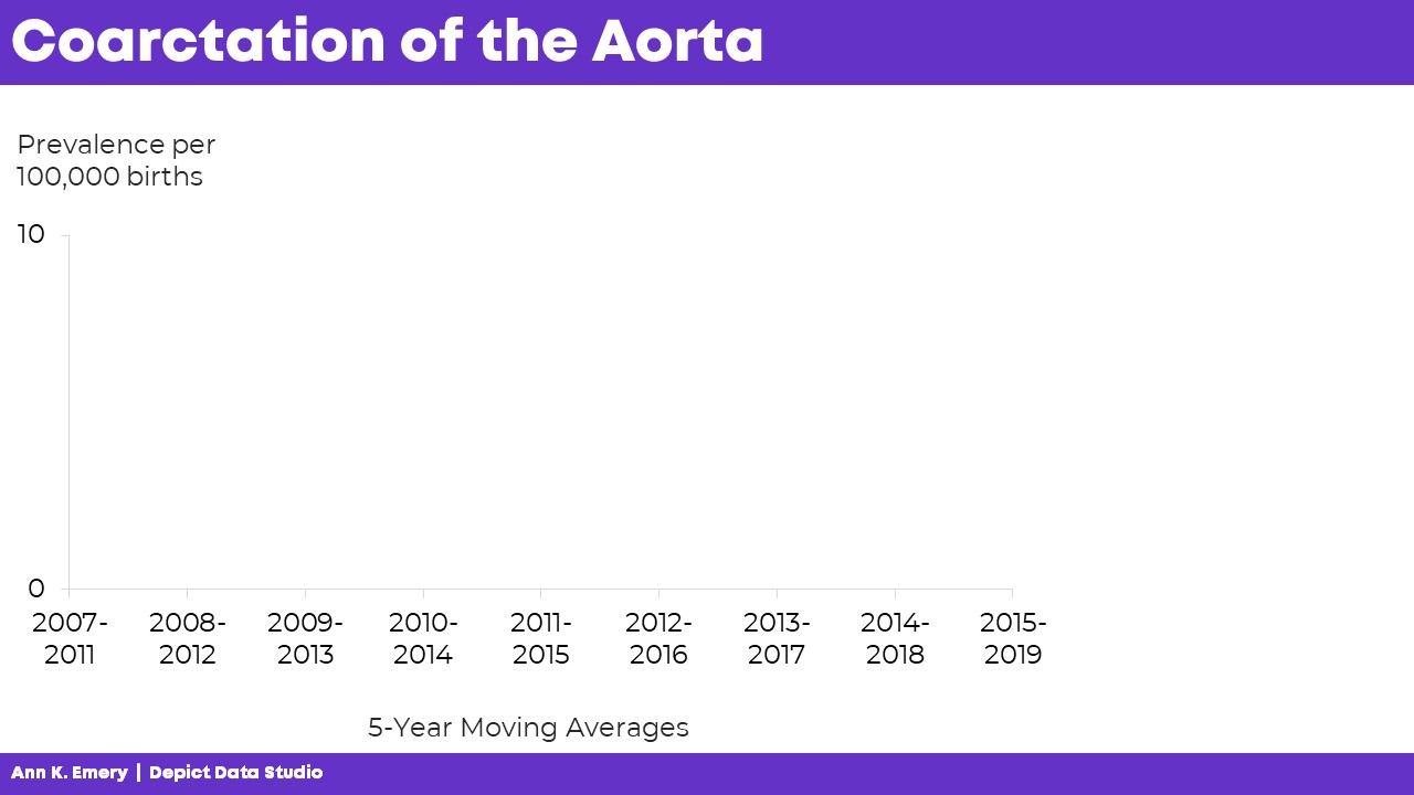
I’d click, move to the next slide, and say, “…and we’re looking at data from 2007 through 2019. The numbers vary a lot each year, so we’re looking at 5-year moving averages in this graph. The moving averages are going to help us focus on the bigger picture.”
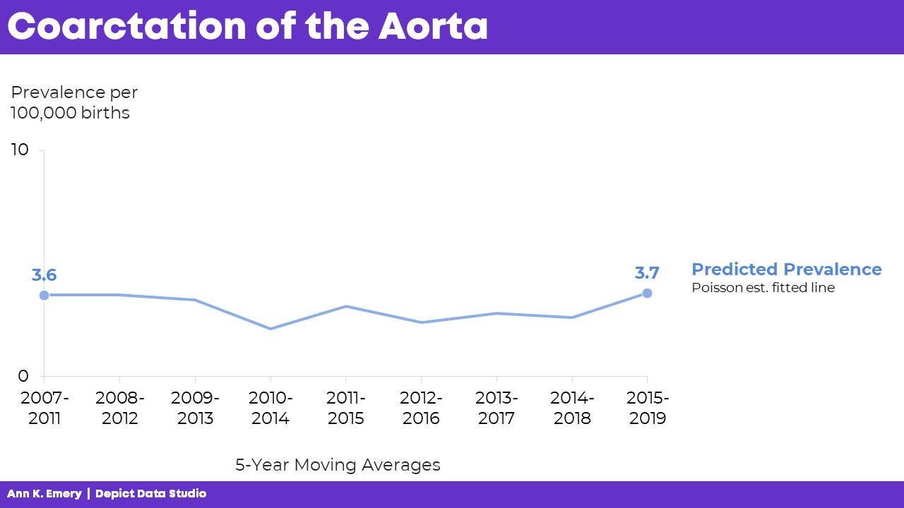
“Here’s what we predicted would happen. You can see some slight variations over time, but we generally estimated that there would be 3.6 to 3.7 cases of coarctation of the aorta per 100,000 births.”
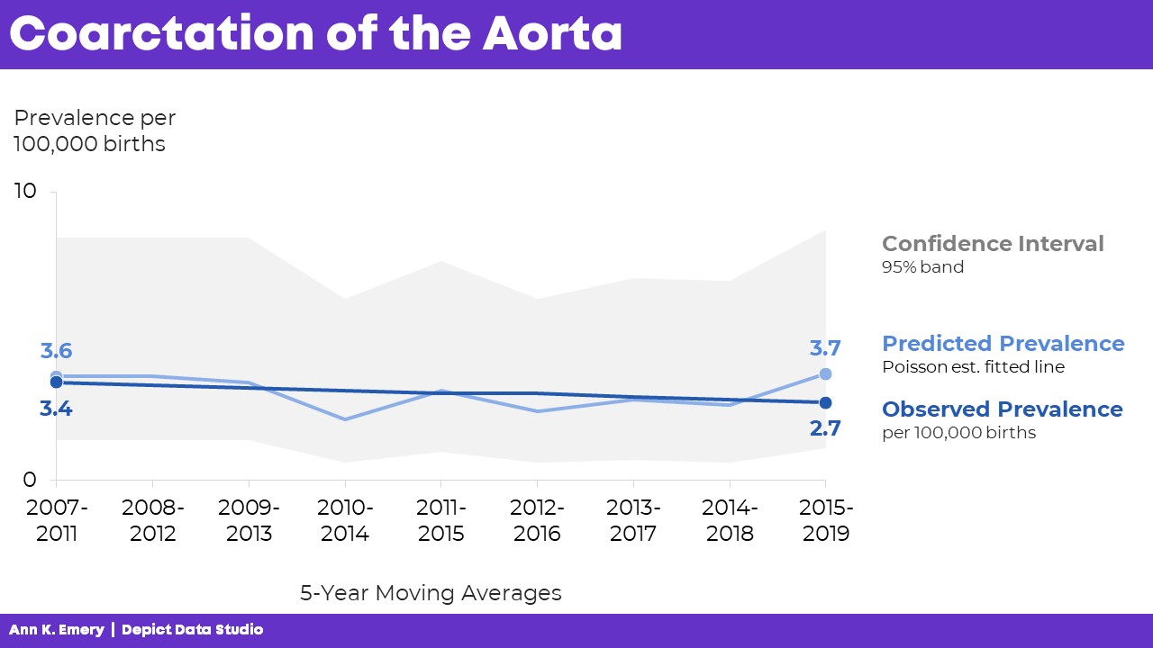
“Here’s what actually happened. There were slightly fewer cases of coarctation of the aorta than what we predicted. And the numbers are actually going down slightly over time.”

Finally, I’d click, move to the next slide, and say, “Here’s the confidence interval with a 95% band.”
The graph is explained piecemeal, RATHER THAN SHOWING EVERYTHING ALL AT ONCE.
If we show everything all at once, then my audience would be looking at one thing while I’m talking about something completely different. That’s Death by PowerPoint.
The Bottom Line
We don’t have to delete or dumb-down our statistical graphs.
We just have to explain them piecemeal.
It’s counterintuitive, but sometimes we need more slides — one slide per sentence or two of speaking points.
We’re not talking for longer, or running over time.
We’re not talking faster, or slurring our speech.
We’re simply clicking through our slides one at a time to match our speaking points.
A few more minutes of planning time on our end… to make sure our audience can follow our dense graphs. A necessary trade-off.
Learn More
Browse more examples of storyboarding in these blog posts.
You’ll also practice this technique inside Powerful Presentations.


Leave a Reply